Guinness Logo
Guinness is a legendary Irish brewery that mostly makes beers – dark stouts in particular. It’s the largest beer brand in Ireland, and one of the largest brands on this kind in Europe. They have also created the Guinness Book of Records – primarily for people who wouldn’t stop arguing in the pubs.
Meaning and History
The brewery was created in Ireland in 1759. As such, it counts among the older beer brands that came from this country. The founder was named Arthur Guinness, and because his family ran the business for the long time since, ‘Guinness’ stuck as the company name.
1862 – 1955
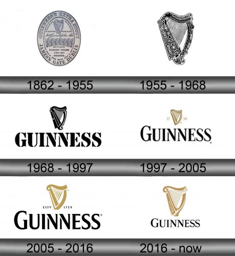
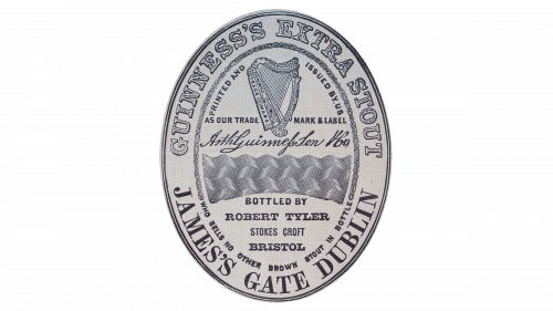
Records show that the first Guinness logo was simultaneously a label for their flagship product back then – the ‘Guinness Extra Stout’. This was written in the top of what was a vertical oval shape with lots of text on it. On the other side of the, Guinness added an address of their brewery in Dublin.
In the inner space, they put an iconic harp symbol (harp is a national symbol of Ireland), as well as many other less important elements.
1955 – 1968
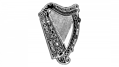
In 1955, they decided to focus on just the harp. This design in particular was monochrome, very detailed and sophisticated. They put a lot of effort into drawing this.
1968 – 1997
The 1968 harp was instead a very simple collection of metal-looking lines that made up an outline that resembled the musical instrument.
1997 – 2005
In 1997, the company adopted a new approach – using the harp symbol alongside the brand name. The instrument’s design was just slightly changed – some new parts were added, and it generally became more elegant. The brand wordmark was a row of tall capital letters, all written in a sharp serif font.
2005 – 2016
Most of the logo remained unchanged, with the exception of the new ‘est. 1759’ writing separated by the harp in the middle, as well as slight changes in the font style. The coloring became normalized this time: black background, white letters and golden harp became a norm.
2016 – today
This time, they only kept the main wordmark alongside the harp. The harp became noticeably 3D, while the letters in the writing adopted a new-ish thin serif appearance. The black background turned from a rectangle into a square canvas. Oh, and the founding year part moved onto the harp this time.
Emblem and Symbol
Guinness ‘Original’ – the bottled variation with an older formula – has its own logotype that’s a bit different from all the rest (which are just the usual emblem put onto a black can’s exterior. This one actually has a label – a white oval with an iconic harp, a black company name and the drink description.
