Heineken Logo
Heineken is a major Dutch brand of beer, and one of the biggest breweries in the Netherlands. In addition to producing their iconic namesake lager, they also own a lot of subsidiary brands, many of which are successful breweries in their own right, such as Amstel, Krusovice and others.
Meaning and History
Heineken brewery was established in the 1864’s Amsterdam by a young beer-maker called Gerard Heineken. Their beer became loved across the Europe shortly after the WW1, and soon it’s become one of the most popular lagers in United States as well. Currently, Heineken is one of the biggest beer companies in Europe.
1864 – 1884
The original emblem was shaped like a cerulean ellipse, serving as a distinctive mark. Encircling its perimeter, inscriptions boldly conveyed ‘Heineken Brewery Enterprise, Amsterdam’ in a striking white hue. Nestled within the emblem’s silvery core was an artistic representation of the brewery’s infrastructure, accompanied by lettering that further elaborated on the specific beverage they crafted. This design encapsulated the essence of the brand, merging both its rich heritage and the dedication to producing quality brews for its patrons. It was a testament to the company’s roots and its unwavering commitment to excellence in the beer industry.
1873 – 1884
This alternate insignia retained many familiar components, yet showcased a prominent crimson elliptical border juxtaposed against a sandy beige backdrop. While the architectural rendering was omitted, the brand’s name, ‘Heineken’s’, was prominently displayed at the center, flanked by additional textual elements. Enhancing the emblematic charm, heraldic shields, possibly representative of family crests or coats of arms, were symmetrically positioned on either side. This design encapsulated the legacy of the brand while subtly blending contemporary elements, creating a harmonious balance between the past and the present, and emphasizing the brand’s rich heritage and commitment to excellence.
1884 – 1889
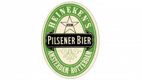
The 1884 logo was more of a label they used for their bottles. It used the oval shape – common back then – with a pale green rim (colored so after the hops). The visual elements included the words ‘Heineken’s’ and ‘Amsterdam-Rotterdam’ written in the opposing ends of the rim, ‘Pilsener Bier’ (a sort of lager) written over the black ribbon in the middle and lastly the black star outline above the center.
1889 – 1930
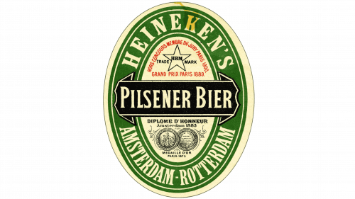
It changed little in the coming years, except made the green rim much more saturated and added minor visual elements all over the logo.
1930 – 1951
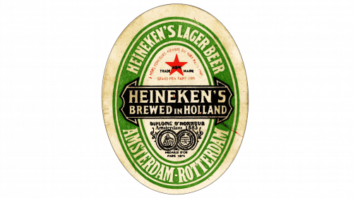
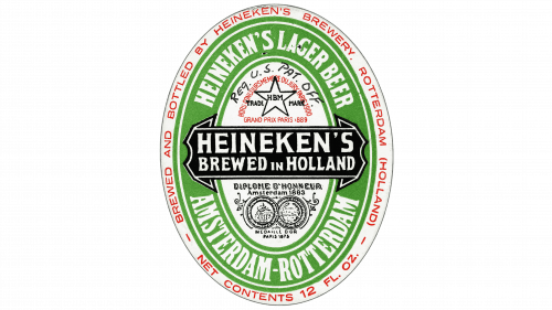
This time, they mostly added to the text all over the logo. The top now said ‘Heineken’s Lager Beer’ (in English), and the middle ribbon declared that it’s a ‘Heineken’s, Brewed in Holland’. The only other notably changes were the yet again paler rim and the newly red star above the ribbon.
1930 – 1954
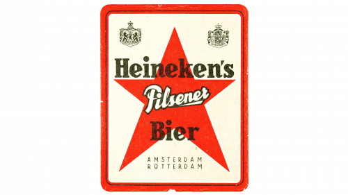
This logo was rather meant for the home market, which is why it’s almost completely in Dutch. It’s a white square with thin red rims and a large red star in the middle, with the words ‘Heineken’s Pilsener Bier’ written in 3 lines.
1951 – 1954
The 1951 logo is mostly the same as its 30s predecessor, except they removed the red from the star and generally scaled back on nuance.
1954 – 1974
This is an even simpler, cleaner version. They made the rim darker again and altered the text: the middle bit now said simply ‘Heineken’, while the bottom changed to ‘Brewed in Holland’. Also, there’s an additional thick white outline now.
1974 – 1991
Except for widening the emblem in general, the only other change is a much cleaner white frame. It’s now streamlined and further surrounded with a thin green line.
1974 – today
In 1974, they introduced a brand logo that was basically just a green-colored word ‘Heineken’ from the previous logos, except enlarged.
1991 – today
In 1991, they added a red star to the existing logotype and released it as a separate thing.
Emblem and Symbol
There’s actually an additional corporal logo used by the Heineken Company (not the brand). Until 2011, they had the logo identical to the one their beer rocked, but then made their own – the same word, but with darker, blockier letters and a reimagined star with another star trace in it.


