Hot Wheels Logo
Hot Wheels are copies of mass-produced cars that have been produced by Mattel since the middle of the last century. Adults also fell in love with realistic toys for children because they can easily trace the history of the global automotive industry. Boys of all ages are interested in playing with Hot Wheels cars, but collecting them is no less exciting. A collection of these toy cars can make its owner a very rich person.
Meaning and History
The Hot Wheels brand was registered in 1968 by Eliot Handler. In the same year, the first models of racing cars with a scale of 1:64 were released for children over 6 years old. Next year, 26 more car models were released. The first auto tracks with dead loops and many sharp turns appeared in stores in 1970. New models and features were added regularly. Since 2000, the company began to produce themed auto tracks, and by the following year, the total number of Hot Wheels auto tracks reached 240 pieces. It was the beginning of a new era of Hot Wheels, as young designers developed the Hot 100 series, Hot Wheels Mutant cars, Transformers models, and other interesting new items.
What is Hot Wheels?
Hot Wheels are realistic toy cars and exciting auto tracks from the world-famous brand Mattel. Over time, they did not lose their popularity and even acquired a certain collection value.
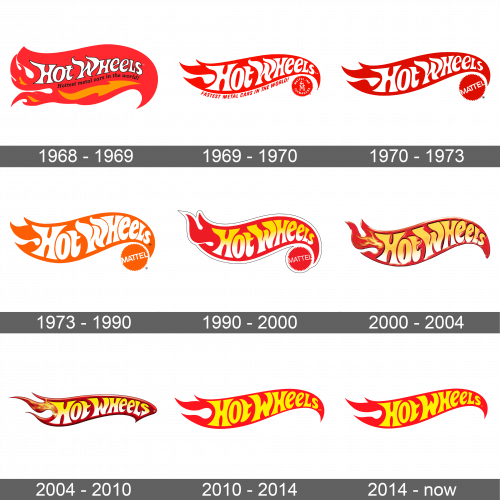
1968 – 1969
It is not surprising that a flame has become the key element of this brand’s logo. The flame was blown to the left and was predominantly red with some orange highlights. Across the fire, it stated the brand name in white title case letters that had a thin black outline. The letters looked like they melted and followed the direction of the fire. Underneath “Hot Wheels”, it stated “Hottest metal cars in the world!” and the overall impression left no doubts.
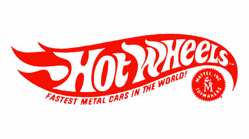
1969 – 1970
The flame did not look as realistic because it had fewer details and featured a brighter, solid red. It was now just big enough to frame the “Hot Wheels” line, which looked almost the same as the original. The other inscription, which now said “Fastest metal cars in the world!”, curved under the flame. It was printed in the same red using all uppercase, bold letters. Under the red end of the fire, there was a small circle with a zigzag border. It was the same red color and had “Mattel Inc. Toymakers” written inside along with an “M” monogram.
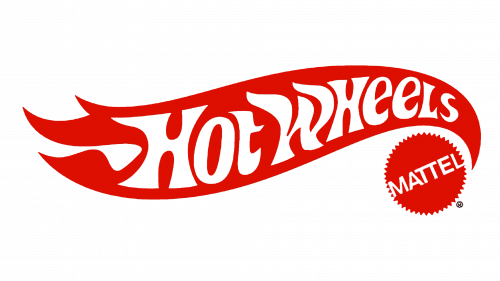
1970 – 1973
The logo was a true representation of a bold and powerful brand. The red got very deep, which made the name literally pop. The was no inscription under the flame, while the circle now simply said “Mattel” in white, uppercase letters placed diagonally across it.
1973 – 1990
The new color palette was represented by orange and white. The flame got thicker, covering even more space, while the letters slightly changed their shape and appeared bolder. It implied the spreading popularity of the brand.
1990 – 2000
The dark red was brought back and accented by a white border. The shape of the flame and lettering was modified again, although not much. This logo introduced a gradient color palette for the brand name. it was yellow at the top and got white towards the bottom.
2000 – 2004
An interesting spin on a familiar logo made it look very impressive and powerful. The flame shape featured a realistic-looking flame, which was more apparent on its left end. There was also less border around the name as the letters got bigger. Both the shape and the lettering now had a 3D appearance.
2004 – 2010
This version looks even more stylish and daring thanks to the deeper colors of the base. The lettering was now a brighter yellow and white, which created more contrast.
2010 – 2014
The brand decided to create a flat, more minimalistic version. They have redrawn the shape a bit and made it a plain red color. The inscription was also a solid, bright yellow.
2014 – Today
This time, the designers made minimal adjustments to the logo. A modern, sleek design was just what a well-known brand needed.
Font and Color
The font and the color palette have stayed pretty consistent over the years. The main colors were always red mixed with orange and yellow. These are surely “hot” colors and stand for power, strength, energy, and heat. White has also played a significant role. When it comes to fonts, Hot Wheels used a custom font that made the letters blend in with the fire and reflect its heat and movement. They had funky, uneven shapes, although the edges of the strokes were preserved smooth.
