HP Logo
HP is a notable American manufacturer of electronics – primarily laptops and other hardware. In fact, they are amongst the most popular laptop producers in the world, owing to their relatively small prices and longevity of products. In 2015, the brand had to be divided into two companies, HP Inc. being the main successor.
Meaning and History
HP was set up by two American entrepreneurs called Hewlett and Packard back in 1939, hence the acronym. Back then, they were involved in the production of electronics, which makes them amongst the oldest brands in this niche. The production was divided into HP Inc. and HPE in 2015 to better manage various resources.
1939 – 1954
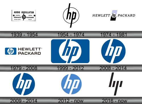
The very first logo was surprisingly similar to the contemporary design. It was a black circle with two white letters ‘hp’ put in the center, as well as two black lines sprouting from the circle that acted as stylistic extensions of the letters.
That being said, they often put it on some sort of promotional image. The usual practice was to put it onto a white plaque that stated what the company manufactures, as well as its full name – Hewlett Packard (all in black).
1954 – 1974
The 1954 logo was almost unchanged. They took the same circle image but switched colors. The circle was now white (with thin black outline), and the letters became black – the extensions, therefore, were made incorporated into the letters proper. Before, they seemed like attachments to the main circle.
1974 – 1981
This emblem changed even less, although they did attach a lot more elements. The 1954 emblem was taken as it was, although without the extensions this time. It was put in a middle of a vertical rectangle, with purple striped upper half and the black lower half, with the emblem separating them midway.
The rectangle was tilted to the right, as were the words on the left and right of this new emblem. These words simply said the company’s name, ‘Hewlett Packard’, in thin black serif.
1979 – 2008
The concept was remodeled in 1979, and this design soon replaced the 1974 one as the main logo.
They basically took the old ‘hp’ emblem, but made the letters thicker and colored them light blue. The emblem was then put onto another rectangle, but this time a horizontal one. Immediately to the right was the company name, but this time stacked in two lines and written in a wide blocky font.
1999 – 2012
This variant was simply an image part from the 1979 logo, without the additional writing on the right.
2008 – 2014
The 2008 design is simply the 1999 variant with inverted coloring and without the rectangle. So, a blue circle with white letters.
2009 – 2014

The 2009 logo is simply the previous attempt with a slightly paler blue part, and that’s it.
2012 – today
Again, the same design with just minor changes. This time, they made the blue color much paler.
2016 – today
In some instances, HP uses this emblem. It is just four black lines tilted to the right. However, compare it to the previous emblems and you’ll see that these lines are supposed to resemble the ‘hp’ emblem, but in a simplified style.
Emblem and Symbol
The famous ‘hp’ logo is still the most iconic and recognizable image to belong to this company. It’s inscribed on the back of the laptops, mostly with the same coloring, but polished till it shines. Although they use the blue shades when they can, the coloring can be effectively anything.


