Nintendo Logo
Know as one the most highrated giants of the game industry of all times, Nintendo has accumulated the fun, simplicity and addictiveness in its products since it was founded in 1889. Unlike other game giants such as Playstation and Xbox, Nintendo always use absolutely different mechanics both in its games and consoles.
Meaning and History
![]()
As Nintendo started in 1889, the company was meant to make a huge variety of games for children and their parents, starting from playcards and ending with toys and videogames. All of this contain simplicity and fun and is shown in the design of Nintendo.
1889 – 1950
![]()
The initial logo Nintendo was using from 1889 to 1950 represents us the name of the company in the blue Japanese hieroglyphs on the beige background with a red upper triangles.
Nintendo has made a great reputation as a great game industry corporation. But the company started with popular in that times play cards, which is shown in their logo.
1950 – 1960
![]()
In 1950, Nintendo introduced this logo: a black spade symbol with a smaller spade inside it, surrounded by white spikes. Inside the whole thing was a white circle with a lowercase ‘n’ inside (written in a Gothic style). In addition, the writing below said ‘Nintendo Playing Card Co’.
Nintendo was mostly making playing cards at the time, hence the design.
1960 – 1964
![]()
In 1960, a new logo was introduced. This new evolution was more centered on the company’s name – in fact, it was the only part in the logo. The name was written in thin cursive, as if it was a signature. Notably, the star stood where the dot on the ‘I’ would be, but nothing there was nothing else special.
1964 – 1965
![]()
For the 1964 variant, they used a combination of red and white. The white company name was written in front of the scarlet rectangle. The letters were connected by a single line, as if sprouting from the common base. It wasn’t very comprehensive, so they scrapped it.
1964 – 1967
![]()
Another attempt was made in the same year, when they took the plain, tall and blocky letters and tilted them to the right side. It was also scrapped – partially because it wasn’t really reflective of the company’s purposes and goals.
1965 – 1967
![]()
Another attempt from the same time period – this time it was just the plainest writing in black that spelled ‘Nintendo’. The letters were uniformly sized, and it was scrapped for the same reasons as the previous one.
1966 – 1970
![]()
In 1966, they tried the red-white mix they are known for even now again. They took the red square, put the white ring inside and filled it with two letters – N and D. They were both in lowercase and, admittedly, the ‘D’ part isn’t depicted as most people would depict it. The ‘tail’ was beneath the ‘o’ part, and not above it.
But again, the design was soon scrapped.
1967 – 1975
![]()
In 1967, Nintendo settled upon one of their first main logotypes. It was a company name written in scarlet, and there were many variation of this design until 1975, when it was replaced.
This writing design wasn’t very uniform. Although there were many strict details and blocky elements, it was also fluid and changed proportions on the go.
1668 – 1970
![]()
That’s one of the variations we spoke of – the same logotype but rather paler and also put inside a hexagon with the same color and style. It was used in cases where you wouldn’t normally see the text alone.
1970 – 1975
![]()
This same logic was what birthed this logo. It’s the same thing, but instead of the hexagon you get the oval shape that surrounded the text. It was more uniform in that it was just as thin in all the places. In addition to that, the color became rather brighter.
1973 – 1975
![]()
In 1973, they also introduced the logo was the home market. It was a black writing made in Japanese glyphs that said ‘Ninte Ndo’ in the company’s native language.
1975 – today
![]()
In 1975, the company started using the writing design they have even now. It was actually a very similar style to the 1967 variation, but the initial logo is now black, and the letters are a bit thinner in places and generally more pleasant in terms of proportion.
1977 – 1983
![]()
This variant of the main logo depicted the same text, but encircled in the oval shape (thicker than the previous attempt made in 1970) as well as a ‘registered’ mark top right from the main logo.
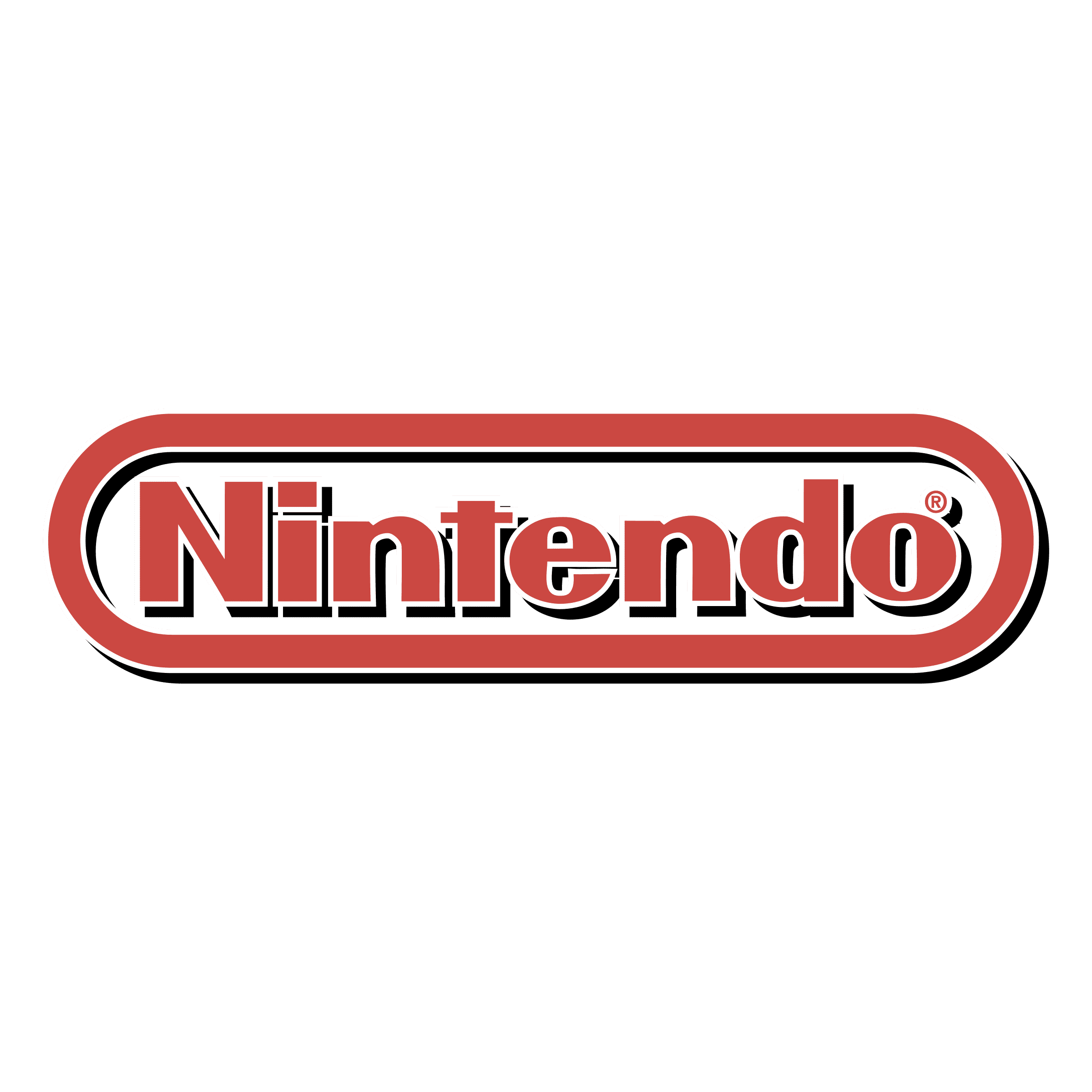
1983 – 2008
![]()
The same variant as before, but painted red instead. It generally supplanted the previous incarnation in most instances, marking their return to the color red once more.
2006 – 2016
![]()
For some time, this logo was the one of the major corporate variants, although it was used in conjunction with other variations in many instances. It was the same logo, but in light grey – good against dark backgrounds.
2016 – today
![]()
In 2016, they started using the white logotype (oval and writing) set against the red rectangle. This same color combination was also used in the branding many of Nintendo’s products since then (such as Switch, for instance).
Emblem and Symbol
The name of the company with a capitalized N is usually white, though it can change the color. For some emblems, it can be black, red or even grey. Generally, Nintendo is surrounded by the oval of the same color. Meanwhile, the icons are out of use at all.


