LG Logo
LG is the technological and financial giant from South Korea. It is making not just electronics, but chemicals, telecommunication products and also is engaged in energy industry. The company appeared with the merger of two corps – Lucky(Lak Hui) and GoldStar. That’s why in this page we will tell you about the logotypes of each company.
Meaning and History
LG, originally established by Koo In-Hwoi in 1947, has grown from a modest South Korean chemical company into a prominent global player in multiple industries. Initially named Lak-Hui Chemical Industrial Corp., the company later became known as Lucky-Goldstar and ultimately shortened to LG in 1995 to reinforce its brand identity globally. Over the decades, LG has made remarkable strides in technology and innovation. Key achievements include pioneering South Korea’s first radio and television, and more recently, developing advanced OLED display technology. Currently, LG continues to expand its influence in various high-tech sectors, including smart electronics and sustainable technologies, maintaining a strong position in the global market as a leader in innovation and quality.
What is LG?
LG is a multinational conglomerate specializing in electronics, chemicals, and telecommunication products. The company operates worldwide, enhancing modern life with advanced technological solutions.
1947 – 1963
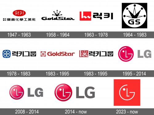
In the first 20 years, when the Lak Hui Chemical Industrial Corp. appeared and was spread in Asian sector only, in use there was a logo with some inscription about the brand in Korean language. There was also the red oval with the then-in-use name on it.
1963 – 1978
With the redesign, the company logo became to look more modern and minimalistic. The designers removed the oval and made the company name the dominant part of the whole combination. Next to the name, we can see the red rectangle with the English ‘L’ character on it, which had the wavy horizontal line.
1978 – 1983
In the pre-merger logo of Lucky, there was a blue square with the white flower on it. That square was positioned next to the full name of the company.
1983 – 1995
When Lucky merged with GoldStar, both companies had to create a single logo. It depicted the similar to the 1963 variant rectangle with the wavy ‘L’, but this time its color got a bit paler and next to it there was a firm star from the GoldStar logotypes. As for the lettering, so, on the dominant position, the ‘Lucky’ inscription in Korean was still showing off.
1958 – 1964
As for the GoldStar Company, so its first logo was just the inscription with handwritten font and the star a bit similar to the princess’ crown, above it. The logo was made of the black and white colors, to follow the trends of that time.
1964 – 1983
The 1964 redesign made the logo look clearer and even more serious than the predecessor. It had the GS abbreviation, the star above it, and the white circle on which all this was drawn. The background of all this was the simple black square.
1983 – 1995
The after-merger GoldStar logo represents the company name of the elegant futuristic font with little gaps between letters and the 1964 square with star and circle. This logo was drawn in the orange color, both the inscription and the icon.
1995 – 2014
This logotype (with a red circle, a dot and the letters ‘L’ and ‘G’, forming human face) appeared after a merger of Lucky and GoldStar in 1995. The best variant was found quickly – bosses have just combined the first letters of the names of each company. The new name was shown on the logo next to the emblem and had the ash color.
2008 – 2014
A little redesign of 2008 consisted of giving some volume to the icon, so it looked like a power button, and drawing the fleck on it. The inscription also gained a mod: it became darker.
2014 – today
The 2014 had prominent 3D elements. The LG abbreviation became even darker than previously, so now it is dark gray. But whether the logo is dark or bright, due to the curious G and L we can always recognize the brand in logo. It shows the ideals of the company and its style very well.
2023 – now
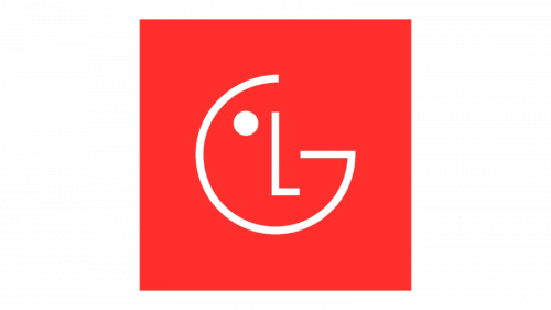
A new, bold, modern look was introduced in 2023. It was presented along with a new brand visual identity – a face that can show several emotions. For the logo itself, they chose a rather neutral emotion with a circle for the eye and a straight “L”. In fact, the “face” looked a lot like it did in the previous version but was done in white without any 3D effects. The designers also preserved the red, although it was now a different shade and was used for a square background. Several other LG logos have already featured a square shape, so it was a perfect blend of modern and old.
