Internet Explorer Logo
Internet Explorer (IE) was a pioneering web browser developed by Microsoft. Born in the mid-90s, it emerged from a collaboration with Spyglass, Inc., incorporating technology from the Spyglass Mosaic browser. Crafted in the United States, IE was designed to allow users to navigate the burgeoning World Wide Web, embodying the era’s digital exploration spirit. Over the years, it became synonymous with web browsing for millions, playing a key role in the early days of the internet until its discontinuation in favor of Microsoft Edge.
Meaning and history
Microsoft birthed Internet Explorer (IE) in 1995, tapping into the web’s infancy. Initially, it was a derivative of Spyglass Mosaic, evolving rapidly. IE’s debut alongside Windows 95 marked a tech milestone. Dominance came with IE4, it integrated deeply into Windows. The browser wars heated, with IE battling Netscape. By the 2000s, IE commanded the market, peaking with IE6. However, security woes plagued IE, tarnishing its reputation. Competition intensified as Firefox and Chrome emerged, offering innovation and speed. Microsoft’s response, IE9, aimed at modern web standards, yet couldn’t reclaim its throne. Eventually, IE’s role diminished, making way for Edge in 2015. Microsoft announced IE’s retirement, ending an era. IE’s journey from pioneer to relic reflects the web’s relentless evolution.
What is Internet Explorer?
Internet Explorer, often abbreviated as IE, stood as Microsoft’s flagship web browser, launched in the mid-90s to chart the digital seas of the internet. As a key player in the early browser wars, it navigated through the World Wide Web’s evolution before passing the torch to its successor, Microsoft Edge, marking the end of an iconic era in internet navigation.
1995
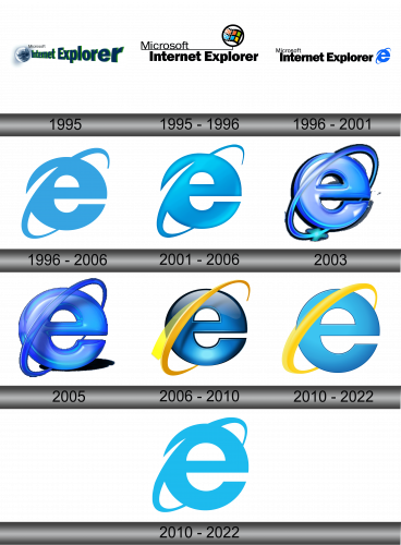
The logo in presents the name “Microsoft Internet Explorer” with a graphic element that resembles a celestial body, akin to a planet. The text employs a bold, italicized font, with “Microsoft” sitting atop in a smaller size. The word “Internet” bridges over “Explorer”, both in a vivid green shade that fades to blue, suggesting a horizon.
1995 – 1996
The logo displays the name “Microsoft Internet Explorer” in stark black lettering, clean and professional in its sans-serif font. Adjacent to the text, a vibrant orb encircles a checkered, fluttering flag bearing the classic Windows logo, suggesting a window to a colorful digital world. This design, simpler and more modern than its predecessor, symbolizes seamless entry into the diverse and dynamic realm of the internet, encapsulating the browser’s essence with a nod to its parent company’s iconic imagery.
1996 – 2001
This iteration of the logo simplifies further, presenting “Microsoft Internet Explorer” in solid black, with a minimalist approach. The notable addition is the blue “e,” iconic and synonymous with IE, conveying a sense of swiftness and fluidity with its orbital streak. The logo retains a professional demeanor, with the “e” adding a dash of color and motion, symbolizing the browser’s ease and efficiency in connecting users to the web’s expanse.
1996 – 2006
In this evolution, the logo zeroes in on the “e”, discarding other text, thus spotlighting the browser’s symbol. Rendered in a gradient of blue, the “e” is sleek and modern, with a orbit encircling it, reinforcing the global connectivity theme. This minimalist design captures the essence of Internet Explorer, focusing solely on the element that came to be instantly recognized as the portal to the web.
2001 – 2006
Transitioning from its predecessor, this logo retains the “e” but infuses it with a deeper blue and adds shading for a 3D effect. The orbital ring now has a gradient, enhancing the sense of movement. This design suggests depth, innovation, and the dynamic, ever-expanding nature of the internet that Explorer sought to navigate.
2003
The logo takes a futuristic turn with a glass-like finish, giving the “e” a crystal-clear appearance. It’s surrounded by a glowing orbit that appears fluid, almost liquid in motion, emphasizing speed and agility. The light effects and reflections suggest a high-tech veneer, in tune with the fast-paced development of the internet, hinting at the browser’s capability to offer a seamless and swift gateway to the digital realm.
2005
The latest logo iteration maintains the glossy, three-dimensional “e” but enhances its depth with more pronounced shadows and highlights. The orbit, slightly thicker and more prominent, adds to the emblem’s dynamism. This rendition plays with light and shadow to give a sense of substance and presence, mirroring the browser’s continuous evolution and its solidified presence in the digital landscape.
2006 – 2010
The refreshed logo brings a striking yellow swoosh, reminiscent of a comet tail, that wraps around the iconic blue “e”.This new element introduces a vibrant contrast, symbolizing speed and agility, while the gradient on the “e” deepens, emphasizing a sleek, modern aesthetic. The logo’s evolution mirrors the dynamic, forward-moving spirit of the browser in the digital age.
2010 – 2022
The logo retains its recognizable “e” but softens the previously vivid comet-like swoosh to a gentle yellow curve. The blue “e” now has a simpler, flatter design, reducing the gloss for a more modern, streamlined look. This subtle refinement suggests a focus on clarity and ease of use, reflecting a more contemporary approach to internet browsing. The changes hint at the evolution of user experience priorities in the digital landscape.
2010 – 2022
The logo has been transformed to a single-tone cyan, shedding the previous version’s yellow and blue gradient. The “e” is now flat and unembellished, aligning with modern design trends that favor minimalism. This cleaner, more abstract version represents a departure from detail, focusing on the essential form, indicative of a streamlined and unfettered browsing experience.
