John Hancock Logo
John Hancock is a financial services company that is located in the US and owned by a Canadian multinational company. It is primarily recognized for its involvement various life insurance policies, investment management services, and retirement plans and annuities. John Hancock has built a strong brand presence in the industry, leveraging technology and customer engagement to enhance its services. The company is often recognized for its social responsibility and has initiatives focused on sustainability and community well-being. It played a significant role in the development of modern life insurance solutions.
Meaning and History
![]()
John Hancock was founded in 1862 and gets its name after the historical figure John Hancock. Initially, the company primarily concentrated on life insurance. Throughout the 20th century, it continued to grow, diversifying its products to include not just life insurance but also annuities and mutual funds. In 1975, the company became a publicly traded. In 2004, John Hancock was acquired by Manulife Financial Corporation—a Canadian insurance establishment that operates globally. In recent years, it has focused on innovation, including the integration of technology in its services.
What is John Hancock?
John Hancock is a financial company that helps individuals and families achieve their financial goals. It provides a comprehensive suite of financial products, including life insurance, retirement planning, investment management, and wealth management services. With a history dating back to 1862, it has built a strong reputation and trust among customers.
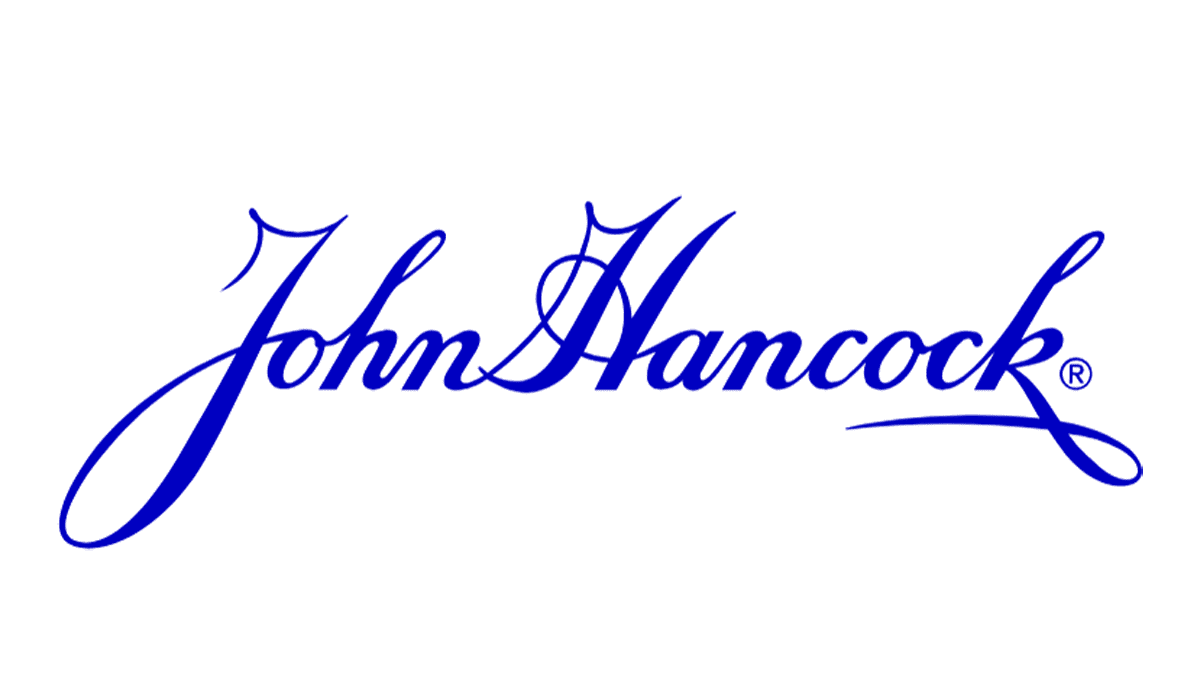
1862 – 1969, 1970 – Today
![]()
The original logo has been used by the company since the foundation until today (except for one year). It features a signature-like inscription with the company’s name. A beautiful cursive font with contrasting stroke thickness creates a sophisticated and respectful brand image. It is as if the company is proud to put its name under the services it provides. The use of black and white color palette enhances this impression.
1969 – 1970
![]()
For a very short time, the company tested a new logo. Sandgren & Murtha designed a logo that featured a bold, sans-serif font with straight cuts and smooth curves. The name is stacked in two lines and the letter “n” in “John” flows into the “k” in “Hancock”. The same detail is also seen with the first two characters in “Hancock”. Although the logo looked well-designed and had unique details, it did not form a close association with the brand, so it was decided to bring back the original version that reflected the John Hancock’s legacy.
Font and Color
The black represents power, authority, and strength of the brand, while white can signify perfection, simplicity, and clarity of the services that the company provides. A black and white color palette conveys simplicity, elegance, and timelessness and creates a balanced image. The use of just two colors can enhance clarity and focus, allowing the design to stand out without the distraction of multiple colors.
The original cursive font resembles a modified version of Italix Brushpen Sans Ink font, Gabor Pro font, or Sunlight Script Bold Regular font by Typehill. For a short period of time, the company also used a sans-serif font similar to Indecise SemiCondensed Regular font.