Kansas City Royals Logo
The Kansas City Royals, based in Missouri, are a prominent Major League Baseball team with a rich history dating back to their inception in 1969. Renowned for their strong team spirit and dynamic style, the Royals clinched their first World Series title in 1985, followed by another championship in 2015, proving their mettle. With their iconic blue and white uniforms, the Royals play home games at the magnificent Kauffman Stadium, renowned for its vibrant atmosphere. Over the years, the team has fostered numerous baseball legends, contributing significantly to the sport’s evolution and history.
Meaning and history
Founded in 1969, the Kansas City Royals quickly established themselves as a formidable force in Major League Baseball. Named after the American Royal, a livestock show, horse show, and championship rodeo, the team has lived up to its regal moniker. In 1976, under manager Whitey Herzog, the Royals clinched their first division title, marking the beginning of a successful era that included multiple playoff appearances and a trip to the 1980 World Series. However, it was in 1985 that they truly etched their name in history, defeating the St. Louis Cardinals to win their first World Series title, thanks to the pivotal performances of players like George Brett and Bret Saberhagen.
The following years were marked by ups and downs, but in 2013, the Royals signaled a resurgence, reaching the playoffs for the first time in 28 years. The next year, they made it to the World Series, losing to the San Francisco Giants in a gripping seven-game series. Unyielding, the team bounced back in 2015, clinching their second World Series title by defeating the New York Mets, showcasing their resilience and prowess. Home games are played at the iconic Kauffman Stadium, famous for its fountains and passionate fans.
Over the years, the team has cultivated a rich legacy, with legends like Frank White, Willie Wilson, and Alex Gordon donning the Royals’ blue and white. Their history is a testament to the team’s commitment to excellence, resilience in the face of adversity, and unyielding pursuit of victory, embodying the true spirit of baseball.
1969 – 1978
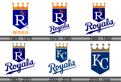
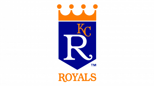
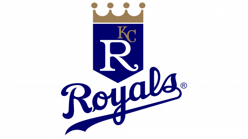
The inaugural emblem of the Kansas City Royals holds its roots in the creative minds at Hallmark Cards Company, a prestigious establishment rooted in Kansas City since 1910. An assortment of 15 skilled artists put forth their individualistic interpretations of the emblem, destined to grace uniforms, promotional materials, and jackets alike. Amongst the diverse array of designs, the rendition crafted by Shannon Manning, an ardent supporter of the Chicago White Sox, emerged triumphant. Manning’s design was a nod to the prevalent aesthetics of the 1960s, encapsulating simplicity and clarity. The emblem showcased a royal blue shield crowned by a sleek golden crown. Within this shield resided a prominent, stark white “R” accompanied by the initials “KC” rendered in a gleaming gold hue. Beneath this primary emblem, the full name “Royals” was inscribed. The contemporary and minimalist essence of Manning’s creation laid down a solid foundation, subsequently influencing the evolution of the franchise’s emblems in the years to follow. To add to the narrative, it is crucial to underscore the integral role that this logo played in encapsulating and conveying the ethos and identity of the Kansas City Royals, serving as a symbolic representation of their rich history, aspirations, and commitment to excellence in the realm of baseball.
1979 – 1985
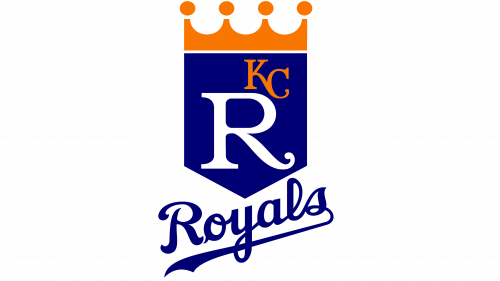
In the year 1979, a subtle yet significant transformation was bestowed upon the logo of the Kansas City Royals. The text “Royals,” which previously reclined at the logo’s base, was given a touch of elegance and fluidity, with its script metamorphosing into a more stylized and curvaceous form, gracefully underscored by a delicate line. In addition to this, the text underwent a diminution in size, adopting a more petite and refined stature. Coinciding with these alterations, a notable shift in the color palette was also observed. The original golden hue that once adorned the word was replaced by a rich and deep shade of blue, adding a new dimension of regality and depth to the overall aesthetic of the emblem. This nuanced revamping of the logo was not merely a cosmetic change, but rather a reflection of the team’s evolution and growth over time, mirroring their ongoing journey in the dynamic world of baseball and their continuous pursuit of excellence, both on and off the field.
1986 – 1992
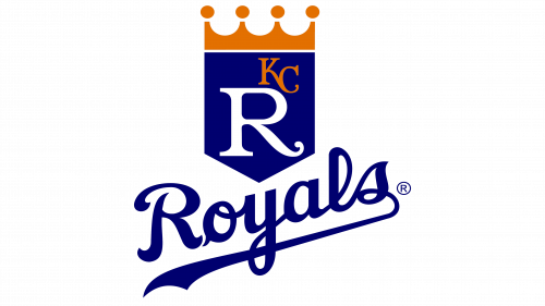
In the 1986 redesign, a notable transformation occurred in the relative proportions of the emblem’s elements, significantly enhancing its visual appeal. The word “Royals,” which forms a crucial component of the logo, was enlarged, thereby amplifying its prominence and visibility. This enlargement stood in stark contrast to the shield element, which underwent a reduction in size, ultimately resulting in a more compact and streamlined appearance. This judicious play on proportions and sizes bestowed the Kansas City Royals emblem with a heightened degree of expressiveness and memorability, ensuring that it would leave a lasting impression in the minds of both fans and onlookers alike. The revised emblem was not merely a superficial change but symbolized the team’s ongoing evolution, reflecting their aspirations for grandeur and their steadfast commitment to carving out a distinct and enduring identity within the highly competitive realm of Major League Baseball. These refinements, though seemingly minor, played an instrumental role in fortifying the emblem’s aesthetic appeal, ensuring its resonance with the team’s vibrant spirit and rich history.
1993 – 2001
In another subtle yet impactful modification, the Kansas City Royals opted to revitalize their emblem by enhancing the color palette. The previous iteration of the logo featured a bright yellow hue, which, while vibrant, lacked a certain richness and depth. In a move aimed at adding a touch of opulence and regality, the designers decided to transition from the bright yellow to a more refined and lustrous golden tone. This change, albeit minor, significantly elevated the emblem’s aesthetic, infusing it with a sense of grandeur and luxury befitting the team’s royal moniker. The shift to gold not only enriched the visual appeal of the logo but also served as a symbolic nod to the team’s ongoing pursuit of excellence and their commitment to holding themselves to the highest standard in the competitive world of Major League Baseball. This emblematic representation of the Royals’ ethos and aspirations is a testament to the power of thoughtful design in conveying a team’s identity and values.
2002 – 2018
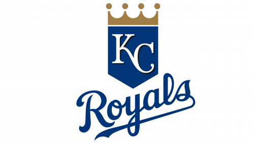
The year 2002 marked a pivotal moment in the visual evolution of the Kansas City Royals emblem. A significant design shift occurred, with the previously prominent capital “R” that adorned the shield being omitted from the tableau. In its place, the white-scripted initials “KC” were elevated to the status of the central visual element, capturing the onlooker’s attention with their crisp and elegant font. Interestingly, amidst these changes, the “Royals” wordmark, which gracefully sits at the logo’s base, retained its original form, providing a sense of continuity and historical linkage to the team’s rich past. This carefully considered amalgamation of the old and the new resulted in a modern yet timeless emblem, reflecting the Royals’ progressive ethos while paying homage to their storied history and deep roots in the heart of Kansas City. This emblem serves not just as a symbol of the team’s identity, but as a testament to their journey, values, and aspirations within the competitive landscape of Major League Baseball.
2019 – Today
The current iteration of the logo harkens back to the inception of the team in 1969, embodying the rich legacy of the Kansas City Royals. The most prominent change from the original is the substitution of the “R” with “KS.” Beyond this, a few subtle refinements have been made, yet the foundational design remains steadfast. Today, the emblem resembles a noble knight’s shield or flag, proudly bearing the franchise’s abbreviation “KC” in stark white against a regal blue backdrop. Crowning this emblematic shield is the principal monarchical symbol – a golden crown, subtly alluding to the team’s noble roots and royal namesake.
The emblem’s geometry is meticulously crafted, consisting of five straight sides that converge to form a sharp, angular point at the bottom. This precise structure provides a solid and imposing frame for the design. The golden crown, positioned just above the shield, features four peaks with gracefully curved tips, subtly echoing the shape of a baseball and seamlessly integrating the sport’s essence into the logo’s symbolism. This confluence of history, symbolism, and meticulous design captures the essence of the Kansas City Royals, reflecting their rich heritage, their connection to the community, and their relentless pursuit of excellence on the baseball field.
