KeyBank Logo
KeyBank is a major American bank with roots in the commercial sector. Society for Savings, its predecessor, was formed by a group of community leaders in Cleveland. They established it to assist local businesses and citizens financially. The bank focuses on retail, small business, and corporate banking services. It aims to provide financial solutions that help communities thrive.
Meaning and History
KeyBank was officially established in 1825 as the Society for Savings in Cleveland, Ohio. Throughout the years, it has undergone numerous mergers and acquisitions, significantly shaping its footprint in the American banking landscape. One notable date is 1994 when it merged with KeyCorp, adopting the name KeyBank and expanding its services nationally. This growth continued with the acquisition of First Niagara Bank in 2016, further extending KeyBank’s market presence.
What is KeyBank?
KeyBank is a financial institution offering a range of banking services. These include accounts, loans, and investment products primarily in the Northeastern United States. It caters to personal, small business, and commercial banking needs, striving to support economic growth and financial stability in its communities.
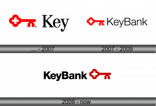
Before 2007
The logo displays a bold red key on the left, signifying access and security. Next to it, “Key” in black, robust, serif letters suggests tradition and reliability. A period follows, hinting at finality and completeness. The design embodies trust and established strength in the banking industry.
2007 – 2009
In this evolved logo, the key remains prominent in red, a beacon of accessibility. However, “Bank” now joins “Key”, forming “KeyBank”, unified in strong black serifs. This signifies a seamless, integrated financial service provider, where key unlocks banking solutions. The period is absent, indicating an ongoing commitment rather than an end. The entire image speaks of unity and an expanded, holistic approach to finance.
2009 – Today
The logo now positions the red key symbol to the right, forming a visual balance. “KeyBank” is presented in solid black, with strong, clean lines that convey modernity and efficiency. This repositioning of the key suggests forward-thinking, an evolution from tradition to innovation. The logo’s simplicity and contrast imply a clear, straightforward approach to banking.


