Kmart Logo
Kmart stands as a retail giant, offering a wide range of products at affordable prices. S.S. Kresge founded the chain, bringing it to life in the United States. The creation aimed to serve communities by providing easy access to a variety of goods under one roof. Kmart carved its niche by combining convenience with value, making shopping easier for millions.
Meaning and history
Kmart’s journey began on March 1, 1962. This date marked the opening of the first store, introducing a new era in retail. The brand quickly expanded, opening numerous stores across the country. By the 1970s, Kmart had become a household name, known for its Blue Light Specials and diverse product range. In the 1990s, it faced fierce competition but remained a key player in the retail market. The brand’s resilience is evident in its adaptation and continued presence in the industry.
What is Kmart?
Kmart is a retail chain offering a variety of products at competitive prices. From clothing to home goods, it aims to be a one-stop shop for families. Kmart emphasizes value and convenience, catering to budget-conscious shoppers across the United States.
1962 – 1964
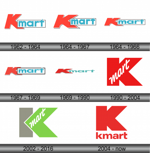
The logo displays boldness with its striking red “K”, commanding attention. A tranquil blue box encases “mart”, suggesting reliability. The typeface is modern, crisp, inviting shoppers with its clean simplicity. This logo, a blend of vibrant colors and geometric shapes, conveys a message of affordability, simplicity, and trust. The sharp angles of the “K” contrast with the rounded forms of “mart”, creating a visual balance. This emblem encapsulates the brand’s essence: economical, approachable, and straightforward.
1964 – 1967
The updated logo retains the iconic red “K,” now infused with a dynamic white border. The “mart” segment, still in a serene blue, now resides within a cleanly delineated rectangle. A white trim outlines this rectangle, adding depth and prominence. This refreshed emblem enhances visual contrast, ensuring the name stands out more emphatically. The entire logo pops with a three-dimensional effect, elevating the brand’s presence. The redesign subtly shifts from a flat presentation to one that suggests movement and forward-thinking, reflecting an evolving and modern Kmart.
1964 – 1966
The logo evolution continues with subtle yet impactful changes. The “K” now sports a sleeker, more stylized edge. The white border around the red “K” has vanished, bringing forth a bolder, cleaner look. The blue rectangle encapsulating “mart” remains, now edged with a thinner white line for a sharper outline. This design iteration emphasizes a more contemporary feel, stripping away additional elements for a streamlined aesthetic. The typeface of “mart” maintains its clean, approachable style, ensuring the brand’s friendly appeal. This rendition of the Kmart logo showcases a blend of classic and modern, retaining familiarity while refreshing its image.
1967 – 1969
In this iteration of the logo, the white border framing the red “K” and blue “mart” makes a confident return. It revives the distinct outline that was previously removed, reinstating a bold, eye-catching contrast. The “K” itself retains its stylized cut, a nod to modern design, while the blue “mart” continues to sit prominently within its white-outlined box. The interplay of red, white, and blue remains a testament to the brand’s patriotic palette. This logo refresh subtly balances nostalgia with freshness, signaling Kmart’s enduring appeal and commitment to staying current in the public eye.
1969 – 1990
The logo takes a minimalistic turn, shedding the border for a sleek, modern silhouette. The red “K” now stands alone, its angular cut more pronounced without the border. “Mart” follows in a clean, lighter teal. The typeface of “mart” is softer, smoother, suggesting a friendly, approachable brand. This design speaks to simplicity and accessibility, core values of Kmart. It’s a visual step toward a more contemporary brand identity, emphasizing ease and clarity in its aesthetic.
1990 – 2004
This logo marks a dramatic shift, with “mart” now nestled within the “K”. The all-red backdrop is powerful, simple. “Mart” is rendered in cursive, a stark contrast to the previous sans-serif, suggesting a more personal, human touch. This design choice marries strength with warmth, modernity with approachability. The “K” looms large, a symbol of the store’s substantial presence in the retail landscape. This emblem encapsulates a blend of tradition and evolution, a reflection of Kmart’s desire to stay relevant while honoring its heritage.
2002 – 2016
A fresh, lively green replaces the classic red, signifying growth and renewal. The “K” shifts to a subtle grey, forming a stable foundation. “Mart”, now in a spirited white cursive, maintains its cozy, informal charm against the vibrant green. This logo steps away from the traditional, embracing a more eco-friendly and energized direction. The green hue injects a sense of innovation, implying a forward-thinking Kmart ready to adapt and flourish. The logo’s new colors and design reflect a company at the cusp of change, eager to connect with the evolving tastes and values of its customers.
2004 – Today
A return to the iconic red captures a resurgence of Kmart’s classic branding. The “K” dominates in a large, solid form, exuding confidence and stability. “Kmart” is unified in lowercase, fostering a sense of accessibility and friendliness. This design strips away complexity, presenting a bold statement of simplicity and familiarity. It’s a visual nod to the brand’s legacy, a blend of the contemporary and the timeless. This refreshed logo signifies a homage to the past, with an eye firmly on the future.


