Walgreens Logo
The pharmacy chain simply known as Walgreens conducts business in the pharmaceutical retail and wholesale trade domestically and globally. Walgreens cares about its customers, making their lives more convenient, and it seems to pay off. According to analytical reviews, the turnover of companies is about a third of the total volume of prescriptions dispensed in the country. The world’s largest pharmacy company was greatly expanded in 2014 through the takeover of the Alliance Boots.
Meaning and History
Walgreens Boots Alliance is the first global pharmacy venture to retail and wholesale medicines, health care and beauty and health products with over 100 years of history. This well-recognized brand was founded in 1901. The second Walgreens pharmacy was opened in several years and the process of a whole chain of pharmacies was launched. Since then, its activities have spread from Chicago throughout the United States. Now, the company operates in about 50 countries around the world.
What is Walgreens?
This is a huge pharmacy chain. Walgreens Boots Alliance owns thousands of pharmacies, beauty, perfume and hygiene stores in more than ten countries.
1901 – 1921
The company did not initially have a long, but it did not prevent it from becoming what it is now.
1921 – 1929
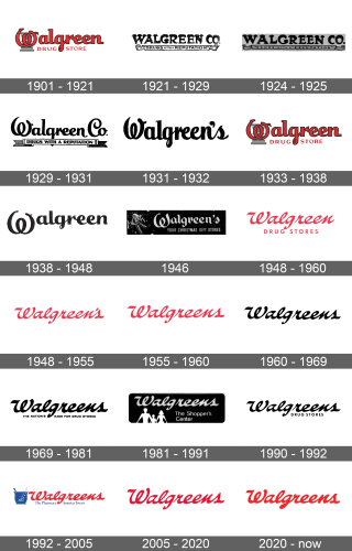
The first logo featured the name of the drugstore along with its slogan. The emblem was done in black and white. “Walgreen Co.” was written using a bold font that made an accent on rounded forms and pointy ends with exaggerated thickness in some places. The white banner with a black outline and interesting ends proclaimed “Drugs with a reputation” with the first and last words being larger. All the letters were uppercase.
1924 – 1925, 1928
The letters that spelled out the name got a little smaller and were written further apart. They also did not look as thick, but otherwise, they looked very similar to the original ones. The banner also got thinner, including its outlines, and had a grey shade to it. There was less accent on the first and last words as they got smaller and were not as bold. Overall, the logo looked more delicate.
1929 – 1931
A new typeface along with a different shape of the banner were introduced. Only the first letters were capitalized. The “W” looked like one twisted swirl, and all the other letters were interconnected. They looked like they were written using a feather. The banner had a rectangular shape with ends that resembled a ribbon. The slogan was done in bold uppercase letters of the same size on a white background.
1931 – 1932
The banner, which has been part of the logo for ten years, has been removed. The name was also changed to “Walgreen’s”. The changes had minimal effect on the font. The letters were only stretched out vertically just a little.
1933 – 1938
The more rounded typeface seen in 1929 was brought back. The letters did not only become red but also looked thicker and had a black outline. To the right and left of the letter “G”, right under the name, it said
“Drug Store” in small uppercase letters, which were also red. Behind the “W” a medicine symbol in the form of a cup with a snake was added in a light grey color. There was no more letter “s” in the end”
1938 – 1948
The logo was black again and the additions introduced in 1933 were removed. Now, it simply stated “Walgreen”. An interesting detail about this logo was that “W” was much lower than the other letters and aligned at the top instead of the bottom.
1946 (Christmas)
A fun emblem was seen during the Christmas season in 1946. It was the name of the drug store with an “s” at the end on a black background. Under the name, a phrase suggested that this is a place where people can also buy Christmas presents. To the left, the emblem was decorated with two bells, a bow, and stars.
1948 – 1960
Although the font closely resembled the previous, it was changed to a similar cursive font. The word “Walgreen” was written in one line, while “Drug Stores” was added right under in all uppercase letters. The whole logo was bright red.
1948 – 1955
A version without the “Drug Stores” part was also seen during this period. It also had an “s” in the end, which was added and removed periodically throughout the brand’s history.
1955 – 1960
The logo that had only the brand’s name was changed once more. It was the first time that the brand added the “s” without the apostrophe.
1960 – 1969
The “Walgreens” version of the brand’s name was continued to be used by the company. There was one small adjustment, though, and the emblem was done in black.
1969 – 1981
In 1969, the company added a new slogan under the familiar brand’s name. It said “THE NATION’S NAME FOR DRUG STORES” in simple black uppercase letters.
1981 – 1991
A logo acquired a black background in the form of a rectangle. At the top, it had the name of the company done in white. It was the same as the one seen previously. In the bottom left corner, it had a solid white figure of a family with a child. To the right, the emblem declared “The Shopper’s Center”, which was written in two lines.
1990 – 1992
The company returned to the version seen in the 1960s. Instead of a slogan, it simply said “Drug Stores” in capital letters. The logo was done in black.
1992 – 2005
The logo was updated again and had a red color. Underneath, it declared “The Pharmacy America Trusts”. To the left, there was a cup done in the same blue color as the slogan. It had white stars on the cup which changed color to red as they flew out of the cup. The end of a whisk was seen sticking out of it.
2005 – 2020
All the details were removed along with the slogan. All that was left was the name of the brand done in red color. The font has not been changed.
2020 – Today
In 2020, the logo was updated just a bit. The changes went only as far as the change to a color that became a deeper shade of red.

