KTM Logo
KTM has long been known as a leading manufacturer of on-road and off-road motorcycles, which are popular not only in Europe but in the US and Asia. By the end of the fifties, KTM bikes were known throughout Germany as inexpensive, but very high-quality vehicles. Motorcycles of this brand participate in the world motorsport championships and occupy a leading position there.
Meaning and History
It all started with a small metalworking firm called Kraftfahrzeuge Trunkenpolz Mattighofen (KTM), founded in 1934 in Mattighoven by engineer Hans Trunkenpolz. Even before World War 2, he was selling DKW motorcycles and even became an Opel dealer. By 1953, he launched the production of his first motorcycle called the KTM R 100. Ernst Kronreif bought a controlling stake in KTM in 1955. Now the company was called Kronreif & Trunkenpolz Mattighofen, but the abbreviation remained the same. After the death of both owners, Hans’ son, Erich, took the reins and changed the name to Kraftfahrzeug Trunkenpolz Mattighofen. There was a period of hardships for the company, but by the early 2000s, it was back at the top.
What is KTM?
The Austrian company KTM is one of the largest and most famous manufacturers of sports motorcycles in Europe. Around the world, KTM is known as the strongest competitor on any race track. KTM AG is owned by KTM Industries AG and Bajaj Auto.
1953 – 1954
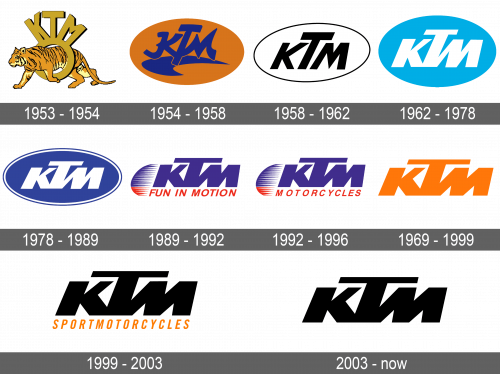
The company used a realistic image of a powerful and fast animal in its first emblem. The tiger is confidently walking through a ring, which is golden in color and has some volume thanks to a thin black shadow. The latter holds the company’s initials at the top, which are done in the same style as the ring.
1954 – 1958
The designers kept bold initials and the orange color, but otherwise completely redesigned the brand’s image. They used brush strokes for the letters and added a curved shape underneath, which made it seem as if the initials were floating. A bright orange background in the form of an oval looked nice in combination with deep blue. It served as a base for all future logos.
1958 – 1962
This version is very sleek and professional looking thanks to a minimalistic appearance and black and white color palette. White was used for the base while the initials featured black. A thin outline around the emblem, which now looked slimmer, added a finishing touch. The company used a simpler font and kept the “T” taller than the other letters to add some uniqueness to its brand image.
1962 – 1978
An updated version was introduced in 1962. A sky blue color added freshness to the emblem. There were also changes to the initials. The font looked bolder and all the letters were now interconnected. The oval shape now looked rounder, similar to the one drawn back in 1954.
1978 – 1989
A deeper shade of blue added more professionalism to the brand image and made the white letters pop. The oval shape was slim once again. The letters did not look as tall anymore, which made the whole emblem look more put together. In addition, there was a double border.
1989 – 1992
The oval background got removed and replaced by a small oval shape on the right that was partially covered by the initials. It had blue horizontal stripes at the top and red at the bottom, matching the blue initials and a smaller red tagline underneath. The tagline said “Fun in motion”, reflecting the adventurous spirit of the brand.
1992 – 1996
Only a small change was done this time. A new tagline now simply states ” Motorcycles”, strengthening the connection between the brand name and its product.
1996 – 1999
It was not long before the logo was redesigned again. The company brought back the orange color seen in the original version. However, this time it was used for the initials, which is the only element that was left from the previous one. The lettering was kept the same.
1999 – 2003
The company decided to make its logo look even bolder and more powerful. The orange color was now used for a tagline, which stated “SPORTMOTORCYCLES” using a sans-serif, italicized font. Just like the taglines in other versions, the line was the same length as the initials. The latter appeared grand thanks to a black color and thick lines.
2003 – Today
This new version has a more luxurious and timeless appearance. The company simply removed a tagline used earlier. It looks almost the same as the logo used during the 1996 – 1999 period. The only difference is the use of black. Thanks to the fact that the initials were written in almost the same style since 1962, the logo looked very recognizable.
Font and Color
The KTM motorcycles are often distinguished by their black-orange color scheme, which is also seen in the first logo as well as in the early 2000s. The blue color, which is seen in several logo versions, is considered to be a masculine color and is associated with trustworthiness and loyalty. In the latest versions, the company went for a luxurious, classic color choice – black. When it comes to the font, it always went for a relatively basic, sans-serif, italicized font. The only exception was the logo introduced in 1954, which featured interesting strokes, inspired by Japanese or other Asian writings.

