Renault Logo
Renault is the largest state-owned company in France that specializes in the production of cars. The company offers many inexpensive models and options for the middle segment. The active growth of the French company has significantly influenced the demand for its automobiles. Its production lines also include engines for various manufacturers, including some Mercedes-Benz models.
Meaning and History
It was born in 1898 when the young engineer Louis Renault designed his first car called Voiturette with the first-ever gearbox. Together with the brothers Marcel and Fernand, they launched a business in 1899. Initially, the name “Renault-Frères” was used, but it became known as “Régie Nationale des Usines Renault” in 1945. The company entered the international market during the 1950s and 1960s. An attempt to produce Renault models in the US in the 1980s ended in failure for the company, so you will not see it there. In 1999, Renault bought 99% of the shares of the Dacia, as well as 36.8% of Nissan in exchange for 15% of its shares.
What is Renault?
Renault is a large French automobile corporation that sells its cars in more than 200 countries around the world. Renault has its main offices in the city of Boulogne-Billancourt, which is not far from Paris.
1899 – 1906
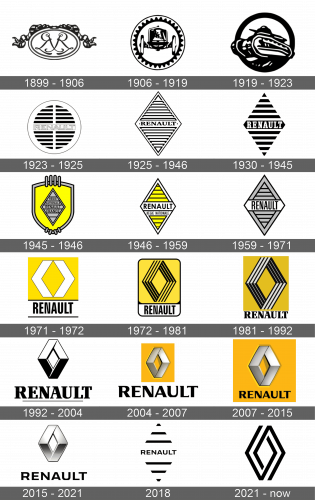
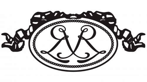
A very intricate design of the first logo had an oval shape with a ribbon at the top and a simple, yet beautiful double border. The center had a symmetrical pattern with lines and curves of various thicknesses, which formed the first letters of the names of the brothers who founded the brand and their last name.
1906 – 1919
A round emblem with a border that resembled a gear followed by a plain border served as the base. In the center, it had an abstract drawing of a car with a sufficient amount of details.
1919 – 1923
The war has influenced the logo look as it now had a tank as the center image. It was done in the same style as the car before. The frame was changed for a thick simple outline. It looked as if the tank was breaking through because it partially went beyond the frame.
1923 – 1925
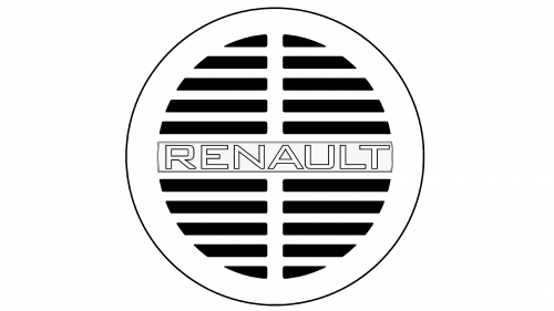
The brand maintained a circular design of its emblem. It had a thick white border followed by a very thin black one. The center had four sections with alternating black and white lines. The word “Renault” was done in white, uppercase letters with a thin black outline. It was placed on a slightly off-white banner in the middle of the emblem.
1925 – 1930
A diamond shape was first introduced in 1925. It had a 3D look due to horizontal cutouts that were going from the top and all the way to the bottom. Similar to what the brand already had, there was a name across the center. It was in all uppercase letters with serifs and various thicknesses of the lines. Two small dots, which resembled screws, were placed on either side.
1930 – 1945
The thin black frame around the figure was removed and cutouts were replaced by alternating black and white lines. The middle line was thicker and had “Renault” written across. The font was similar to the previous one, except it was now white, thicker, and slightly stretched out vertically.
1945 – 1946
This time, the designers introduced some color. It was yellow, which was used for a shield that had a black border with a gray center. The shield also had framed lines at the top and the bottom, the latter being about twice as short. In the middle, it featured a gray diamond emblem with “Regie Nationale Renault France” printed each on a different line using a simple black typeface without serifs.
1946 – 1958
The yellow was preserved, but now it was used to color the center of a diamond. The figure had horizontal black lines and two black lines serving as a border. It had “Renault” in large, black letters across the center of it on a white banner. Right below, the emblem said “Regie Nationale”.
1959 – 1967
The brand left only the “Renault” inscription, which had the letters written closer together and stretched out vertically. The diamond itself was gray with a total of six horizontal black lines and a double border.
1971 – 1973
The brand preserved its color palette and the diamond figure. A yellow diamond was placed on a white hexagon and the latter had a yellow rectangle as a base. Under the emblem, the logo had “Renault” done using the same font and color as in the previous version. It was framed by a black line at the top and the bottom.
1972 – 1982
The company had to come up with a new design as the previous one resembled a logo that was used by another brand. The new one placed the whole logo into a vertical rectangle with rounded corners. At the bottom, it had “Renault” in black on white. The brand continued to use the slightly modified font it introduced back in 1946. The upper portion was yellow with a diamond that had a thick border that featured black and yellow lines of various thicknesses.
1981 – 1990
The black border around the emblem was removed and the yellow got a shade darker. The letters got thicker in some places and thinner in others, while the addition of serifs gave it a more classic feel. The rhombus has not changed its shape but now featured white instead of yellow.
1992 – 2004
The yellow background as well as the lines on the diamond were removed. The rhombus now had a white top and black bottom with a thin black outline. There were highlights and shadows in the center, which reinforced a 3D appearance. The wordmark was now larger compared to the figure, while a thin black line underneath completed the professional look of the updated image.
2004 – 2008
The yellow background was brought back. The 3D feel was enhanced thanks to the metallic golden color of the emblem, shadows, as well as an appearance as if the emblem is embedded in the yellow plate. The “Renault” was done in an even larger font, which was slightly modified again to have a different type of serifs.
2007 – 2015
The only difference between this emblem and the one introduced in 2004 is that the name was placed on a yellow background and had a smaller font.
2015 – 2021
There was no more yellow plate again. The rhombus had a metallic silver color and a 3D appearance. The wordmark looked very similar to what the brand already had, except the serif type was changed again and letters were placed further apart.
2018
The redesign of 2018 has brought a modern minimalistic touch to the Renault visual identity. The new concept of the logo design was based on flat lines and a monochrome palette. The badge was composed of the uppercase Renault logotype in a straight and distinct sans-serif typeface, written along the central line of the rhombus, and accompanied by three lines from above, and three from the bottom. The lines featured different lengths, to keep the iconic rhomboid shape of the Renault logo.
2021 – Today
The designers modified a logo introduced back in 1973. The diamond had two black lines that were interconnected in an interesting way. Underneath, it featured the same wordmark but without any serifs. The logo was black and white again.
Font and Color
Renault has used three primary colors for its logos. There were times when it stuck with black and white logos, as well as times when it added some yellow to the emblem. The custom font used to write the name underwent only slight modifications throughout its long history. Most of them were addition or changing of the serif type as well as the size of the letters.
