Lloyds Bank Logo
Lloyds Bank, a cornerstone of British finance, emerged when John Taylor and Sampson Lloyd II founded a private banking business in Birmingham. Originally intended to serve the burgeoning local industry, it has grown into a vast network, providing a wide range of banking and financial services. From its humble beginnings in a thriving industrial town, Lloyds has evolved into an institution synonymous with trust and reliability in the UK’s financial landscape, adapting over centuries to meet the changing needs of its customers.
Meaning and history
Founded in 1765 in Birmingham by John Taylor and Sampson Lloyd II, Lloyds Bank began as a private entity. It quickly established itself as a trusted local bank. By the 19th century, it expanded, absorbing smaller banks. The 20th century saw Lloyds becoming a national force. Innovations like the first ATM in the UK in 1972 marked its progress. The 21st century has seen Lloyds embracing digital banking, constantly evolving. Despite challenges, including the 2008 financial crisis, Lloyds has remained resilient. It’s a banking giant, offering diverse services, yet staying true to its roots of serving community needs.
What is Lloyds Bank?
Lloyds Bank, a beacon of British banking, sprouted from the entrepreneurial spirit of a button maker and an iron producer in 18th-century Birmingham. Today, it navigates the vast seas of finance, anchoring its legacy in innovation and resilience, serving millions with a blend of traditional values and digital foresight.
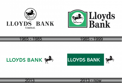
1965 – 1985
The emblem of Lloyds Bank is a study in classic symbolism and stark monochrome contrast. Centered is a black stallion, mid-gallop on a ground line, encapsulated within a circular border, exuding strength and forward momentum. The words “Limited” anchor the design, underscoring the institution’s stability and corporate identity.
1985 – 1999
The logo transforms, introducing a vibrant green backdrop, symbolizing growth and vitality. The iconic black horse now resides within a green oval, bounded by a subtle outline, echoing continuity yet freshness. “Lloyds Bank”, in a clean, sans-serif font, stands beside, its letters unpretentious yet assertive. This iteration marries tradition with modernity, reflecting an institution that respects its heritage while striding into the future. The design’s simplicity and the green hue speak to accessibility and a connection with the evolving world of finance.
2013
In this evolution, the logo embraces minimalism. The green hue deepens, reflecting maturity and prosperity. The horse, now freed from its oval frame, gallops assertively above the bank’s name, symbolizing unbridled progress and dynamism. The typeface of “LLOYDS BANK” is bold and uncluttered, promoting clarity and a modern aesthetic. This design speaks to a bank that is moving confidently into the future, casting off the old while maintaining its core identity and strength. The overall simplicity suggests efficiency and a focus on the essentials in the digital age.
2013 – Today
The logo’s latest rendition sees the horse break free, charging ahead to the right of “LLOYDS BANK”, which is now emblazoned on a solid green rectangular backdrop. The design’s spatial dynamics hint at momentum and a forward-thinking approach. The text and the horse are balanced, reflecting harmony and symbiosis between tradition and progress. The rectangle’s sharp edges suggest precision and structure, while the horse’s silhouette against the stark white space conveys freedom and agility. This logo embodies a legacy that gallops confidently into the future, anchored by a timeless symbol.


