L’Oréal Logo
L’Oréal is an international group of brands with the main office in Paris. The core direction of the company is related to cosmetics industry. Over 500 companies under L’Oréal’s management manufacture natural and clean bodycare products, haircare goods, cosmetics tools, makeup instruments, perfumery, et cetera. This is one of the largest and oldest companies in the beauty industry – it was established in 1909, and since then it has hired more than 85,000 employees.
Meaning and history
Initially, Aureal was a hair coloring product made by a French scientist named Eugène Paul Louis Schueller. In the beginning of the 20th century, he had presented the dye as a solution for the haircut specialists in Paris. Later, this product grew into a company set up in 1909 and named Safe Hair Dye Company of France. It was later renamed after the Schueller’s product, but with some stylistic changes – L’Oréal. The original basics, suitable to the company even now, read about constant research and innovations in the fields of cosmetics.
What is L’Oréal?
L’Oréal is a French international, focused on beauty industry. Established in 1909, L’Oréal is occupied providing innovations in the cosmetics. They produce high quality make up tools, as well as skin-, hair-, and bodycare products. Now, they control around 35 global companies and 500 plus potents and have their points of presence across the whole world.
1909 – 1910
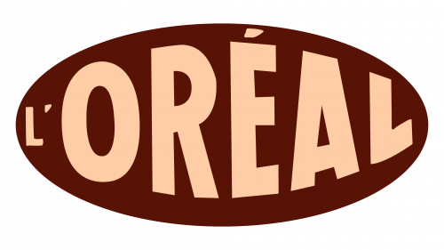
The very first logotype featured a brown oval. Most of its space was occupied by the beige word ‘L’Oréal’, written in all capitals. The initial ‘l’ symbol was tiny, while the following letters increased in size closer to the center.
1910 – 1911
Since 1910, the brand has been using a sole wordmark as the core element of its visual identity. The first version of their nameplate had a semibold typeface with all capitals. The characters had sharp serifs and narrow space in between.
1911 – 1914
A year after the introduction of this logotype, L’Oréal appeared with another wordmark. It had bolder characters, occupying more space than before. The ‘r’ symbol had also changed its diagonal bar. Being a thin straight line in the 1910 version, it became a bold bar in the next iteration.
1914 – 1962
With the 1914 inscription, the company has finally decided on a logo that would stand for the following 48 years. It was a very bold name caption with tiny intervals among the letters. The ‘o’ symbol was enlarged and highlighted among the other letters.
1962 – today
The 1962 wordmark is strongly similar to the version from the beginning of the age. The inscription has a thin capitalized font without serifs.
Font
The ongoing watermark has many similarities with the inscription used in 1914. This is a sans-serif inscription executed in all capitals. The ‘o’ character is enlarged, as before, while the remaining letters have their lines elongated and narrowed. Due to these modifications, the inscription started to look more elegant and professionalism.
Color
Traditionally, the color code of the logotype goes black for inscription and white for its background. The reversed palette is also used to feature the logotype. This classic colorship reflects the company’s professionalism and the quality of its products as the core value.
