Milwaukee Brewers Logo
The Milwaukee Brewers are a professional baseball team based in Milwaukee, Wisconsin. As members of Major League Baseball’s (MLB) National League Central division, they have fostered a rich heritage since their inception in 1969. The team calls the American Family Field home, a stadium known for its retractable roof. Over the years, the Brewers have showcased remarkable talents and have engaged in memorable playoff runs. With a passionate fan base, the team is symbolized by its iconic glove logo and navy blue and gold color scheme, representing Milwaukee’s deep-rooted baseball tradition.
Meaning and history
The Milwaukee Brewers’ journey began in 1969 when the team was originally established as the Seattle Pilots in the American League. However, after just one season, financial challenges forced the Pilots into bankruptcy. In 1970, businessman Bud Selig acquired the struggling franchise and relocated it to Milwaukee, renaming it the “Brewers” in homage to the city’s rich brewing history.
Under Selig’s ownership, the Brewers gradually transformed into contenders, most notably reaching the World Series in 1982. Despite this success, the team experienced fluctuating performance throughout the ’80s and ’90s.
In 2005, the Selig family sold the Brewers to a group led by Mark Attanasio, a Los Angeles-based investor. Attanasio ushered in a new era for the Brewers, with increased investment in both player personnel and infrastructure, notably the completion of the American Family Field. Under his stewardship, the Brewers have seen a resurgence, reaching the postseason multiple times.
Throughout their history, the Brewers’ ownership changes have paralleled the team’s on-field fortunes. From their uncertain beginnings in Seattle to their establishment as a staple in Milwaukee’s sports landscape, the team’s narrative has been one of resilience and transformation, driven by dedicated ownership.
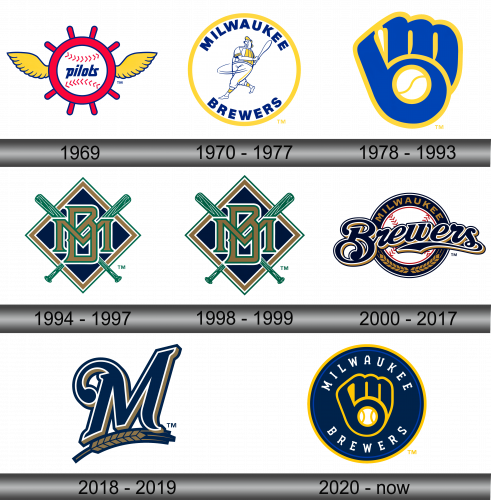
1969
During its inaugural year, the team hailed from Seattle, going by the name “Seattle Pilots.” Their symbolic representation featured a crimson maritime helm, nestled within a pristine white baseball, bearing the word “pilots.” Flanking the helm on both sides were golden wings, adding a touch of elegance. This design not only conveyed the maritime essence of Seattle but also hinted at the speed and agility desired in baseball. The fusion of these elements into the emblem showcased the club’s unique identity, bridging the world of sports with nautical themes, reflecting the team’s roots and ambitions.
1970 – 1977
Just a year on, the squad relocated to Milwaukee, undergoing a rebranding to become the Milwaukee Brewers. Encased within a sun-hued circle is the depiction of the Beer Barrel Man – a unique character with a beer barrel as his torso, donned in a golden cap, poised to take a swing with his bat. Hovering above this imagery is the word “Milwaukee”, while “Brewers” anchors it from below. The team’s moniker is elegantly rendered in a deep navy shade, highlighting the rich heritage and vibrant spirit of the club. This new emblem epitomizes the team’s connection to the brewing legacy of the city while retaining its athletic essence.
1978 – 1993
In 1978, amidst a pool of over 2,000 submissions from both seasoned and novice designers, a particular emblem stood out during a contest held in November 1977. This distinct design was the brainchild of Tom Meindl, an art history scholar from the University of Wisconsin-Eau Claire, who was awarded a handsome sum of $2,000 for his ingenious creation. The symbol artfully merges the letters “b” and “m”, representing the team’s initials, to craft the shape of a baseball mitt. Cradled within this glove is a pristine white baseball, symbolizing the heart and spirit of the game. This inventive integration captured the essence of the team and its connection to the sport.
1994 – 1997
On January 15, 1998, the Brewers unveiled a fresh emblem, marking a departure from their previous colors and design. This innovative rebranding journey commenced in 1992, when the Milwaukee Brewers reached out to the Major League Baseball Design Service. Their aspiration? To craft an avant-garde image that would resonate with the impending 21st century. This revamped vision was first showcased to the public during an event in 1994. Encased within a black diamond framed by brown and white contours are the intertwined letters “M” and “B.” Beneath this confluence of letters, a pair of verdant baseball bats crisscross, signifying the team’s deep-rooted connection to the sport.
1998 – 1999
The emblem introduced in 1998 bore striking resemblances to its predecessor. The intertwined letters “M” and “B” continued to stand as a testament to the team’s full moniker. While the foundational palette of brown, black, and green was retained, white was consistently utilized as an outlining hue, binding the design together. This iteration subtly refreshed the brand’s identity, preserving its legacy but also offering a nod to modern aesthetics, ensuring the team’s visual representation resonated with both longstanding fans and newer audiences. The continuity in design highlighted the Brewers’ commitment to their roots, even as they ventured into new chapters of their history.
2000 – 2017
In the dawn of the new millennium, 2000, the Brewers embarked on a total revamp of their emblematic representation. Encasing the design was a jet-black circle adorned with the gilded word “Milwaukee”. Within this circular boundary lay an immaculate white baseball, evoking the sport’s timeless charm. Subtly incorporated barley sprigs on the ring weren’t mere decorative elements; they stood as a testament to the team’s deep-seated history and Milwaukee’s rich brewing heritage. Proudly placed atop the entire design, the word “Brewers” reaffirmed the team’s identity, bridging past legacies with future aspirations.
2018 – 2019
The present iteration stands distinctly apart from its four predecessors. At its core lies an intricately designed letter “M”, a blend of timeless tradition and contemporary flair. This emblematic “M” not only signifies the team’s moniker but also nods to the seminal role of the brewing industry in shaping its legacy. Complementing this is a design element resembling a spike, echoing the foundational roots of the Milwaukee Brewers.
Set against a serene backdrop, a prominent deep blue “M” emerges. Its presentation suggests a hand-crafted touch. Triple-layered contours in shades of pristine white, subdued gold, and a complementary blue frame the letter. The typography remains straightforward and unembellished. Dominating the space beneath the “M” is the elongated gold and blue spike, cementing the emblem’s character.
2020 – Today
The idea to reimagine the team’s emblem had been brewing in the minds of the club’s leaders since 2015. It was only in 2020 that this vision was brought to life. The new emblem was inspired by the iconic 1978 logo, one that had captured the hearts of many and became a defining image for the team. This design ingeniously incorporated two distinct letters, so seamlessly woven into the fabric of baseball that it resonated deeply with fans.
The emblem portrays a unique baseball glove, cleverly integrating the letters “m” and “b.” The three main fingers of the glove, representing the index, middle, and ring fingers, craft the “m” of “Milwaukee.” Meanwhile, the thumb, along with a portion of the folded palm, forms the “b” from “Brewers.” Nestled within this design, a baseball adds depth, acting as the space between the letters.
