Minnesota Twins Logo
This baseball team has been around for decades and decades. At one point, the Minnesota Twins were actually not Twins and had a completely different name and homebase. They moved to Minnesota only sixty years after their foundation to give this state a baseball team they did not have. This is when their success has skyrocketed. Their first franchise win was that very first year at the new location.
Meaning and History
With over one hundred years of history, which starts all the way back in 1901, the Minnesota Twins have played in MLB as long as they existed. Although the current name has been with them since 1961, the fans will recognize their original name – Washington Senators. Minnesota has three World Series, with the latest being in the early 90s, and six American League titles to be proud of.
What is Minnesota Twins?
This is a baseball club that has been playing in the US for more than a century. The team has gone through a lot of changes and has seen some great, successful periods along with not-so-good times for the team.
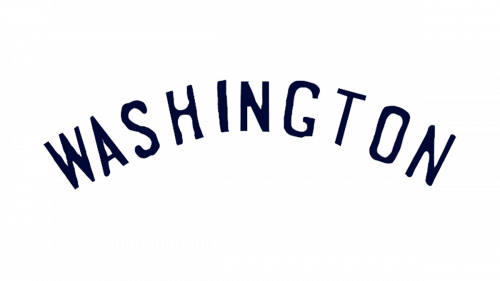
1901
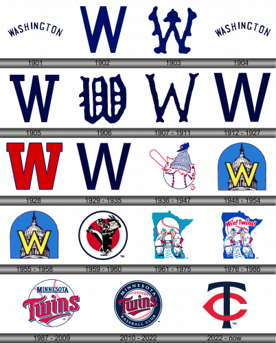
The first logo spelled out “Washington” in dark blue uppercase letters. The font was very simple. The word was slightly arched. There were no other details.
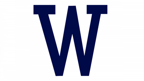
1902
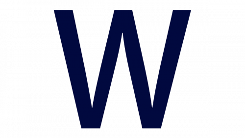
A bold capital “W” stood for the name of the team. It was deep blue and had straight lines. The tops and bottoms were cut off evenly in a straight line.
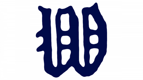
1903
The “W” now looked very intricate and looked more like an art object. It had several rounded protruding elements that served as a decoration.
1904
The original logo was brought back during this year. There were no visible differences.
1905
A big “W” was used for a logo once again. The color palette has also stayed the same. It looked very similar to the one used during 1902. However, at the top. It had two horizontal lines that created a completed look.
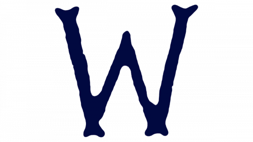
1906
A new fancy “W” appeared in 1906. It had a hand-drawn look, which did not diminish its elegant look. The lines were smooth. The letter did not have any angles or completely straight lines.
1907 – 1911
The hand-drawn style was maintained. However, there were no more extravagant details. The “W”, though, still had interesting ends at the bottom and top. The letter was thin and the middle part was slightly lower than the other two lines.
1912 – 1927
A logo was redesigned once more. It was very similar to the one used back ten years ago. The only difference was that the “W” was wider than the one seen before.
1928
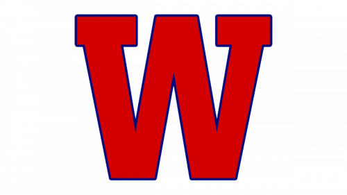
A bright red “W” was the new emblem for 1928. It had a thin dark blue outline and was noticeably thicker than any of the other versions. All the lines were cut evenly horizontally. The tops had two horizontal lines going across, similar to what they had in 1905.
1929 – 1935
The new red logo did not stay for long and the club brought back the previous emblem. It did make a little adjustment and stretched out the letter vertically just a bit.
1936 – 1947
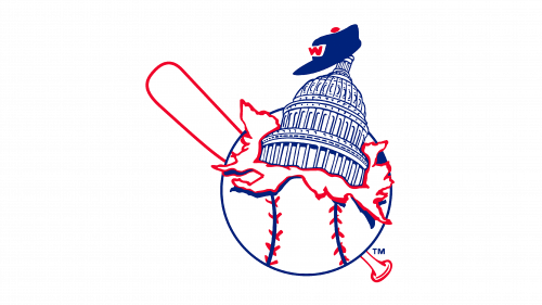
The new logo was the most drastic change the team had so far. A white baseball with red and dark blue details had an image of Capitol popping out of it. The baseball hat of blue color was set right on top of the building. A red outline of a white bat drawn diagonally was placed behind the ball. The team truly wanted the emblem to capture a lot of meaning in one image.
1948 – 1954
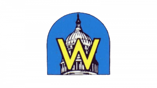
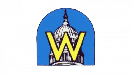
The top of the Capitol building was featured in the new logo again. It was positioned on a blue background that arched at the top and had a thin black outline. A bright yellow “W” with a thin black border was placed right in front of the building, which brought back the familiar element.
1955 – 1958
The team continued to use the logo introduced in 1948 all the way till 1958.
1959 – 1960
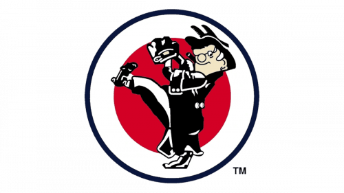
The team surprised its fans with a new logo once more. It was a drawing of a man dressed in a black and white outfit ready to pitch. A red circle followed by a wide white outline and then a thin black border served as a background.
1961 – 1975
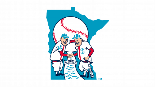
The first true Minnesota Twins logo was easy to guess as it had two baseball players shaking hands, with one of them holding a bat. There was large baseball behind them in the upper half of the logo. A river was flowing as if from the ball and going between the twins with a small bridge in the background. A solid blue image of the state served as the base.
1976 – 1986
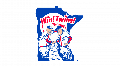
A little update was done in 1976, with the blue color looking darker and deeper. The black details were also replaced by blue for a more cohesive look. A phrase “Win! Twins!” was added above the players with a star serving as a dot above the i’s. The slogan was done in red.
1987 – 2009
A new emblem was created in 1987. A white baseball with red details served as a background. At the top, it spelled out “Minnesota” in blue uppercase letters using a simple typeface. The first and the last letters were slightly longer at the bottom and the space between them was filled by a thin line. The word “Twins” was written across it in large red letters. A black shadow added some volume, while a swoosh underneath completed the look.
2010 – 2022
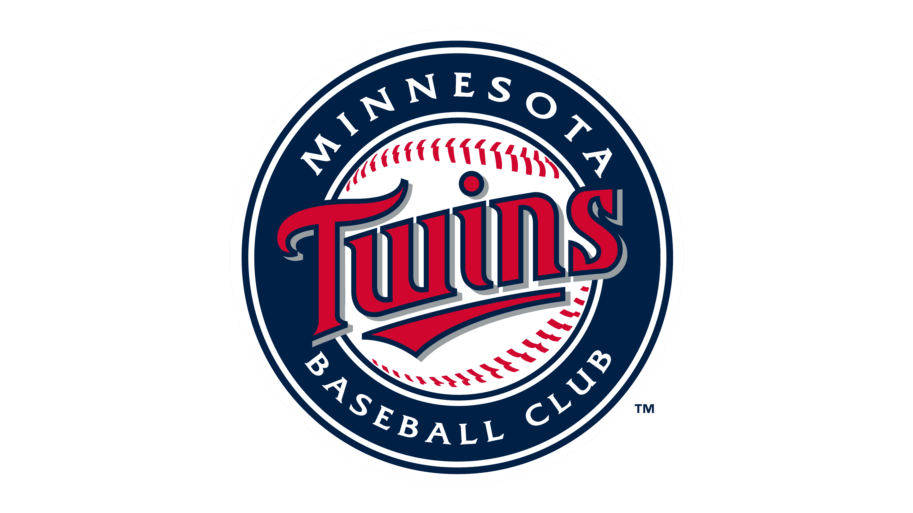
The baseball was set on a round dark blue background with thin white borders for more details. The word “Twins” has not changed and was only centered on the ball. The “Minnesota” was moved to the top of the wide border around the ball and was done in white uppercase letters using a simple typeface. At the bottom of the border, it said “Baseball Club” in the same style as the “Minnesota”.
2022 – Today
Sports teams typically adorn emblems correlating with their official titles. However, in 2022, the Minnesota Twins diverged from this norm, adopting a TC emblem. This deviation spawned queries among enthusiasts, questioning the relevance of “C” in the insignia.
The “TC” denotes “Twin Cities,” representing the conjoined urban areas of Minneapolis-Saint Paul, the franchise’s home since relocating from Washington in 1961. Concurrently, the club initiated the utilization of a secondary emblem, featuring the interconnected “T” and “C,” evolving into the formal symbol in 2022.
The contemporary emblem maintains notable resemblances to its precursor, encompassing a prominent dark blue “T” interlaced with a compressed, red “C,” symbolizing the thymus. This amalgamation reflects the synergy between the autonomous cities of Saint Paul and Minneapolis. Moreover, the “TC” also serves as a constant reminder of Calvin Griffith’s initial aspiration to name the team Twin Cities Twins, a proposition eventually discarded.
The emblematic transformation was proclaimed in November 2022 at the Mall of America, a location imbued with symbolic significance, as it formerly housed Met Stadium, the Twins’ original abode. The revamped logo was inaugurated in the 2023 season.
This subtle yet profound transformation emphasizes not only the mutual accord between the two cities but also reflects the enduring essence and evolving identity of the club in the sporting realm. The intertwined letters echo the harmonious blend of historical lineage and progressive dynamism, carving a distinct visual narrative in the diverse tapestry of sports iconography. The chronological journey of the logo, from its inception to its modern rendition, encapsulates the multifaceted ethos of the team and resonates with the fans’ enduring allegiance and fervor.
