Morgan Stanley Logo
Morgan Stanley, a leading global financial services firm, offers a wide range of services including investment banking, wealth management, and trading. Headquartered in New York City, its influence spans major financial hubs worldwide. Catering to corporations, governments, institutions, and individuals, its footprint is particularly strong in North America, Europe, and Asia. While it’s a publicly traded company listed on the NYSE, its ownership is diversified among institutional and individual shareholders. The firm consistently adapts to the dynamic global financial landscape, ensuring it remains at the forefront of the industry.
Meaning and history
Established in 1935, Morgan Stanley emerged in New York City when J.P. Morgan & Co. partners Henry S. Morgan and Harold Stanley branched out to form their own venture, post the Glass-Steagall Act, which mandated the separation of commercial and investment banking.
In its early years, Morgan Stanley made its mark with significant deals, aiding the US war effort by underwriting bonds. In the subsequent decades, it expanded its services to include mergers & acquisitions, real estate, and asset management.
The 1980s and 90s witnessed further growth. The firm went public in 1986, broadening its capital base. In 1997, it merged with Dean Witter, Discover & Co., diversifying into retail financial services and credit cards. This merger fused high-end investment banking with middle-class retail brokerage, creating a more comprehensive financial entity.
The 2000s were transformative. Like others, Morgan Stanley faced challenges during the 2008 financial crisis. However, it navigated these turbulent times, receiving a strategic investment from Japan’s MUFG Bank, which further solidified its capital position.
Over the years, leadership shifts influenced the firm’s direction, but its core focus on client service and innovative financial solutions remained unchanged. Today, Morgan Stanley stands as a testament to adaptability, continually evolving to address global financial complexities while upholding its foundational commitment to clients.
1997 – 2000
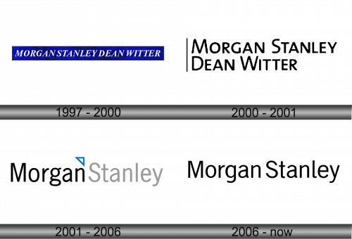
In 1997, Morgan Stanley underwent a transformative shift, merging with a prominent brokerage firm to become Morgan Stanley Dean Witter & Co. This union prompted a brand revamp, introducing a fresh emblem. The design showcased a deep blue rectangular backdrop, contrasted with a pristine white overlay spelling out “MORGAN STANLEY DEAN WITTER.” Crafted in an elegant, italic typeface reminiscent of bygone eras, every letter stood in uppercase, emphasizing the combined strength and legacy of the two financial giants. This visual identity underlined their joint commitment to pioneering excellence in the financial realm.
2000 – 2001
A year prior to its official rebranding, the banking entity underwent a logo transformation. The design team decided to ditch the previous blue geometric motif, opting instead for a bold, black textual representation. The name was artfully split, positioning the initial segment at the upper tier, with the subsequent portion resting just beneath. To the left, a stark black vertical stripe was introduced, adding a touch of modernity. This rendition employed a sleek, contemporary sans serif typeface, symbolizing the institution’s evolution and its commitment to aligning with the dynamic financial landscape while preserving its foundational values.
2001 – 2006
In 2001, the banking institution’s leadership opted to revert to its original moniker, “Morgan Stanley,” aiming to bolster brand recognition. On the updated insignia, the designers meticulously juxtaposed two distinct text elements: a bold “MORGAN” in jet black and a softer “STANLEY” in a muted gray hue. Nestled between these words, a petite white triangle framed in striking blue added a unique touch, symbolizing the bank’s legacy and forward-thinking approach in the ever-evolving financial landscape. This strategic design move was an ode to the bank’s rich history while emphasizing its commitment to future growth and innovation.
2006 – Today
The most recent iteration of the logo boasts a singular color palette, showcasing an all-black inscription devoid of any additional embellishments. While retaining the original typeface, subtle refinements were made to the characters “g,” “a,” and “l.”
Morgan Stanley’s dual-toned emblem exclusively features the name of this financial behemoth, without any ancillary designs. Even the tiny triangle, once nestled between the words, has been omitted. This stripped-down approach is emblematic of the institution’s gravitas and unwavering foundation. The design mirrors the bank’s ethos: a straightforward commitment to financial excellence and trust.


