New York Mets Logo
The famous American baseball club New York Mets conquered the love of millions of fans. The New York Mets, a cherished sports club, played a significant role in the history and culture of the sport in the area. The club has won the World Series twice in their existence, which is an incredible accomplishment. In addition, the All-Star Game was twice hosted by the Mets, first in 1964 at Shea Stadium and once in 2013 at Citi Field.
Meaning and History
![]()
The Brooklyn Dodgers and New York Giants, two former NY National League teams, were replaced by the Mets in 1962. When the team was still in its infancy, it functioned under the corporate name “The New York Metropolitan Baseball Club Inc.”. Steve Cohen, a billionaire hedge fund manager who acquired the Mets for close to 2.5 billion dollars in 2020, is the team’s current owner. Team owner at the time, Joan Payson, chose “Mets” because it was short, so easy to remember and print, as well as looked like it was a short version of the word “Metropolitan” in the corporate name.
What is New York Mets?
An American baseball team called the New York Mets has its home in Queens. The Mets compete in MLB. A devoted and enthusiastic fan community known as “The 7 Line Army” supports the New York Mets.
1962 – Today
![]()
A bold and intricate monogram was designed with the creation of the club. While the red color reflected the strength and confidence of the club, the bifurcated serifs added a sophisticated touch. The two letters, which stood for “New York”, overlapped in such a way that the top of the “Y” was about midway of the height of the “N”. “Where is the “M” for Mets?” you would ask. If you look closer, you will see that the top portion of the “Y” becomes the diagonal lines of the letter “M”, while the vertical strokes of the “N” become also the vertical strokes of the “M”. Such interesting use of lines is surely a peculiarity of many monograms.
1962 – 1998
![]()
Along with the monogram, the club also created a round emblem where the baseball ball served as the basis. Blue high-rise buildings filled the shape almost completely, leaving a white skyline around the upper half of the ball. The baseball ball pattern in orange and white bridge overlapped the buildings. At the forefront, the logo featured “Mets” printed in orange with a thin white outline. The designers used a cursive font to create a fluent inscription that created a feeling of movement along with the ball pattern. Despite a quite busy background, the name did not get lost, which is often hard to achieve.
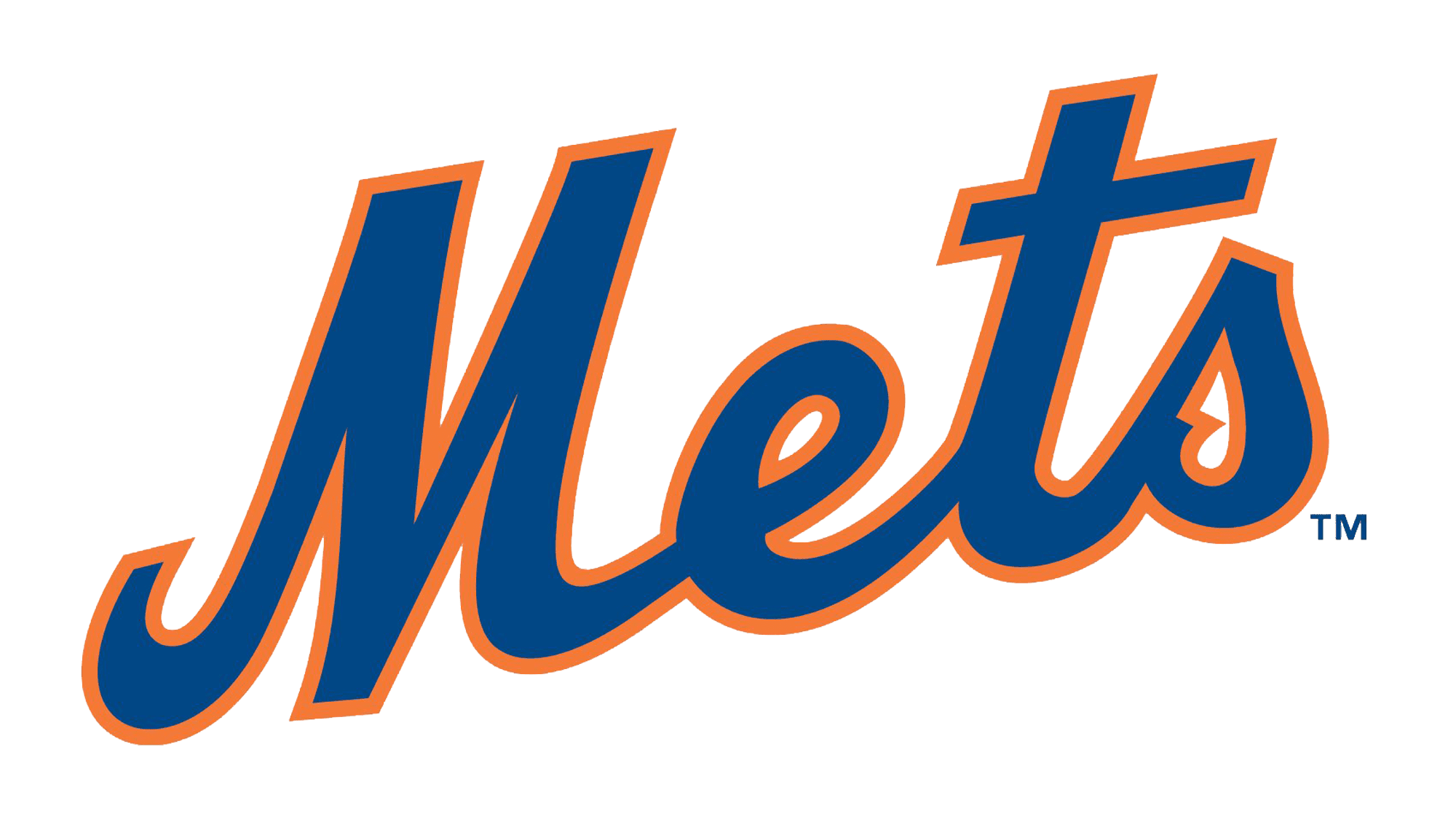
1999 – Today
![]()
A few modifications were made in 1999. The designers made the bridge lines thicker, so it was standing out against the blue background much better. The small “NY” letters to the left of “Mets” were removed, creating a cleaner look. The blue and orange colors also got more saturated. The emblem, otherwise, stayed the same and many probably did not even notice the changes.
Font and Color
The club chose an elegant and intricate font with beautiful serifs to create its monogram. The font used for the emblem was no less fine looking, although it was much simpler. A sans-serif, cursive font that featured all the characters being interconnected balanced out other bold elements in the logo.
When it comes to the color palette, the club went for a bright orange and white color palette for the monogram and added a dark blue to the round emblem. The orange color is considered to be a youthful, social, and fun color that is full of enthusiasm and energy. The blue reflects the confidence and determination of the club.