Newgrounds Logo
Newgrounds is a pioneering online entertainment platform founded in 1995 by Tom Fulp. It’s renowned for being a hub where creators share flash animations and games, fostering an innovative and creative community. The site gained fame for its user-generated content, ranging from quirky animations to indie games, many of which have had significant cultural impact. As a trailblazer in web-based multimedia, Newgrounds has played a crucial role in the evolution of internet culture, particularly in animation and gaming, and continues to be a beloved site for both creators and fans.
Meaning and history
Newgrounds, initiated in 1995 by Tom Fulp, revolutionized online entertainment. Initially a personal site, it rapidly evolved into a ground-breaking platform for user-generated flash animations and games. Pioneering in this domain, Newgrounds became synonymous with web-based multimedia creativity.
In the late 90s, as the internet gained traction, Newgrounds introduced the “Automated Portal,” allowing users to upload content and receive feedback. This feature was groundbreaking, fostering a dynamic community of creators and viewers. The site’s content ranged from humorous and quirky to groundbreaking, often pushing the boundaries of digital art and gaming.
As flash technology advanced, Newgrounds stayed at the forefront, hosting iconic games and animations that shaped internet culture. It became a launchpad for many animators and game developers, some of whom transitioned to successful careers in mainstream media.
However, with the decline of Flash in the late 2010s, Newgrounds faced challenges. Its response was adaptive and innovative. The site embraced HTML5 and other modern technologies, ensuring its relevance in a post-Flash era. Newgrounds also maintained its core ethos of creative freedom and community engagement, continuing to be a haven for indie creators.
Newgrounds has been more than a website. Its influence on internet culture, particularly in animation and gaming, is profound and enduring. Even as the digital landscape changes, Newgrounds remains a symbol of creativity and innovation.
What is Newgrounds?
Newgrounds is a trailblazing online platform that has been a haven for digital artists and game developers since 1995. Known for its eclectic and user-generated content, the site has played a pivotal role in shaping internet culture, especially in the realms of animation and indie gaming.
1991 – 1995
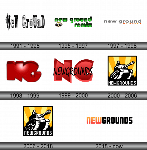
The logo is a striking display of alternating color and case, featuring vertically elongated letters. Each letter stands tall and narrow, contributing to a sleek and modern aesthetic. The color scheme is a simple yet effective black and white, with each letter alternating between these two contrasting hues. This pattern not only catches the eye but also adds a rhythmic quality to the design. Furthermore, the logo plays with the concept of letter case, alternating between uppercase and lowercase. This alternation adds a dynamic and somewhat playful element to the design.
1995 – 1997
The logo presented deviates significantly from the initial description. It showcases a more playful and casual design, with the words “new ground remix” in lowercase. The font is whimsical, characterized by a soft, bubble-like appearance, hinting at a friendly and accessible brand personality. The colors are a uniform bright green, which stands out with vitality and freshness against a plain background.
The logo incorporates an endearing animal face to the left of the stylized text “new ground remix.” This character adds a layer of charm and identity to the logo. The animal’s face is a blend of colors, predominantly purple, with a spiral motif that could suggest hypnosis or a trance-like state, aligning possibly with the psychedelic or mesmerizing qualities one might associate with a musical remix.
1997 – 1998
In this iteration of the logo, the design has been stripped back to a minimalist aesthetic. The words “new ground atomix” are displayed in a simple, clean sans-serif font. The color palette is subdued, with a gradient transitioning from a light grey at the beginning of “new ground” to a more pronounced orange at the end of “atomix.” This gradient could represent a sunrise or a spark, suggesting innovation or the dawn of a new idea.
The text is entirely lowercase, which contrasts with the previous logo’s mix of an animal face and uppercase letters. This choice promotes a sense of approachability and modernity. The logo lacks additional imagery, focusing solely on the typography to convey its message. The absence of the animal face from the previous design suggests a shift towards a more serious or mature brand identity.
1998 – 1999
The logo has undergone a dramatic transformation from the previous text-based design to a symbol-centric one.
The color red is vibrant and intense, often associated with energy, strength, and excitement, which could be indicative of the brand’s dynamic nature. The finish of the logo has a glossy sheen, giving it a modern, almost three-dimensional appearance that pops against contrasting backgrounds.
Unlike the previous logos that relied on text to convey their message, this logo communicates through its form and color, leaving a strong visual impression that is open to interpretation. The absence of any text means that the symbol must carry the brand’s identity on its own, a bold move that can enhance brand recognition if the symbol is distinctive enough.
1999 – 2000
The logo presents a unique and eye-catching design, centered around the letters “NG” in a prominent position. These letters are styled in bold, red uppercase font, exuding a sense of strength and authority. They are placed in the background, creating a subtle yet commanding presence. In the foreground, overshadowing the “NG”, are the words “Newgrounds”, written in vibrant, bold black letters. The red font is dynamic and modern, capturing the viewer’s attention instantly. This design choice underscores the brand’s creative flair and its emphasis on bold, straightforward communication.
2000 – 2006
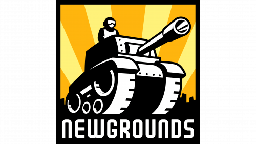
The logo depicted in the image is dynamic and bold, with a stark black and white color scheme accented by a vibrant yellow backdrop. At the center, a tank, a symbol of strength and resilience, commands attention. The tank is stylized in a bold, graphic manner, reminiscent of classic video game art. Atop the tank sits a figure wearing goggles, reinforcing the edgy and adventurous spirit of the brand. Below the tank, the word “NEWGROUNDS” is written in large, blocky white letters that stand out against the black ground. The font used for “NEWGROUNDS” is straightforward and impactful, emphasizing clarity and presence. Radiating from behind the tank are sharp yellow rays that create an explosive and energetic effect, suggesting innovation and creativity. The overall design conveys a sense of rebellion and artistic freedom, resonating with a community that values independent and groundbreaking content. This logo is not just a brand mark; it’s a statement, a celebration of the creativity and spirit of the independent digital arts community.
2006 – 2018
The logo maintains its bold and edgy style while introducing a more refined and balanced aesthetic. The tank, a central element, remains a focal point, now rendered with enhanced detail and a sense of depth, giving it a more three-dimensional appearance. The figure atop the tank, still wearing goggles, appears more integrated into the scene, emphasizing the unity between character and machine. The font is sleek, subtly altered, and has a cleaner finish that modernizes the overall look.
2018 – Today
The logo in the image has transitioned to a minimalist and sleek design, focusing purely on typography without any graphic elements. The word “NEWGROUNDS” is spelled out in a clean, sans-serif font, showcasing a modern and accessible look. The most striking feature is the gradient applied to the first three letters, “NEW”, which fades from a warm orange to a deeper red, suggesting a sunrise or the ignition of something new and exciting. This color choice infuses the logo with energy and a sense of beginning, which aligns with the brand’s ethos of innovation and creativity.
The remaining letters, “GROUNDS”, are in solid black, providing a stark contrast to the vibrancy of the gradient. This contrast creates a visual balance and ensures legibility. The uniformity of the font size and color for the latter part of the word grounds the logo, giving it stability and a strong foundation. The absence of additional imagery or embellishments signifies a shift towards a more straightforward and refined brand identity, one that emphasizes clarity and focus. This stripped-down approach reflects a confidence in the brand name alone to convey its message and values.
