YouTube Logo
YouTube is a one and only video-hosting website, and it’s been this way since 2005, the year it was launched. The only two platforms that come close are the regional replacements and Twitch. In short, YT is an ultimate form of entertainment if you want to spend some time watching videos, regardless of your tastes.
Meaning and History
The founders didn’t really think long before coming up with the name. The ‘You’ means that you’re free to choose what to watch or post and ‘Tube’ is just another name for ‘TV’. So, it was envisioned as a sort of TV-watching platform with way more freedom than people had back then.
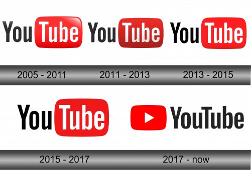
The logo, surprisingly, barely changed at all over the years.
What is Youtube?
Youtube is a video hosting platform founded in 2005 by ex-Paypal workers. The idea behind the website is that anyone can post sand watch video content and even make money off of it. It’s a free service with millions of users, and it’s long become the one platform to watch videos.
2005 – 2011
The very first iteration feature the name of the website – YouTube – sliced into two parts. The first one (‘You’) was written in black, and the other (‘Tube’) was put inside a red rectangular shape and subsequently painted white. The font choice stuck over the years. It was a collection of slim yet prominent letters, and the style didn’t change at all.
The only part that really changed over the years was the rounded rectangle. In this period, it was heavily shaded and illuminated. This was what most other brands did with their logos, although it started to look old-fashioned soon.
2011 – 2013
It was in 2011 when they finally decided to change the appearance. The illumination and the gradient were significantly reduced, and they darkened the red plaque very heavily. It was likely an attempt to do a full reversal from an overly-bright previous incarnation, but it’s just speculation.
2013 – 2015
In 2013, they made the color brighter, but it’s not the only change. They reduced the shading even more, although it wouldn’t until the next iteration that shades were removed completely.
2015 – 2017
The colors changed again, and it became slightly brighter. Also, the lighting was removed completely, which made the logo a lot cleaner and straightforward.
2017 – today
2 years later, they’ve made the most significant change yet. They united the text into one black one, while the red plaque was made somewhat slimmer and noticeably smaller. They put it to the left of the text. Noticeably, the color became the aggressive scarlet, which suits the emblem very much.
Also, it started to wear a now-iconic white triangle that signifies the start of the watching sequence.
Emblem and Symbol
The red plaque was ever supposed to mean the screen, even if the color choice doesn’t really tell you about it. It’s become obvious when the company added the triangle shape on top of the plaque. They also use this emblem independent of the writing now, which significantly improved the design opportunities.
