Shein Logo
Shein is one of the largest online clothing retailers, covering more than 220 countries and regions around the world, specializing in the sale of women’s, men’s, and children’s clothing, shoes, accessories, and home goods. It has customers in Europe, America, Australia, and the Middle East. Customers can purchase goods both on the official website and through an application. The company owns three warehouses: in Europe, China, and the USA.
Meaning and History
The fundamentals of the SHEIN store were set in 2008 when the website Zzkko.com was created. It sold women’s clothing aimed at American buyers. Xu later renamed his platform SheInSide and narrowed the range to selling wedding dresses, but in 2012, he returned to a wider assortment of goods. In 2014, SheInSide began to form its own supply chain system, becoming a fully integrated retailer. A year later, the company shortened its name to SHEIN, making it more memorable and easier for buyers to find.
What is Shein?
Shein is an international e-commerce platform that sells clothing, shoes, and accessories directly to private buyers around the world. The company is owned by ZOETOP Limited (Hong Kong).
2011 – 2012

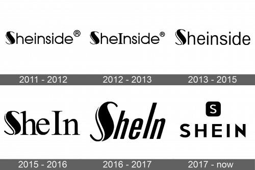
The logo created in 2011 featured the original name of the Shein brand. It spelled out “Sheinside” in black, sans-serif letters of a black color. The emblem would look very basic and not memorable if it was not for the signature “S”. The first letter was capitalized and had a combination of a bold, thick stroke with thin delicate lines. A portion of it featured a double line. The registered mark sign was placed in the upper right corner.
2012 – 2013

It might seem the logo has not changed, but one small detail made it look different. it was the first letter “I”. It was not only capitalized and bade bolder, but also got elegant serifs. The other letters stayed the same.
2013 – 2015

Another update followed quite soon. The letter “I” was made lowercase again. The other lowercase letters got wider and taller. Their close spacing made the company appear confident and strong.
2015 – 2016

Even though the new logo now said “SheIn” and featured thin, flaring serifs, it had a lot of resemblance to the original version. This was achieved thanks to the letter “S” which has stayed unchanged throughout all these years. Like the 2012 version, this logo had the “I” capitalized to visually split the name into two words.
2016 – 2017

The designers wanted to make the logo look stylish and attract even more attention to the brand. They italicized the name and removed the serifs. The new font looked noticeably bolder than in the previous version, which created a powerful appearance. The fact that this logo was also done in black and featured the recognizable “S” made it easy for consumers to associate the new logo with a brand they know.
2017 – Today

Although the logo of a well-known brand is not unique because it simply has the name of the company, it looks classic and reflects the good taste of the designers. The black letters have clean straight lines and corners. The ends of the letter “S” are cut at a diagonal, while the two ends of the “N” are sharp. All the letters are uppercase and widely spaced apart. All these little details give a feel of professionalism and show the thought that the designers put into the logo and, assumingly, into all the goods the brand sells.


