Instagram Logo
Instagram is the biggest website when it comes to sharing photos, videos and all sorts of images. It started back in 2010 and was soon amongst the biggest social network services in the world. They were also the pioneers of using hash-tags to find the content you are specifically interested in. Now, they are property of Facebook.
Meaning and History
![]()
The story is Insta begins in 2010, when several Californian entrepreneurs decided to start a project that would have people share the photos they made and form communities based on the photography interests. It proved to be a successful choice, as you know.
The name is the mix of words ‘instant’ and ‘telegram’, which reflects the service’s capability of posting your photos instantly and sending it around.
2010 – 2010
![]()
Insta logo changed a lot since its inception back in 2010. It featured a basic white photo camera with a grey background. At first, the camera looked very complex and was full of details. It was very realistic, and the only elements that persisted were the lens and the rainbow ribbon that went through the middle vertically.
The rainbow in particular stayed with the logo for the longest time, although it was later scrapped. This initial design was largely simplified because it was just too obscure and unrecognizable to use as an icon for an ambitious photo-gallery/network such as Instagram.
2010 – 2011
![]()
That’s when the iconic brownish square first surfaced. This iteration was supposed to look like a camera, although there weren’t a lot of details, unlike the very first design.
It was a rounded square with a brownish shade on the edges. The lower ¾ were beige, while the rest has been painted brown. Right in the center sat a lens, which was one of the two most detailed parts about this logo. The other was the flash, located just in the top right corner.
There was also a small oval badge with the letters ‘INST’ on it right on the border of the colors, on the left from the lens. From it and over the top, there was a familiar rainbow streak. It’s likely they used it as homage to the gay community of San Francisco, where the developers were from, but it wasn’t really confirmed.
2011 – 2016
![]()
Everything stayed pretty much the same in this iteration. There were some changes, of course.
For instance, the shading became noticeably more intense. The designers added a lot of lighting and gradient, which isn’t surprising for the time. The lens also became somewhat more realistic, but not too much.
The ‘INST’ badge, however, became noticeable wider and larger, and it now read ‘INSTA’. The rainbow, consequentially, was also widened. Now, the symbols became much clearer, and the logo grew in recognition.
2016 – Today
![]()
The monochromatic printed rendition of the logo blends simplicity with elegance. Designed for high contrast and legibility, this black and white format is tailored for situations where color printing may not be feasible or ideal. This minimalist approach, evoking a timeless feel, ensures adaptability across various platforms and mediums.
2016 – 2022
![]()
There were minor logos throughout the history, and many of them differed very significantly from the key design. This was the first time the main logo changed from the usual brownish camera emblem.
It was now a pink rounded square with the gradient all over the place. From left bottom to the opposite corner, it became gradually darker. The main color is still pink. Inside the logo, the camera reached its peak in minimalism. It was now just a white frame and two white circles where the flash and the lens were before.
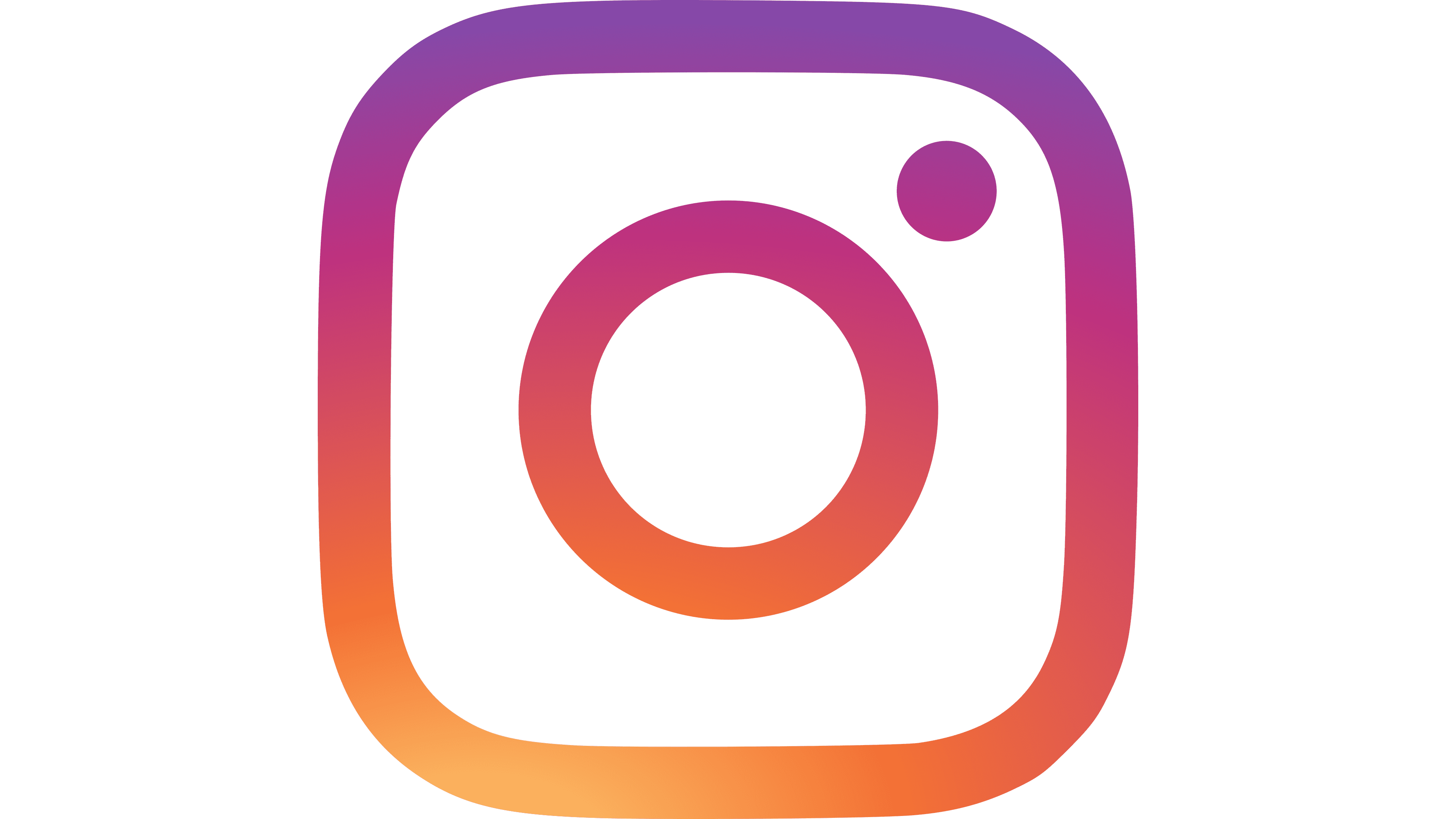
2022 – Today
![]()
In 2022 the Instagram visual identity gets another refreshment. The logo, designed for the social media platform became brighter, and also kept all the elements from the previous version almost untouched. The only change, that has been made to the Instagram insignia is its color scheme, which gained a lighter shade of all its gradients. The purple and the orange hues on the iconic logo became more delightful and vivid. The composition itself remained untouched, so for many, this redesign will stay almost unnoticed.
Emblem and Symbol
The choice of a camera as a main symbol was very clear. The developers long dabbled in photography, and the whole premise of their new app that they launched in 2010 was photo-sharing. There was really nothing else that could relay the general idea to the public.
The logo was a camera, one way of another, through the whole history of this social network.


