Google Logo
Google is a company that created a #1 browser used by most people today. Not too many people in the world are still unaware of what Google is and what role in the modern world it plays. For all intents and purposes, they have the same brand and the same logo.
Meaning and History
![]()
The initial name for the company and its main product was BackRub – on account of its intended helpfulness. It was very promptly changed to Google, which was in turn inspired by ‘googol’ – an extremely long number that stands for 1 with one hundred zeros. The founders simply liked the idea, it seems.
What is Google?
Google is a search engine and a browser, launched in 1998. It’s currently the biggest in the field, and the most popular. It accommodates over a billion users worldwide, as of 2023. The company behind it is also one of the biggest American IT companies, which owns plethora of other online services.
1995 – 1997
![]()
For two years before becoming Google, the company was known as BackRub. The logo also represented it, although it was very unlike the later designs. It was a plain typographic company name written in red. It wasn’t really catchy, so they changed it – alongside the name.
1997 – 1998
![]()
In 1997, BackRub was renamed to Google after just two years of existence. Its initial logo featured the same multi-colored letters we know now but heavily tilted forwards. The revealed parts were colored a violent red, which wasn’t a very good sight, by all accounts.
1998 – 1998
![]()
1998 saw the company develop the first design that would resemble the contemporary style. The difference from the modern Google logo was that letters stood rather far away from one another, had more volume and, consequentially, shading to them, and, lastly, the capital ‘G’ was green instead of blue.
The general concept, however, persisted to this day.
1998 – 1999
![]()
The same year, the developers added a few changes. Firstly, the first letter was given a more pleasant blue coloring. Secondly, they added more shadow behind the letters, giving them even more volume. Lastly, an exclamation mark was put after the last letter.
On another note, the colors became rather brighter, which was a step in the right direction.
1999 – 2013
![]()
For most of their life, Google used this logo. It was more pleasant than others, and was, in fact, ahead of its time. All the shading and excessive volume were stripped from the logo. The font was changed to a gentler and fluid type, while the letters themselves grew in size and now stood rather closer to one another than before.
The exclamation mark also vanished for good.
1999 – 2010
![]()
Using the previous version as the basis, this variant added shadows behind the letters, lighting on the letters themselves, as well as made them rather darker.
It’s an iconic design, and while the basic logo was the umbrella emblem and was used for all products by Google, this one was the primary logo for browsers. For the longest time, this was what people saw when they tried to search for answers.
2010 – 2013
![]()
The browser-specific logo saw its first change in years in 2010. Not a whole lot changed – the shading was largely removed, and the shadows around the letters vanished completely. In addition, the coloring itself became brighter and paler in some places, making the logo look much fresher.
2013 – 2015
![]()
In 2013, all the logos used alongside one another were changed in favor of this variant. It’s basically the same 2010 style, but with absolutely no shading or gradients. It has a classic 2D look, reminiscent of the 1999 design, but with a coloring scheme from 2010.
2015 – today
![]()
2015 saw another radical change. Nothing substantial was removed, the only change occurred in relation to the font – to two aspects in particular. Firstly, the notches on the ends were scrapped. Secondly, each letter was now uniformly thick – basically, no more fluid thinning or widening.
The letter design in general has also been rather simplified. Excessive curls and twirls are a bygone era now.
Emblem and Symbol
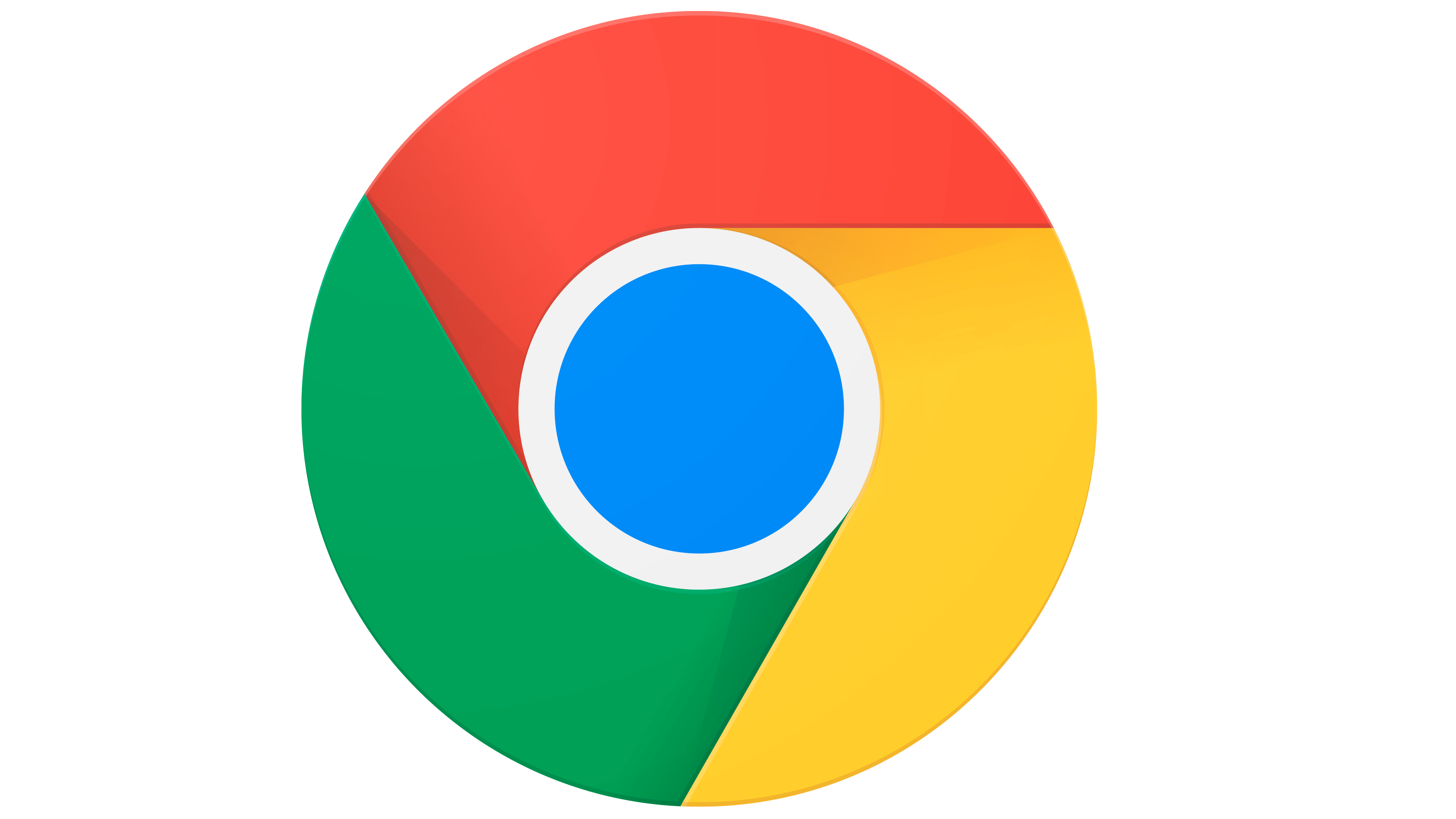
When Google Chrome (the browser) needs specific imagery for app icons or other similar purposes, they often use a special logo. It’s basically a circle with a blue center and a whirlpool consisting of equal green, red and yellow parts. The coloring is a throwback to the usual scheme used by Google, but the shape has no real meaning.


