TikTok Logo
TikTok is one of the most rapidly growing brands of late. It was only launched in 2016 as an attempt to supplant Vine. Both services are mobile apps with extensive features focused on sharing short vertical videos. Although TikTok was an obscure Chinese app back in 2016, it somehow gained an unprecedented amount of popularity.
Meaning and History
![]()
TikTok is the name chosen by the developers for the international market. It’s supposed to emanate rhythm, fast pace and ticking of the clocks. Basically, it’s all about music and fast-paced videos. If they are popular, they can set up trends and get viral. That’s the main principle, anyway.
2016 – today
![]()
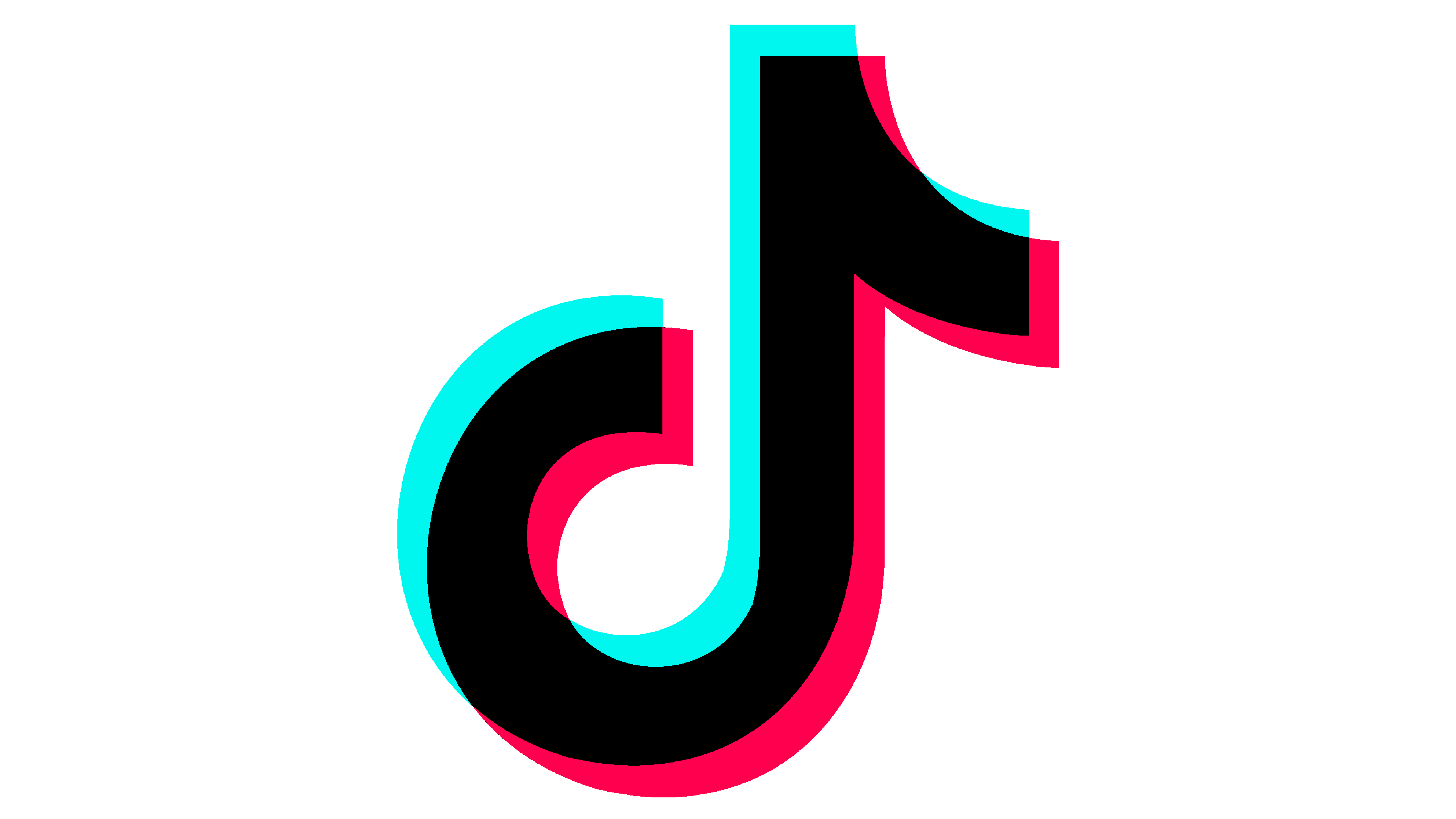
This is the main image the brand uses independently or in conjunction with other elements. It’s a black note-like symbol with something that looks like a 3D-filter. Basically, the main symbol is located right in the center, and there are also two identical shapes just like the main one in the background.
One is shifted to the left and is colored a light blue, and the other is colored pinkish red and is moved to the right. It can also be distorted sometimes. When the symbol is put inside a white circle, the circle is also often distorted and 3D-filtered to fit the aesthetic.
2017 – 2018
![]()
In 2017, the company decided that some variations of the logo need to be spiced up with some text. In 2017, they created a version with two words that spelled ‘Tik Tok’ in the bottom. The font was just as it is now, but the only difference was the space between the two words.
2018 – today
![]()
In 2018, the text version was upgraded into this one. The text remained the same, except the space was removed and the writing was shifted into just one word – ‘TikTok’. It also became rather thicker, but, other than that, there were no differences.
The only other difference is that the symbol became bigger in comparison to the text, which ensured everyone could see it from the mile away.
Emblem and Symbol
The combination of a note-like symbol and a 3D effect is supposed to tell you that the main two aspects of TikTok are: music and visual effects. That’s what you can do with your video, anyway – modify it to be catchier and more interesting.
In fact, the note can also be a reference to the Chinese name of the app – Douyin, or ‘抖音’. The first half of the first glyph could be influence, but it’s just speculation.
Who designed the TikTok logo?
The name of the designer of one of the most famous logos in history remains unknown. The creator of the TikTok badge hides his name, but he did share the story behind the design, and the source of the inspiration — a dark club room and a rock concert with music and light vibrations.
What is the TikTok logo based on?
The TikTok logo design was created by an unknown developer who, according to TikTok executives, was inspired by a concert he attended before he was invited to work on the symbol. Reportedly, the designer wanted to create an emblem that mimicked the excitement of attending a major concert.
How was the TikTok logo made?
The TikTok logo was designed with the idea to highlight the talented content creators in the app and demonstrate the entertainment value they offer. The design uses a stylized “D” modeled after a musical note, which at the time symbolized the name Douyin. Although the app’s name was changed to TikTok when it was launched internationally, the company kept the same design.


