Gmail Logo
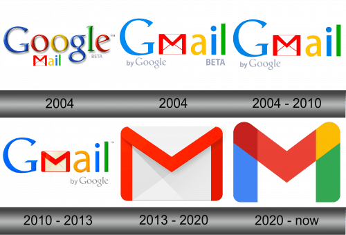
Since its launch in 2004, Gmail has been one of the key email services online. Although deeply imperfect and somewhat uncomfortable to use, Gmail has accumulated a large userbase and by 2021 surpassed most competitors. Its main upside is that the service can be integrated with many other Google products.
Meaning and History
Gmail (stands for Google Mail) has entered development in the beginning of this century. The primary cause of introducing the new mailbox for Google was that all existing providers were no good for anything bigger than a reasonably-sized letter. If you wanted to attach a file, it just wouldn’t let you in most instances.
2004 – 2004
This logo is a nostalgic throwback to the early days of one of the world’s most widely used email services. It features the word “Google” rendered in its characteristic color sequence of blue, red, yellow, and green, with each letter showcasing a 3D effect that adds depth and substance. This styling evokes a period when skeuomorphic design, which imitates real-world textures and lighting, was prevalent in digital interfaces.
Beneath the Google brand, the word “mail” is presented in a lighter font, aligning with the colors of the Google lettering above it. The choice to use a lighter typeface for “mail” might represent the seamless and unobtrusive experience the service aims to provide.
Accompanying these elements is an envelope graphic with a red ‘M’ that is both an emblem for mail and a nod to the service’s function. The word “BETA” in a plain font beside the main logo indicates that the service was, at the time, in a testing phase and subject to improvement and change.
Together, these design elements convey a message of innovation, user-friendliness, and a commitment to growth. This logo is not just a brand mark; it’s a piece of internet history, encapsulating the zeitgeist of the early 2000s web design and the dawn of an era where email became accessible and integral to daily life for millions of users.
2004 – 2004
This logo version belonged to the beta of Gmail that was opened to the public in 2004. This exact design has been in use until 2013, in fact.
The logo is subject to the usual Google concept of casting colors onto various letters of the logo. The font is very similar to the one used in Google’s own logo, except for one difference. The letter ‘M’ is not there. Instead of it, the designers put in its place a white envelope with a letter in question marked in red across the lines of the envelope.
Beneath the main logo were two text elements. On the left, the grey text reminds you that Gmail is made ‘by Google’, and on the right another grey writing tells you it’s just a ‘beta’ version in uppercase.
2004 – 2010
When the mailbox left beta and was fully launched, the logo changed little. The ‘beta’ text vanished, and the characters of the main logo (including the ‘M’ replacement) were made wider. Google also added some lighting onto the letters, and that’s about it.
2010 – 2013
In 2010, the ‘by Google’ part moved right, and the logo as simultaneously given even more illumination. It particularly affected the envelope, whose seams almost disappeared. There were no other substantial changes.
2013 – 2020
In 2020, Google decided that users are familiar enough with the software, and they simply scrapped everything expect the envelope. They made sure it’s illuminated more appropriately, and also reduced the thickness of the red element.
If they absolutely needed the text to specify that it is indeed Gmail and to stand next to the icon, they would’ve just written it in plan grey text.
2020 – now
Following the general overhaul of their designs by Google, the company simply discarded the envelope and left the letter ‘M’ in roughly the same place where the red marking was before. By comparison, the new emblem is significantly wider and softer – the edges and angles are severely rounded.
But the most notable change is the color shift. Instead of the uniform scarlet the main colors are now blue, red, and green with yellow and burgundy on the corners.
Emblem and Symbol
Although the later designs have become the norm when it comes to addressing the Gmail, Google still uses the 2013 design a lot – especially when they need a tiny icon to specify the service. It’s shown on many pages related to the service – most prominently, on the front page of the mailbox itself.


