Nissan Logo
Nissan is one of the world’s largest car manufacturers. It manufactures cars and trucks, automobile parts, as well as communication satellites, sports boats, etc. From the very beginning, Nissan has been establishing production facilities abroad. Soon after the merger in 1933, the company began exporting its first automobiles to Asia, Central, and South America. Today, Nissan has factories not only in Japan, but also in the United States, Europe, and Australia.
Meaning and History
Nissan was formed as a result of the gradual merger of several automakers. Officially, Nissan was founded in 1933 when Nikon Sangyo Co. merged with Tobata Imono Co. In 1934, the company was named Nissan Motor Co., Ltd. The name of the brand is a combination of the first letters of the words NIHON and SANGYO. It is translated from Japanese as “Japanese industry”. There is another version that claims that it is a play on Japanese words, the translation of which means “Striving for success.”
What is Nissan?
Nissan Motor Co. is one of the most famous and largest Japanese car manufacturing companies. It is one of the three largest Japanese automakers along with Toyota and Honda.
1933 – 1940
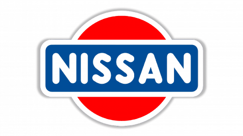
The first logo was bright and bold thanks to a red, blue, and white color palette. The name of the brand was done in thick, yet simple, uppercase letters that were white just like the border around a blue rectangle that served as a background. Behind it, there was a red sun that also had a white border. It was a good association with the rising sun that plays an important role in Japanese culture. The whole emblem had a gray shadow around it, which made it pop and look like it was a sticker.
1940 – 1950
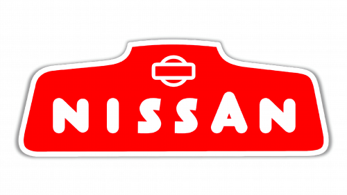
A complete redesign of the logo was done in 1940. The only thing that was kept the same was the white font and border and red color that served as a background. The name of the company was done using a different font style that featured rounded corners and ends, except for the letters “S” that had ends cut at an angle. To add some interest to the wordmark, the designers made the letter “A” slightly higher than all the other letters. The wordmark was placed on a geometric shape that somewhat resembled a trapezoid figure. Above the wordmark, there was a white outline of a circle with a rectangle outline placed in front of it. Just like in the original version, there was a gray shadow around the whole emblem.
1950 – 1959
The company simplified the funky geometric shape, so the wordmark was placed on a rectangle with rounded corners. The shape was still red with a white border and shadow. Although all the letters were kept white and uppercase, the font has been changed. Some letters had rounded corners and ends, while others featured corners that were cut straight.
1959 – 1960
An updated version featured a white wordmark with letters that had straight lines and angular/straight ends. The letters had a relatively thin outline. The red background was no longer going beyond the letters. The rectangle not only got smaller but also lost the white border and shadow.
1960 – 1967
An even more simplified version was introduced in 1960. It was the name of the company done in beautiful cursive handwriting. The company left the red color but removed everything that was in the background. It was remarkable.
1967 – 1970
The introduction of the brown color palette was something new. The typeface was simplified and italicized, and the letters were no longer interconnected. The first letter was capitalized and had a serif at the top, which added a nice detail to an otherwise simple wordmark. The light beige letters had a thick brown border which also filled the space between the letters.
1970 – 1978
It was not long before the company introduced yet another completely different logo. There were some similarities, though, in the form of a rectangular shape with rounded corners that served as a base for the name. The wordmark was done in a light gray color using all uppercase letters. They were quite wide and had large serifs. The background was black with a light gray border that was outlined by a thin black line.
1978 – 2001
The company decided to return to its origins and brought back the original logo. However, the designers placed it on a white background with a blue frame around it. To the right of the emblem. There was the name of the company done in a very similar style to the name on the emblem itself with white capital letters and a blue rectangle as the background. Both elements were interconnected, forming one long rectangular logo.
1978 – 1988
In 1978 Nissan switched to a minimalistic badge with clean lines and a monochromatic palette. The new logo featured the uppercase inscription with the company’s name set in a bold sans-serif typeface, based on the previous version, but with wider contours of the letters. The logotype was written across a horizontally-oriented rectangle in gradient silver shades with a thin yet visible black outline. This laconic and strong logo stayed with the Japanese automaker for en years.
1988 – 1989
The redesign of 1988 brought back the iconic circle concept but made it more modern and strict. It was now a silver roundel in a thick black outline, crossed by the black horizontal rectangle with the silver logotype on it. The corners of the rectangular banner were rounded to balance the straight and sharp lines of the voluminous silver inscription. The typeface of the lettering got slightly refined, and it was now three-dimensional, so due to the shadows and new geometry, the Nissan logotype looked sleek and progressive.
1989 – 1990
In 1989 Nissan was using its most laconic logo ever — the bold black inscription set on transparent background with no additional elements. The typeface was still the same, but the lines got bolder, hence the inscription got more stable and brutal, especially in the minimalistic black color palette. The straight cuts of the bars and sharp angles added power and confidence to the Nissan logotype.
1990 – 1992
The Nissan roundel came back in 1990 for two years. Now it was not the solid circle, but just its outline, although the horizontal rectangular has remained almost the same as on the version of 1988, but with reversed colors. Now silver was the prevailing shade on the Nissan Logo, and only massive lettering and some thin lines were set in black.
1992 – 1998
The silver shade gets completely removed from the Nissan badge in 1992. Now the roundel with the rectangle was set in flat black on white. The framing of both the circle and the rectangle got thicker and wider, hence the black inscription in the corporate sans-serif font started looking smaller and more delicate. This version of the logo was used by the company for almost six years.
1998 – 2001
The redesign of 1998 made the Nissan logo more elegant, replacing the bold black outlines with thin ones. Also, the contours of the rectangle were refined and softened, so now the angles were rounded and the whole composition got a more balanced look. The lettering got even smaller, and now even the sharp straight cuts of the bars did not look brutal.
2001 – 2012
The new design was also a modification of the original logo as the company used a horizontal banner for the name and placed it across a ring. The name was done using the same font as in the previous logo but in black. The ring and banner had a 3D shape thanks to black and white gradients. It looked like a silver emblem taken right from a real car.
2012 – 2020
The Nissan logo redesign of 2012 slightly played with the shade of silver on the badge. If the previous version was classic gray and matte, the new one got more glances and some yellowish hues. As for the concept itself, all shapes and details remained untouched, just the silver surface was modified.
2020 – Today
A simplified version of the previous emblem was created in 2020. The ring was drawn as a simple black outline. There was a hint of a white banner with only partial border lines above and below the “N”s that connected to the circle. The name of the company was written in black using the same font. The letters, though, were thinner and spaced further apart. The designers took the original idea and modernized it.
