OPPO Logo
OPPO is a dynamically developing brand that gaining awards at prestigious technology conferences and expanding the presence of its products in the markets of various countries. This company loves to surprise, so it often brings to life developments that other manufacturers are guided by. These include the thinnest smartphone, a phone equipped with motorized camera module rotation technology, the world’s first 5-inch Full HD display, unique photo quality programming technology, and the like. A characteristic feature of all models is a high-quality front camera, even on budget models.
Meaning and History
![]()
The OPPO brand was created in 2001 by Duan Yongping and three other executives from independent companies that were part of BBK. The independent company OPPO was registered in China in 2004. Tony Chen became its CEO. In the same year, OPPO Digital was founded in Silicon Valley to develop DVD and Blu-ray players. In 2005, they released an mp3 player in China and a DVD player in the US. In 2008, the company launched the first Oppo mobile phone. Ten years later, OPPO was among the ten most popular gadgets.
What is OPPO?
OPPO is a leading Chinese manufacturer of smart gadgets, which continues to rapidly gain popularity among millions of users. The company produces both budget devices and premium smartphones. OPPO gadgets to this day hold a good and leading position.
2004 – 2013
![]()
The logo of a company that always wanted to stand out with its innovations looks relatively simple. Although it features only the name of the brand printed in all lowercase letters, the black color and lack of other disturbing details make it look sophisticated and luxurious. All the letters look stretched out horizontally, so the “O”s look like an ellipsis, while the “P”s use the same “O” shape only a bit open at the top. To add some dynamics to the logo and reflect the innovative nature of the brand, the designers gave the strokes different thicknesses, making the “O” thinner on the left and thicker on the right.
2013 – 2019
![]()
Although there are no noticeable changes when it comes to the font, the logo acquired a completely different feel. A simple replacement of black with a natural green gave it a friendlier appearance while reflecting all the values this color stands for and the company wants to be associated with.
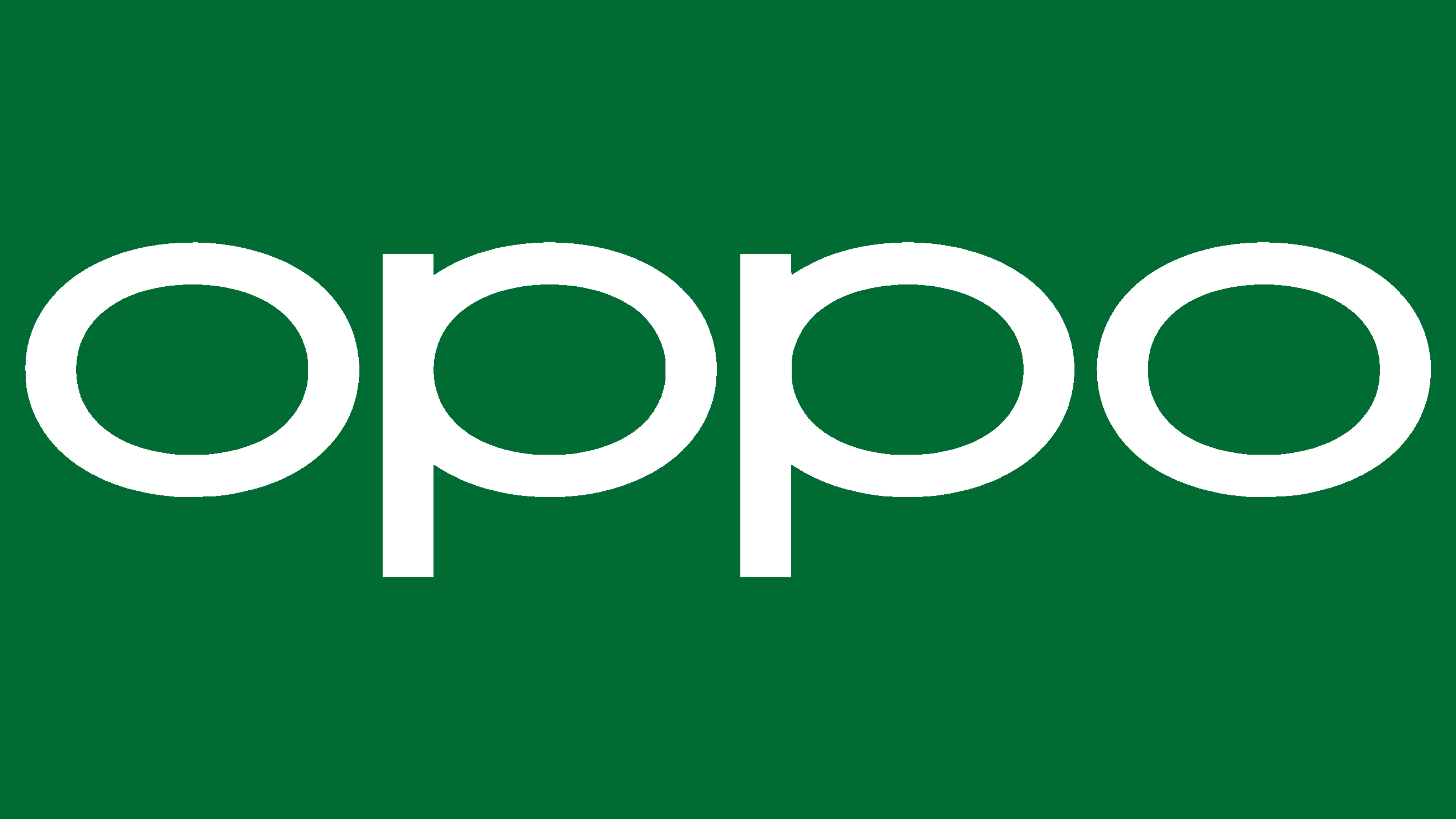
2019 – Today
![]()
This time, the company not only changed the color but also the font. It used a custom-designed sans-serif font that featured bold strokes of even thickness. The slightly horizontally stretched-out shape of the letters drew a connection between this logo and the previous two versions. The “P”s, though, did not have a slit at the top, which gave the logo a more uniform look. A deeper shade of green made the company look stronger and was pleasant to the eye.
Font and Color
The logo used since 2019 features a custom font called Oppo Sans designed by Pentagram. Originally, the company went for black, which is a safe option that allows any company to look professional and powerful. The green color, which was used in the logo from 2013 until 2019, stands for newness, quality, and innovation. This is also a color of growth and dependability. Since 2019, the shade of green was changed to a darker one, which gave the logo a more sophisticated and serious look.


