Pfizer Logo
Starting from a modest fine chemicals business, Pfizer has grown into a major pharmaceutical company and a leader in the global pharmaceutical market. Today, the concern owns a leading portfolio of innovative drugs for the treatment and prevention of various diseases. Pfizer is a leader in the development of new drugs for the treatment of diabetes, cancer, and cardiovascular disease. The company also gained fame as the inventor and manufacturer of Viagra. In 2020, the holding introduced the Pfizer mRNA coronavirus vaccine to the planet.
Meaning and History
The history of Pfizer began 170 years ago. Charles Pfizer and Charles Earhart, two German chemists, emigrated to the US in pursuit of a better life. They started Charles Pfizer & Company with the borrowed $2,5 thousand. By 1910, the company’s sales had reached $3 million, the equivalent of $80 million today. The real recognition was received 30 years later. The company successfully entered the international market in the early 50s. Pfizer is now one of the world’s largest pharmaceutical companies and one of the 100 largest corporations in the United States.
What is Pfizer?
Pfizer is a multinational American pharmaceutical corporation. The company invests about 7.5 billion dollars annually in scientific research aimed at creating new effective drugs. It operates in more than 150 countries with main offices in USA and Belgium.
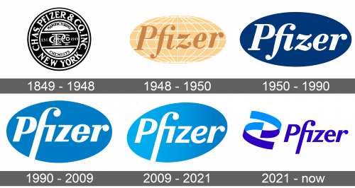
1849 – 1948
The logo was in the form of a round, black emblem with several white and black borders. The outer black border was thick and featured “Chas. Pfizer & Co. Inc.” written in white, uppercase letters with serifs. At the bottom, it stated the original location. Across the white circle in the center, there was a black banner with a monogram. It looked well thought-out and stylish.
1948 – 1950
The redesign of 1948 introduced a completely different Pfizer badge, which has become a basis for all future logos. It was a horizontally stretched globe in a smooth and tender yellow shade, with thin white orbits all over it and light-brown lettering in the title case of a bold and elegant serif font with rounded details on some of the bars. The inscription was enlarged and written in a straight horizontal line across the stylized globe, looking confident and professional.
1950 – 1990
The recognizable oval emblem with “Pfizer” written across was introduced in 1940 to reflect the new name of the company. It was done in white on a blue background that looked like a pill. The name was italicized and the curves and serifs of the letters gave it an elegant and stylish appearance, while still being quite minimalistic.
1990 – 2009
Besides making the background lighter, the designers changed the typeface. Italicized letters and serifs had straight lines and sharp cuts. Their geometric shape was softened by the round ends of the letters “f” and “r”. The “f” also stretched out to the outer edge of the oval base, as if symbolizing that there are no boundaries for growth and innovation.
2009 – 2021
The updates to the logo were not very noticeable, yet they made a difference in the overall feel. There were no more serifs and the letters “z” and “e” got smoother lines. the background also acquired a lighter gradient. These changes made Pfizer feel more approachable.
2021 – Today
The year 2021 brought a completely new spin to the logo, which was designed by the Brooklyn-based studio team. Such a major change was meant to reflect the new focus of the company on science-based products. The oval base was gone, but the company kept the blue color scheme. Although the designers used closer spacing, the font has also undergone minimal changes to stay true to one’s roots. Two swirling ribbons to the left resemble a DNA or gene, which reflects the scientific activities of the brand.
Font and Color
The company used a custom font that resembled Imperial Ultra Bold Oblique with the addition of ball terminals to the “f” and “r”. The wordmark looked very sophisticated and energetic. A combination of blue and white has been with the company since 1940. Blue is known to stand for stability, loyalty, and confidence, while white is the color of safety and perfection.


