Pittsburgh Steelers Logo
The Pittsburgh Steelers, an iconic NFL team, hail from Pittsburgh, Pennsylvania. Established in 1933, they have a rich history of success, boasting six Super Bowl titles. The team plays its home games at the Heinz Field, a landmark venue in the city. The Steelers are owned by the Rooney family, with Art Rooney founding the franchise and his legacy continuing through subsequent generations. Known for their passionate fanbase, the “Steel Curtain” defense, and the instantly recognizable black and gold colors, the Steelers are a symbol of grit and determination in American football. Their legacy in the league is unparalleled, making them a dominant force on the gridiron.
Meaning and history
The Pittsburgh Steelers, an iconic NFL team, were founded in 1933 by Art Rooney. Initially named the “Pittsburgh Pirates,” they underwent a name change in 1940 to better reflect the city’s industrial heritage.
Over the years, ownership has predominantly remained within the Rooney family. Art Rooney handed over the reins to his son, Dan Rooney, in the 1970s. Dan, an influential figure in NFL circles, further elevated the team’s prestige. Under his leadership, the Steelers won four Super Bowls in the 1970s, a testament to the team’s excellence. His vision extended beyond the field; he was instrumental in formulating the “Rooney Rule” in the NFL, a regulation ensuring that minority coaches are interviewed for head coaching positions.
In 2017, the leadership torch was passed to Art Rooney II, Dan’s son. While ownership changes have been minimal, there has been a consistent approach to team management, emphasizing stability, long-term planning, and a commitment to excellence.
Historically, their teams have been built around a strong defense, often referred to as the “Steel Curtain” in the 1970s. Offensively, the franchise has seen evolution, transitioning from a run-heavy approach to a more balanced offensive attack in recent decades.
In conclusion, the Pittsburgh Steelers represent more than just football; they symbolize the resilience and spirit of Pittsburgh. Through consistent leadership under the Rooneys, the franchise has maintained its identity, adapting and evolving, yet always staying true to its roots.
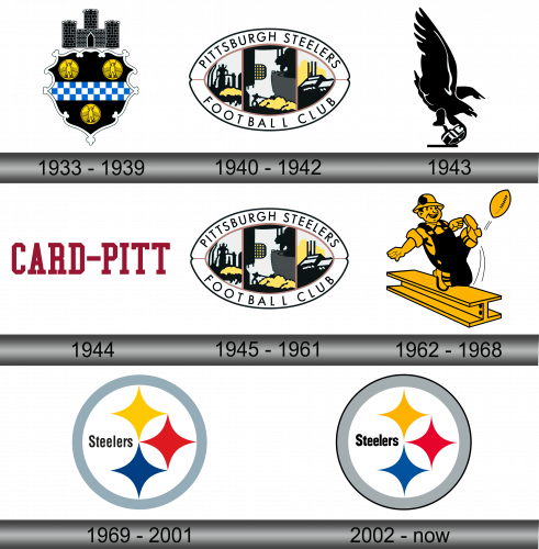
1933 – 1939
The initial emblem for the Pittsburgh Pirates mirrored the city’s official emblem. This design resembled an intricate armorial bearing, stretching out like an “elongated hide,” showcasing a three-spire fortress atop. Incorporated within this emblem were three golden discs adorned with soaring eagles. Such elements, borrowed from the U.S. Great Seal, symbolized generosity, supremacy, and strength. A broad band, patterned with a blue and white chessboard design, adorned the emblem’s center. Its backdrop was of a deep ebony hue.
1940 – 1942
Upon transitioning to the moniker “Pittsburgh Steelers,” the team felt compelled to revamp its visual identity. The freshly conceived Steelers insignia embraced an oval contour, mirroring the silhouette of a traditional American football. Within this contour, one could discern the outlines of industrial steel mills, complete with billowing chimneys, a molten metal workshop, and a figure representative of a steel laborer. These illustrations possessed a somewhat nebulous and hand-drawn quality. Encircling the oval, a pristine white boundary stood out, which housed the team’s name in a dark, cursive script. The bold “Pittsburgh Steelers” was positioned at the top while the phrase “Football Club” anchored the design below. The emblem sought to encapsulate the rich industrial heritage of the city, paying homage to its hard-working populace.
1943
In the year 1943, an unexpected amalgamation occurred between the team and the Philadelphia Eagles, leading to the birth of the “Phil-Pitt Eagles.” This marked a groundbreaking moment for the franchise, as it decided to forgo its signature gold hue. The emblem for that year showcased a raven-hued eagle, wings outspread in mid-flight, clutching a similarly dark helmet within its talons. The design’s intricate details were highlighted by irregular white strokes. This somber color scheme and imagery resonated deeply with the weighty sentiments of the World War II era, reflecting the global turbulence and uncertainties of those times. The emblem stood not just as a representation of a sports team, but also as a mirror to the prevailing mood of an era marked by conflict.
1944
In the subsequent year of 1944, the team underwent yet another amalgamation. This time, they combined forces with the Chicago Cardinals, giving rise to the name “Card-Pitt” for the Pittsburgh Steelers franchise. The revamped moniker played a pivotal role in the redesigned logo. Against a pristine white backdrop, the words “Card-Pitt” were inscribed in a deep, rich crimson hue. The typography used was reminiscent of a bygone era, with its bold vintage lettering adorned with broad, straight-edged serifs. Interestingly, every letter proudly showcased these defining serifs, with the singular exception of the letter “C,” providing a subtle unique touch to the overall design. This emblem encapsulated the essence of two distinct teams coming together, showcasing unity while still paying homage to their individual identities.
1945 – 1961
By 1945, the organization decided to stand independently once more. Reverting to its previous moniker, “Pittsburgh Steelers,” the club also reinstated the emblem used from 1940 to 1942. The signature logo of the Pittsburgh Steelers displayed a symmetrical, spherical design, effortlessly intertwining the essence of American football with the robust steel-manufacturing heritage of Pittsburgh. This emblem wasn’t just a symbol for a sports team; it captured the heart and spirit of a city known for its grit and industrial might. The fusion of these elements underscored the intertwined nature of sport and culture, suggesting that the resilience seen on the football field was akin to the perseverance demonstrated by the city’s steelworkers. The emblem, in its simplicity, conveyed layers of meaning and history.
1962 – 1968
In 1962, a fresh emblem made its appearance. The earlier intricate design was succeeded by an image of a steelworker playfully kicking a football. This rendition for the Pittsburgh Steelers showcased a whimsical portrayal of a steel laborer outfitted in typical work attire: sturdy boots, a work shirt, a coverall, and a safety helmet. The jovial figure, with a grin on his face, poised himself on a steel girder, one leg arched back, the other extended in readiness to strike the football. The vibrant mustard-hued depiction was accentuated with a bold black outline. This design not only brought forth the football spirit but also subtly acknowledged the hardworking essence of the city’s steel industry, bridging the gap between sports and local culture.
1969 – 2001
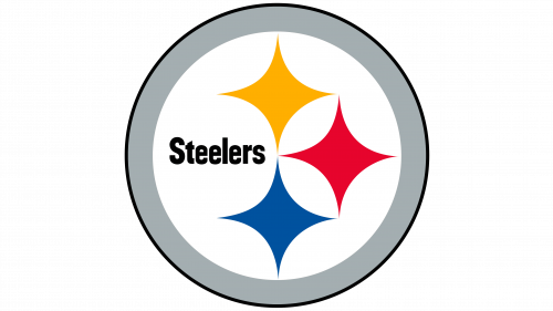
In the year 1969, Republic Steel, a company rooted in Cleveland, proposed that the Pittsburgh Steelers adopt the American Iron and Steel Institute’s emblem as their own. Originally crafted by the Pittsburgh-situated U.S. Steel entity, the logo initially bore its creator’s name. However, the team’s proprietors were determined and successfully secured the AISI’s approval to append “ers” to “Steel.” This modified text found its place towards the left-center of the design. On the emblem’s right side, three distinctive astroid stars, or hypocycloids, showcased themselves. These stars, taking the form of contoured diamonds with pronounced vertices, flaunted colors of yellow, azure, and crimson. Symbolically, they represented the notion that steel would illuminate both diligent labor and relaxation, expanding the possibilities presented by the surrounding environment. All these components were gracefully encased within a luminous silver circlet, binding the design into a cohesive whole.
2002 – Today
The emblem introduced for the Pittsburgh Steelers in 2002 showcases minimal changes from its predecessors. The hues now possess a more vivid intensity, and a deep slate ring is accentuated by a bold ebony outline. The Astroids stand as symbols for the fundamental ingredients in the steel-making process: vibrant gold represents coal, crimson signifies iron ore, and cobalt blue denotes scrap metal. These color associations are customary within the steel fabrication domain. The Astroid emblem’s brilliance isn’t merely a design choice; it’s a reflection of Pittsburgh’s essence. The city, renowned for its abundance of steel factories, deeply influenced the logo’s conception, making it resonate with both history and industry.
