Playstation Logo
Playstation is a major game platforms’ brand of Sony. If you need to play videogame with a controller on your TV staying on your bed, you will find Playstation as the best platform for yourself. Many games for you and your family which use all the features of the console make your game experience even funnier.
Meaning and History
The product’s history begins in 1988 when Nintendo Corporation in collaboration with Sony created the prototype of Playastation 1. Soon after, the companies had disagreements about the project and Nintendo break out of the affair.
The bosses of Sony and Nintendo could not agree upon the way the revenue will be split. A few years after, in 1993 the Playstation was eventually introduced.
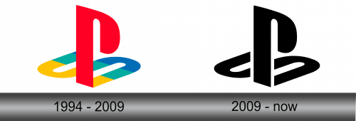
The initial logo, which was shown in 1994, described the familiar PS symbol we all know nowadays. It is quite interesting that the company had at least 20 different versions of the logotype to choose from, but the marketers’ eye had stopped on the well-known letter ‘P’ and perpendicular ‘S’.
1994 – 2009
The original PS logo had a letter ‘P’ which was colored in red and had unusual design standing right on the perpendicular ‘S’, which was laying almost horizontally and had a yellow, green and blue colors in every third of the letter.
Optic illusion gave the logo a little bit of volume, made it look more serious and minimalistic even though the colors were bright.
2009 – Today
The new logo designed by Japanese artist Manabu Sakamoto (An author of Sony’s emblems) in 2009 in a new style. It had a little difference in the structure: the letter ‘S’ was split in two parts on different sides of ‘P’, while saving the optical illusion.
However, the color structure was changed: there weren’t any of them except dark black. It was motivated by the author’s desire to give the logo the maximum minimalism and simplicity as possible.
Emblem and Symbol
In the emblems of each console Sony and its designer Sakamoto kept to their selected style. The classic combination of the white text on black background catches your eye and make an impression of elegancy and minimalism
The font also makes you to look at the style the symbols are written: the letters look quite simple but unique, ‘T’ and ‘P’ are especially recognizable.


