PNC Logo
PNC Bank, part of the PNC Financial Services Group, stands as one of the leading US banks, offering an array of financial solutions. Spanning from personal banking, wealth management, to corporate services, PNC effectively meets diverse needs. Predominantly active in the Eastern US, its footprint stretches across 21 states. While it serves various markets, it retains a strong presence in areas like Pittsburgh, its birthplace. As a publicly traded entity, PNC is owned by shareholders, with its stock listed on the NYSE. The bank continually evolves, seeking to blend traditional banking with innovative financial technology.
Meaning and history
PNC Bank’s origins trace back to 1852, with the founding of Pittsburgh Trust and Savings Company in Pittsburgh, Pennsylvania. Through the years, mergers and acquisitions paved its growth path. In 1959, the bank merged with Provident National Corporation, leading to the coining of its present-day name, PNC.
The late 20th century saw PNC expand its reach. In 1982, it acquired Citizens Fidelity Bank and Trust Company. Later in the 1980s, the acquisition of Central Bancorporation and the formation of a holding company further solidified its stature.
PNC’s growth strategy leaned heavily on acquisitions. Significant ones included the purchase of Riggs National Corporation in 2005 and the retail banking segment of Royal Bank of Canada’s US operations in 2011. This move deepened PNC’s presence in the Southeastern US.
In recent history, PNC’s acquisition of BBVA USA in 2020 was a landmark, making it the US’s fifth-largest bank by assets. This deal emphasized PNC’s commitment to national growth, bolstering its position in newer markets like Texas and California.
Throughout its journey, PNC has transformed from a regional bank to a national banking powerhouse. Shareholders have witnessed this evolution, with PNC being publicly traded for much of its existence. Mergers and expansions aside, PNC’s core commitment to serving customers and embracing innovation remains unchanged.
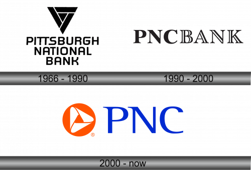
1966 – 1990
Back in 1959, the amalgamation of Peoples First and Fidelity Trust Company birthed the entity known as Pittsburgh National Corporation. The emblem that represented this novel financial behemoth was multifaceted. At its core was an azure inverted triangle, symbolizing the famed Golden Triangle of Pittsburgh. This moniker is colloquially used for Downtown Pittsburgh, a bustling hub that’s home to numerous international corporate giants.
Encased within a sunlit yellow quadrilateral was the triangular form. Right beneath this figure, imprinted in a deep shade of blue, the words “PITTSBURGH NATIONAL CORPORATION” sprawled over three distinct rows, announcing the corporation’s powerful presence.
1990 – 2000
The PNC Bank logo is a masterclass in typographical elegance and simplicity, embodying the timeless values and integrity associated with financial institutions. Rendered in a pristine black hue, the logo consists of the letters “PNC” seamlessly followed by the word “BANK”.
Upon closer examination, the typography employed is noteworthy. The characters are set in a classic serif typeface, which adds a touch of formality and authority. Serif fonts have long been associated with tradition, reliability, and trustworthiness—qualities that are paramount in the banking industry. The letters’ weight is consistent, projecting stability, a foundational pillar in the world of finance. The spacing between the characters is meticulously calibrated, ensuring legibility and preventing any visual clutter.
The decision to maintain a monochromatic palette further underscores the bank’s commitment to straightforwardness and transparency. By abstaining from flashy colors or intricate designs, PNC Bank ensures its identity is immediately recognizable and communicates a message of confidence and professionalism.
2000 – Today
In 1982, a pivotal shift in Pennsylvania’s legislation paved the way for statewide banking services. Capitalizing on this transformative moment, Pittsburgh National joined forces with Provident National, birthing the PNC conglomerate. The iconic triangular motif was bequeathed to this new entity, albeit with a revamped aesthetic. A fresh coat of pristine white adorned the emblem, its angular edges now softened and its central lines acquiring a gentle curvature.
This evolved triangle found its home within a radiant orange orb. The bank’s nomenclature gracefully encircled this design, stepping out from its geometric confines. While the hue of the lettering echoed the deep blue of the erstwhile Pittsburgh National Corporation insignia, its typography underwent a metamorphosis — the characters now sported elongated, razor-sharp serifs.


