Porsche Logo
Porsche is a historically German firm that has always operated in Stuttgart. It is considered to be among the most successful auto manufacturers. Porsche owns one of the greatest modern car manufacturing plants, which is located in Leipzig. The models found under this brand range from high-end sports cars, including cars with a V-shaped engine, to crossovers and sport utility vehicles (SUVs).
Meaning and History
An engineering company abbreviated as “Dr. Ing. h.c. F. Porsche AG” was founded in 1931 by the famous designer Ferdinand Porsche. Since then, this company has been successfully manufacturing luxury German sports cars. In the postwar years, it resumed work on passenger cars. In 1972, Porsche went public. The company’s first SUV was designed in cooperation with Volkswagen in early 2002. Even today, the activities of Porsche are closely linked with the Volkswagen Group, which owns almost a controlling stake in the company. The Porsche family owns a large portion of the remaining shares.
What is Porsche?
Porsche makes premium sports vehicles and SUVs for people who value reliability and stunning appearance. The unique design and characteristics of cars created a well recognizable company’s image.
1922 – 1938
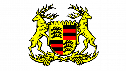
To signify its roots, the brand used the coat of arms of the Free People’s State of Württemberg as the basis for its logo. It had two standing deer facing outwards on both sides of the shield. They are standing on two branches that are placed under the shield and go to the right and left. The shield has a pattern at the top that resembles a crown. It is divided into four sections with three black deer antlers diagonally opposite of each other and red and black stripes in the other two sections. Besides the black and red stripes, the main color is yellow with black being used for outlines and details.
1938 – 1948
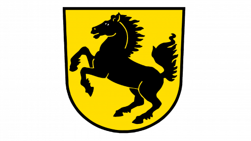
The new logo has just as a powerful feel as the previous one, although it is much simpler. It is a yellow shield with a black border. Inside, it has a silhouette of a black horse. The animal is standing on its back feet with its tail turned up. The colors and image choice reflect the strength, power, and energy of this brand.
1948 – 1952
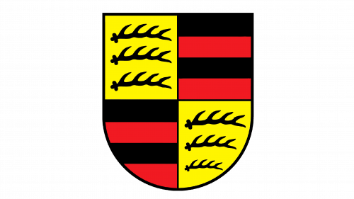
The shield from the original logo was used separately for a short period of time. There was no crown-like pattern at the top or the double border. The antlers were redrawn to look thinner.
1952 – 1963
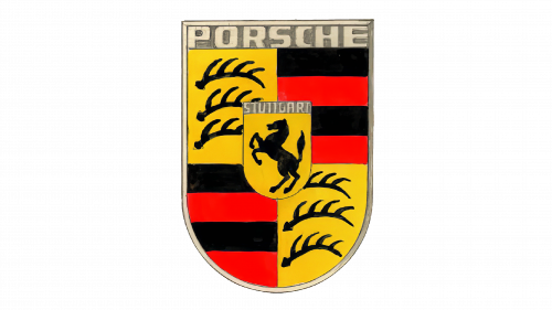
The logo was updated by adding a prancing horse emblem similar to the one used before in the center of the shield with antlers and stripes. Right above the small shield with a horse, there was a gray stripe with the word “Stuttgart” done in an off-white color, which pointed to the historical roots of the brand. The main shield also got a gray top with the word “Porsche” done in uppercase letters similar to the other inscription. The black border around the shield was replaced by a thin double gray border with off-white in the center. The emblem looked hand-drawn.
1963 – 1994
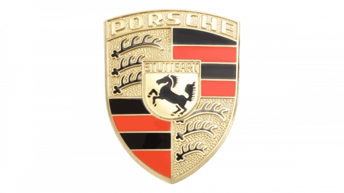
The logo was given a metallic appearance. It looked as if the shield was real with the yellow being replaced by golden and red by burgundy. The top of the shield was rounded instead of a straight line. Golden lines were added between the lines and the four sections of the main crest. The smaller shield had the black border moved slightly inward, which created a double border. The antlers also got a golden outline. The antlers, border, name, and shield with a prancing horse had a 3D appearance. Overall, it had a very high-end, professional look, which was very appropriate for a luxury car manufacturer.
1994 – 2014
In 1994 the Porsche badge was redrawn in flat style, with all the gradient shades removed. The new color palette consisted of dark and deep shades of yellow and red; with the thick black outlines of all elements. The uppercase logotype on top of the crest was rewritten in thick black lines, balancing the composition and making up a more professional and distinctive look of the crest.
2014 – 2023
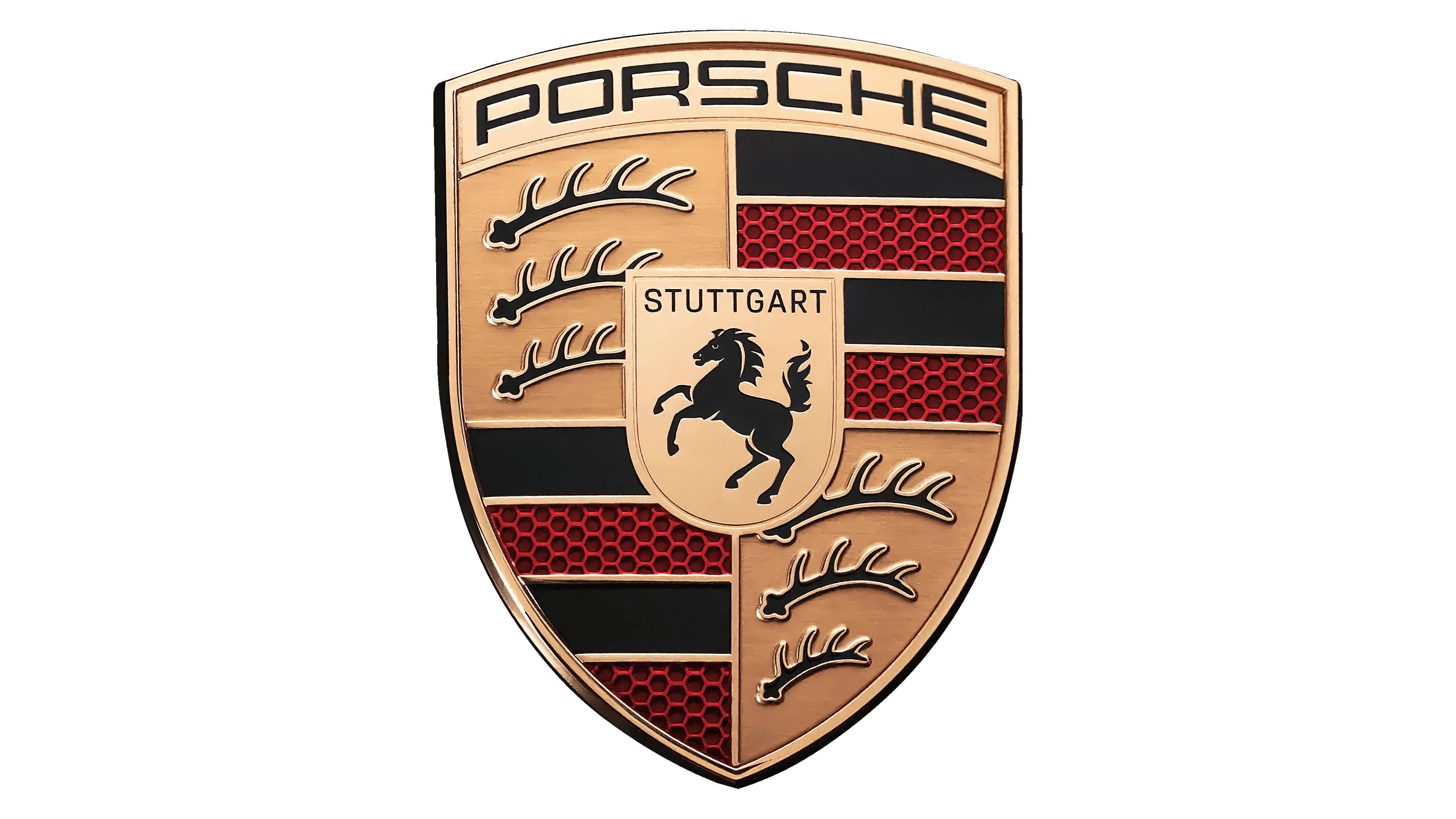
The redesign of 2014 has introduced a refined version of the Porsche badge, which is somewhat in between the two previous versions. The crest became voluminous again, with the yellow shades replaced by glossy gold, but the black contouring and lettering remained.
2023 – now
Porsche brought out the updated company logo in 2023. Unless you closely monitor the brand and the news, this might be surprising as the logos look almost identical. However, when placing the two emblems side by side, one will see that there is now a honeycomb structure in the red sections. The brushed metal finish gives it a more sophisticated look. The updated logo reflected the fact that the brand is loyal to its traditions.
Font and Color
Since the name was used only in two versions of the logo, the designers did not have a lot of different fonts. The current font is a modern sans-serif typeface. An off-white color for the brand name was replaced by gold and later black. The word “Stuttgart” was initially off-white and later black. It was also done using a grotesque font. Throughout the years, yellow/gold, black, as well as red/burgundy were the main colors of the brand.
