Ferrari Logo
Ferrari is the name that is associated with fast and stunning cars that originated in Italy. They set records on racetracks and attract attention anywhere they are. These legendary cars are the dream of Enzo Ferrari, who managed to turn a childhood passion into reality by creating racing cars. It was not easy and for many years, Enzo Ferrari was a simple racer and had no company of his own. Ferrari was constantly experimenting and never completely satisfied. His cars came in all shapes and sizes. Ferrari was interested in beauty, but the main driving force has always been the desire to win.
Meaning and History
![]()
Ferrari, which started out as a racing team created by Enzo Ferrari in 1929, managed to become one of the most famous automotive brands in the world. The company created the first car in 1940. However, the year 1947 is traditionally recognized as the beginning of this brand, when the first car under the Ferrari brand was completed. After the Ferrari cars gained a great status in the sports world, Ferrari considered producing cars for the larger public. It was under the complete control of Fiat for a long time but in 2016 regained independence.
What is Ferrari?
This is a legendary automotive brand. It was brought to the world by Enzo Ferrari, who was a passionate car racing enthusiast from a young age.
1923 – 1929
![]()
The earliest logo of the famous company was done in metallic silver color that added a touch of glamour, grace, and innovation. It consisted of a shield with a slightly caved-in top and smooth rounded bottom. The emblem had only a drawing of a prancing horse. The horse had a three-dimensional appearance that enhanced a sleek and sophisticated overall appearance.
1929 – 1931
![]()
The symbol of the aviation hero during WWI was a prancing stallion, which Enzo Ferrari later used as the emblem for his cars. According to some versions, it was the wife of Enrico Barakka and the mother of the national hero who suggested adding a black horse for good luck. It was placed on a yellow shield with a black outline. At the top of the shield, the border also had white and red lines, which added a great accent to the whole emblem and brought some of the colors of the Italian flag. To the right and left of the stallion, there were letters “S” and “F” that stand for “Scuderia Ferrari”.
1932 – 1940
![]()
A few modifications were made in 1932. The most noticeable change was the shape of the shield as it had a pointed top, so the multicolored banner at the top followed this triangular shape. The border was also significantly thicker just like the initials at the bottom. There was a version that featured a thinner border and lettering, like in the previous logo, as well as a horse that had fewer white highlights, which made it appear slightly bigger.
1940 – 1945
![]()
A shield was replaced by a round emblem. It was yellow with another circle inside that had a red and yellow gradient and resembled a sun. The stallion was redrawn and now looked like a black horse that spread its wings. There was an Italian flag under each wing. Above and below the horse, there was an inscription “Auto-Avio Construzioni” done in all uppercase black letters. It looked just as impressive as the original logo.
1945 – 1947
![]()
There were several versions of the logo that the company used during this period. It was during this time that the company introduced the vertical rectangle shape of the logo that most are familiar with today. The two rectangular versions mainly differed in the thickness of a multicolored banner at the top as well as the “Ferrari” inscription at the bottom. There was also a version that had an arched top, which made it more relative to earlier emblems. The overall look, though, was very similar. It is obvious that the company was testing a new identity while trying to preserve the brand image that became well-recognized.
1947 – 1951
![]()
The first rectangular Ferrari badge was introduced in 1947 and stayed unchanged for about four years. It was a vertically oriented plate with rounded angles, with the black horse set on a solid yellow background. The Italian flag on the top of the logo was very narrow and almost unnoticeable, but the black “Ferrari” inscription in its iconic style was written under the stallion and worked as the basement of the whole composition.
1951 – 1960
![]()
The redesign of 1951 made the Ferrari rectangle straight and strict. Now when the angles got sharp, the flag on top of the logo became wider and brighter. As for the main hero of the badge, the stallion, it was redrawn more elegantly and got a bit smaller, gaining bold silver outlines. As the badge became slightly narrowed, the “Ferrari” lettering had to be refined as well. The inscription became condensed, and each letter got outlined in silver too.
1960 – 1981
![]()
It was not the first time that the company introduced very minor modifications to its logo. Unless you place both versions next to each other, you might not even notice the difference. Otherwise, you will realize that the logo has a different, darker shade of green. In addition, the horse’s tail as well as its mane looked more refined.
1981 – 2005
![]()
In 1981 the Ferrari logo gets refined again. This time the yellow rectangle with the black horse on it got a pretty thick silver frame. All of the elements remained in their places, but the color palette of the logo was intensified, so now everything looked stronger and more confident. The silver outline of the stallion almost disappeared, so with more black shades, the badge became brighter.
2005 – 2010
![]()
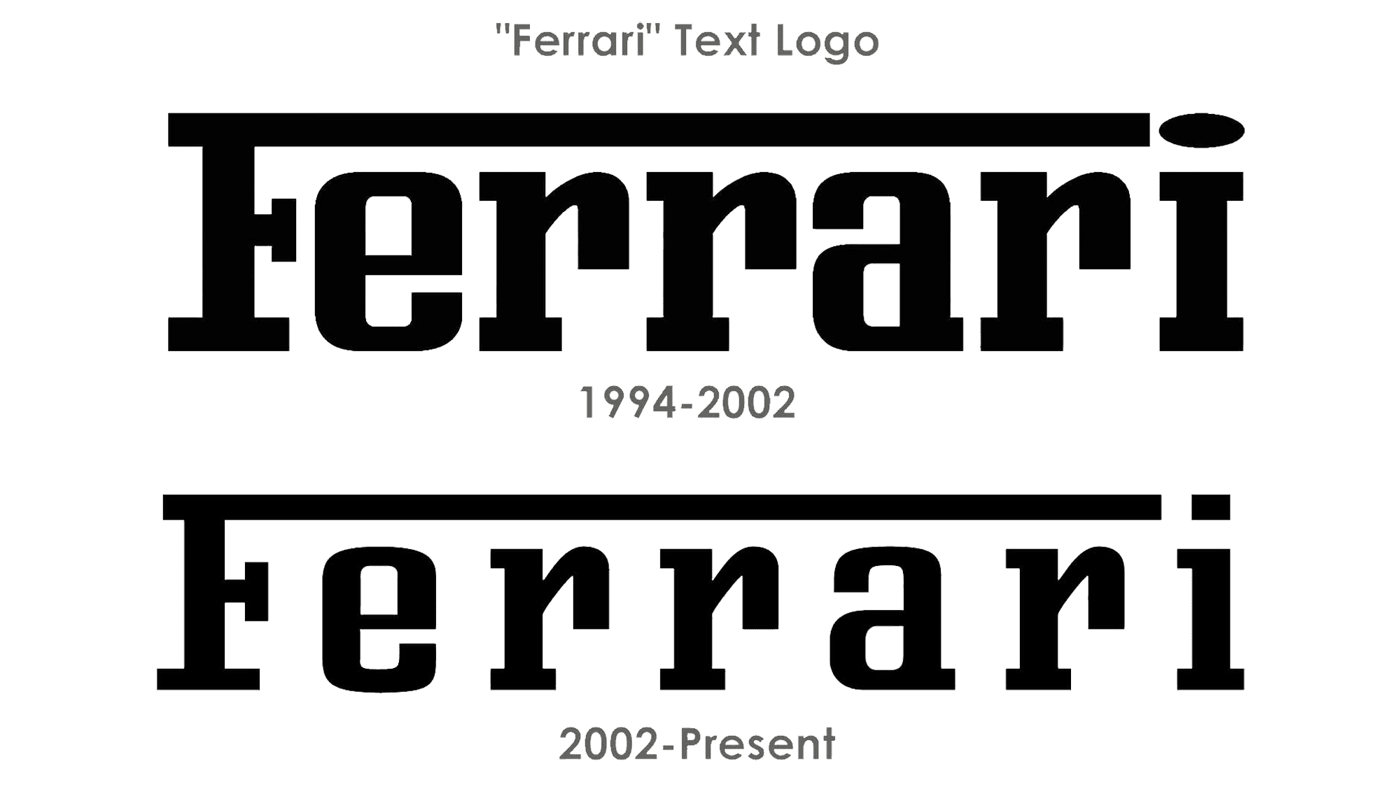
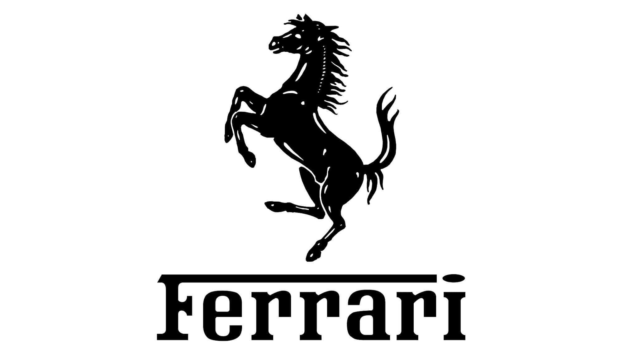
A familiar black stallion was brought back, although now it looked stronger and sleeker. It was set on a yellow vertical rectangle with rounded corners and a thin black border. At the top of the shape, the rectangle had three lines that represented the colors of Italy and were separated by black lines. Under the stallion, the emblem had the name of the company – Ferrari. It had a classic typeface with serifs and the top line of the letter “F” was stretched across the whole word. It was done in black that went great along with the black horse.
2002 – Today
![]()
The horse on the logo was redrawn, although the changes were so minimalistic that not everyone would notice it right away. In addition, the designers removed the black lines that separated three colored strips at the top. The yellow background was not as bright, but the horse still contrasted beautifully against a warm background.
Symbol
Ferrari has a horse emblem that is among the most well-known. A standing upright horse is shown in the company’s emblem. The black and yellow create an eye-pleasing contrast and reflect the energy and power of the brand. Despite this, everyone is aware that red is the brand’s distinguishing color. A strong animal represents perseverance, strength, and resilience. Count Francesco Baracca, who was a renowned pilot during World War I, originally drew the horse emblem on his aircraft.
Emblem
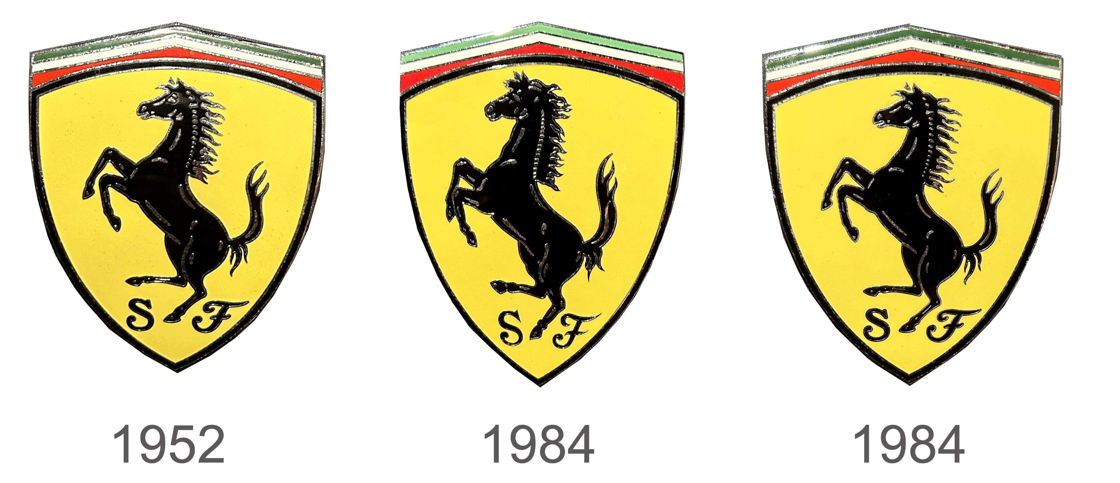
1952
One of the most prominent brand identities in history is that of Ferrari. The aircraft of Francesco Baracca, a pilot of the French Air Force, is where the horse symbol for Ferrari automobiles originated. The emblem is also distinguished by the horizontally elongated tricolor of Italy and the canary background, which Enzo borrowed from the yellow half of the flag of his hometown. The company headquarters were very close to Modena and still has not changed its location.
1984
Unless the viewer is a fan of Ferrari automobiles or has both versions of the logo placed next to each other, it might not be obvious that a new design of the emblem was developed. The changes consisted mainly of a different, more powerful and grand appearance of the horse. The initials were also printed using a different font.
2000
The well-recognized emblem created in 1952 has returned at the beginning of a new century. The company kept it exactly the same, which made it obvious that the company is still creating the legendary automobiles that made it renowned across the globe.
Font