Premier League Logo
The emergence of the Premier League is a result of a large number of circumstances. But at some point, everything came together to create the richest and most successful football league in the world today. The Premier League is a professional football league for English football clubs. It is the top division in the English football league system. Each team has the opportunity to play 38 matches during the tournament, which begins at the end of the summer and lasts until May.
Meaning and History
The Football Championship of England is the oldest national championship. In 1885, the Football Association (FA) was created, and football became a professional sport in England. Three years later, the Football League was founded. In 1992, the English Premier League was born under the name of the Football Association Premier League. It took the First Division’s position as the top football league in England. This was done in order to reap more financial rewards once the First Division teams made the decision to leave the Football League. The Premier League has since grown to be the most renowned and successful sports league.
What is Premier League?
The English Premier League is a professional football league in which football clubs in England and a number of clubs based in Wales try to prove that they are the best. Although it officially appeared at the end of the last century, its predecessor was established back in 1888.
1992 – 2007
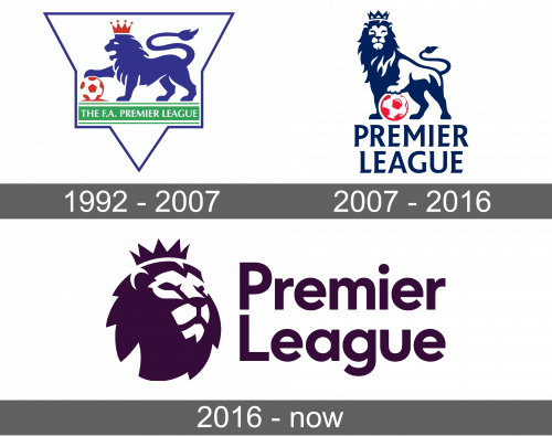
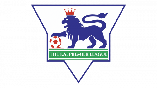
A blue lion with one of its feet on a football was the main element of the original emblem. It was a symbol of power, leadership, strength, and courage. A red crown on its head was a confirmation of that. The side view of the animal did not have many details and looked more like a solid silhouette. The football was done in white and red, which went great with the crown. Under the animal, the emblem had “The F.A. Premier League” written in all uppercase, white letters. The inscription was done on a grassy green banner, which represented the field, with two thinner lines above and below for more interest and statement.
2007 – 2016
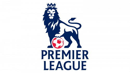
The new emblem preserved the same idea with a blue lion holding a red football. In this version, the lion was facing forward and looked more realistic. It was a darker shade of blue and had white highlights. The crown was also done in dark blue and looked smaller, although it did not diminish the mighty look of the king of animals. The inscription at the bottom stated “Premier League”, which was written in two lines using all uppercase letters and modern font with serifs.
2016 – Today
The updated version still stayed true to its origins, but this time, it was only the lion’s head with a crown that adorned the emblem. The animal was facing right and had a very serious look. It was placed to the left of the name. The latter was written in two lines again but featured a different font. The color of the whole logo was changed to a dark purple that looked almost black. Although there are no more original colors or the football image, the emblem stayed quite recognizable.
Font and Color
Initially, the font was quite basic without serifs. A different thickness of lines, though, kept it from being boring. The next font was a lot fancier with pointy serifs and diagonally cut ends. A rounded sans-serif typeface was used for the last logo. It looks simple, yet, formal and sleek. When it comes to colors, the league was also quite reserved. It used classic colors, such as blue, white, and purple, along with some red to symbolize the power, energy, and strength of the league.
