Rangers Logo
One of the oldest clubs in Scotland when it comes to football is known as Rangers. Like many other teams, the Rangers have gone through periods of success, when the stadiums were full of their fans, and times when they were at the very bottom and only had the most loyal fans still supporting them. Nonetheless, it made a name for its country by winning most championship titles.
Meaning and History
![]()
The brothers Moses and Peter McNeil, along with Peter Campbell and William McBeath, four professional football players, formed their own team in 1872. They gave their club the name “Rangers” after randomly seeing the word in a book. Although the first game was played in May of that same year, the team was formally established only a year later. When the Scottish Football League was established in 1891, Rangers joined it. They went through bankruptcy procedures in 2012 and were ultimately placed in the fourth division of the country. However, they climbed back to the top despite everyone’s doubts.
What is Rangers?
This is a football club based in Glasgow. It is also the most titled football club in Scotland in terms of the number of championship titles won and one of the oldest football clubs in the Scottish Championship.
1959 – 1968
![]()
A heraldic shield of dark blue color with a lion image inside was the center of the logo. The lion was a golden color which was complimented by the golden frame and details of the shield. Under the lion, it said “Ready”. The shield was placed on a circular base with a white center and red border. The full name of the club was written in all uppercase, golden letters on the red border.
1968 – 1991
![]()
This version looks very similar to the original one, yet it is very unique. The circular base is now completely white with only thin black borders. The name was now done in black and lost the article in front of it. The heraldic shield was replaced by a ball that was a light blue color with white lines. The lion on the emblem now had a red color and looked courageous.
1991 – 2020
![]()
The whole logo now was done in blue with white background. The only other color was a red lion. In this version, it looked even more daring. The name inscription was done in a similar way but the letters were wider. The border was now also thicker, which added boldness to the overall appearance.
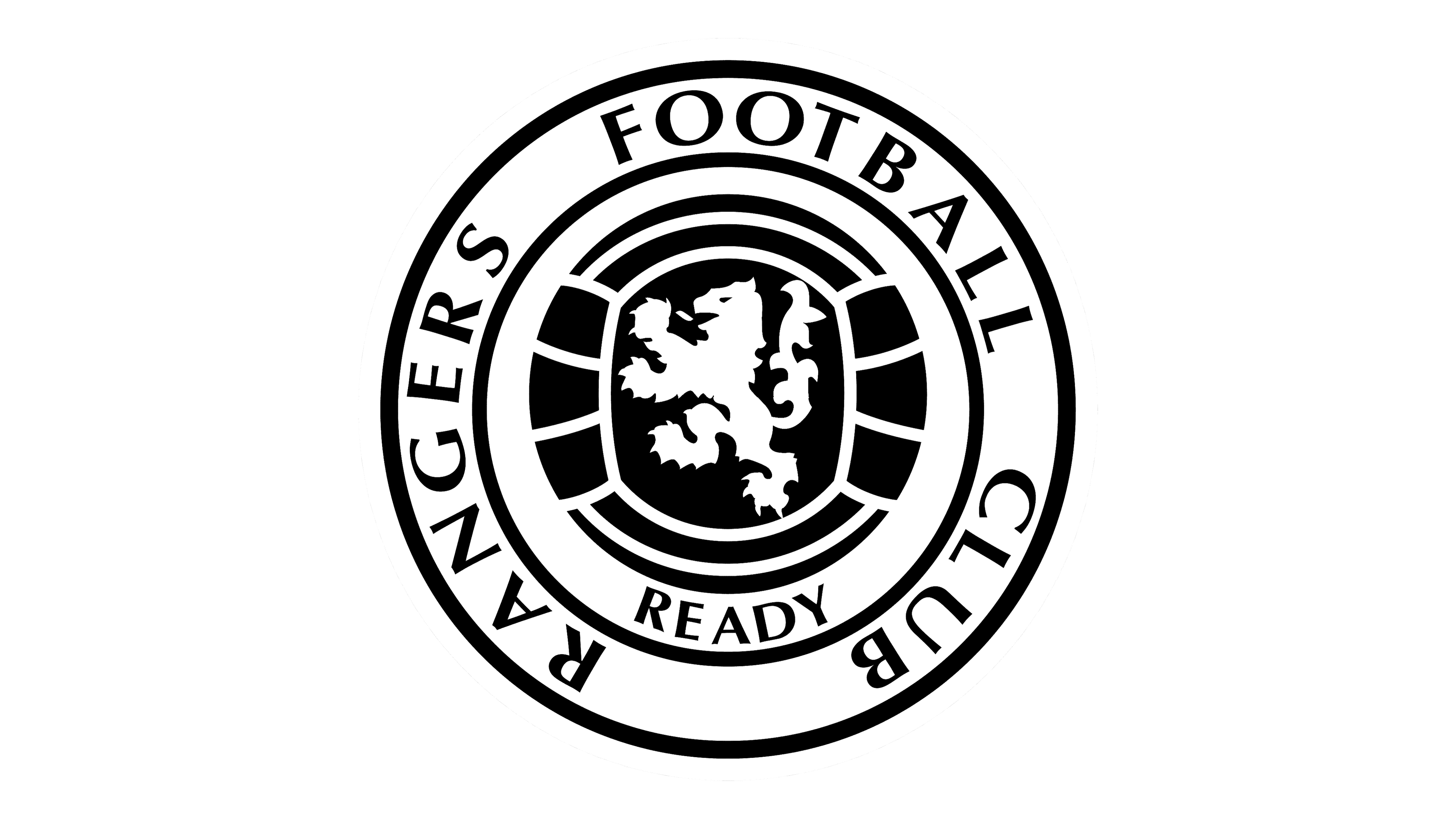
2020 – Today
![]()
The designers from Sea Saw decided to get the ball to fill the whole center. The name inscription was not only bolder but also positioned differently. The “Rangers” was written at the top, while “Football Club” was placed at the bottom of the white border around the blue ball. The red lion was also redrawn to look even more powerful and proud. The new logo definitely looks more modern.
Font and Color
The team has always used a bold, sans-serif font. The most recent typeface was a custom one. It featured smooth lines and elegant, pointy ends and corners. Red and blue have always been part of the club’s logo. They stood for power and strength, as well as their determination to achieve great heights no matter the challenges. The white and black served as basic colors.


