Royal Crown Cola Logo
Royal Cola is an old brand of American soft drinks. Although seems like a rip-off of the famous Coca Cola, Royal Cola is just partially unoriginal. The creator actually wanted to use legally bought Cola syrup for it, but failed and decided to create his own formula to beat the competition.
Meaning and History
The first successful Royal Cola drink started selling in 1905. Back then, it was something closer to ale or root beer rather than what you’d think of a cola today. Over time, they improve the recipe and eventually came closer to the sugary drink that is Coca Cola. And then they were bought off by Dr. Pepper.
1905 – 1930
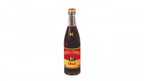
Initially, the brand didn’t have any sort of logo, but they did decorate their bottles in the specific way. They’d usually take the two yellow letters ‘R’ and ‘C’, put them onto a black square and place it in the middle of a bicolor red and yellow label. The top of this label said ‘Royal Crown’ in yellow, and the bottom said ‘Cola’ in red.
1930 – 1970
The 30s logo was the first real emblem they had. It was a wide red rhombus with white lettering inside that said ‘Royal Crown Cola’ in two lines. Additionally, they placed a white crown image on top of this text. It could be inspired by the Coca Cola’s own emblem at the time, but it’s unclear.
1969 – 1989
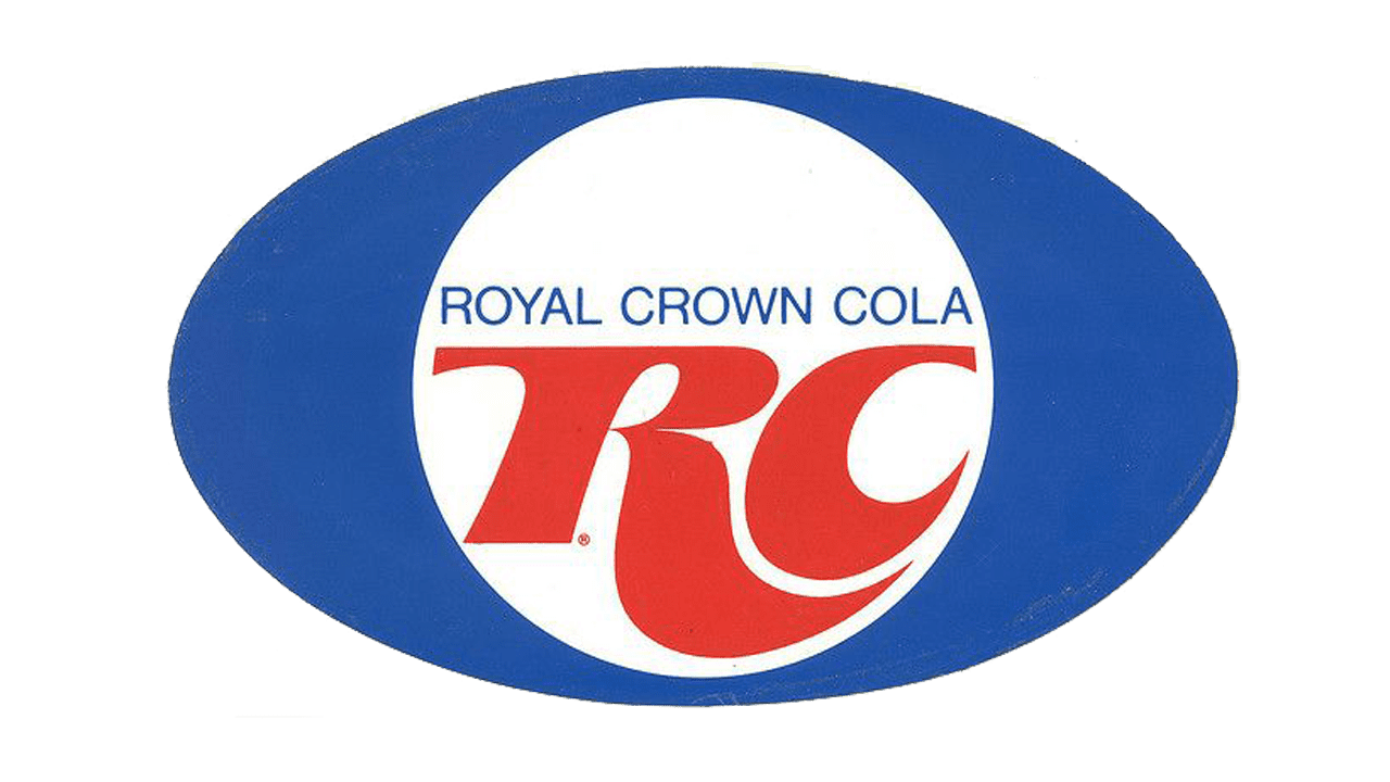
The 1969 logo depicted a blue oval with white circle rammed right into its middle. For the name inscription, they returned to using the ‘RC’ acronym, although not fully. They still had ‘Royal Crown Cola’ written right above the main written part in blue thing letters.
The ‘RC’ acronym, for its part, was red and depicted using disproportioned, bloated style of letters.
1982 – 1985
The secondary logo they introduced in 1982 used the big red emblem from before, although this time they skewed it and gave it a trail of blue and turquoise sticking out of its left side, as if it’s flying through the air. The last touch was the addition of the blue ‘Royal Crown Cola’ inscription in thin, capital letters above the main acronym.
1989 – 1998
In 1989, they decided to just use their ‘RC’ design and not much else. They actually decided that it stands for ‘Royal Crown’, and not ‘Royal Cola’, because they added a small word ‘Cola’ in white right below the acronym.
As for the acronym, the design also changed a bit. Namely, the letters became much better proportioned. They are still cartoonish and bloated, but at least there are no appendage parts the size of the rest of a letter.
1998 – 2009
They reused the ‘RC’ part without the ‘Cola’ below, colored the letters white, but kept the underline from the previous design red. That being said, they rearranged everything again, but not terribly so. You can still see that it’s pretty much the same emblem.
2009 – today
It was followed by another slight rearrangement. In particular, the letters became even more proportioned and more mundane this time, and the underline changed positions again. They also added the ‘Cola’ part from below. Other than that, it’s the same logo.
2009 (USA)
The 2009 American-exclusive emblem was mostly the old bloated acronym, except they added a lot of glint to it and added the white, blue-outlined inscription above it. There was the full name in the same font and the ‘est. 1905’ part in the blocky, plain style’. Above it all, they put a white crown, also with blue outline.
2018 – today
As a secondary logo, they introduced the one they used in the 70s without any change, except maybe for the coloring. Here, it’s a bit paler.
Emblem and Symbol
Most of the emblems, including the various evolutions of the ‘RC’ symbol, are used with the blue background. That’s actually the main color this brand uses, and you can often see the versions of this logotypes with specifically added blue squares for reference. Moreover, all the cans of Royal Cola use this one for coloring.
