Safari Logo
Safari is a web browser developed by Apple Corporation on January 7, 2003. It is now the second-largest user in the world.
Meaning and history
The name Safari for the browser was not immediately approved. The “draft” name of the project was Alexander, under which he went through all the stages of development and testing. Then there was the idea to name the browser “Freedom”. However, the idea fell through due to the fact that in the United States the name was associated with a popular series of feminine hygiene products. A little brainstorming and the name Safari was born.
During its long existence, Safari has changed its logo more than once, but the original idea has remained unchanged.
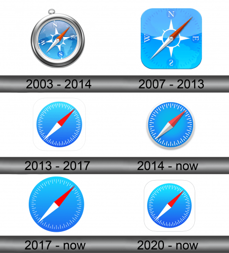
2003 – 2014
The original Safari logo is a three-dimensional model of the compass. It has a massive silver frame and sky-blue dial. Above, can be noticed a special ring, with which the compass is usually attached to a chain. The compass image is tilted slightly to the left and the red arrow points towards the northeast.
2007 – 2013
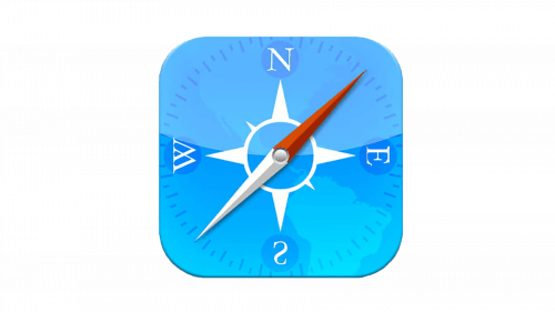
The logo was updated in 2007, but there were no global changes. However, the image of the circular compass disappeared, only the dial remained. The badge got a square shape with rounded corners. The direction of the arrows remains unchanged.
2013 – 2017
In 2013, the logo was further simplified. The letters indicating the cardinal points have been removed. All that remains is the compass needle and the dial itself.
2014 – present
The 2013 logo was slightly redesigned in 2014. In particular, a silver frame was added and the divisions also became silver.
2017 – present
The logo created in 2017 looks almost the same as the logo of 2013. The only difference is the lack of a silver frame.
2020 – now
In 2020 little modifications happened one more time. The dial color has become lighter blue. The form has also been changed to a square one with rounded edges.
