San Diego Padres Logo
The San Diego Padres are a professional baseball team based in San Diego, California. Competing in Major League Baseball (MLB) as a member of the National League’s (NL) West Division, they were founded in 1969. Despite their early struggles, the Padres have made multiple playoff appearances and reached the World Series twice. Playing their home games at Petco Park, the team boasts a navy and gold color scheme. Known for their passionate fanbase, the Friars, as they’re affectionately called, remain a key sports institution in the San Diego region.
Meaning and history
As part of the National League’s West Division, they embarked on their baseball journey amidst challenges. Their early years were marked by on-field struggles, but over time, the team carved out memorable moments.
By the 1980s, the Padres began making their mark. In 1984, they celebrated their first National League pennant, although they faced defeat in the World Series against the Detroit Tigers. Another high point came in 1998 when they clinched their second NL pennant, but the New York Yankees thwarted their World Series aspirations.
The late 1990s and 2000s saw shifts in ownership, with John Moores taking the reins in 1994, paving the way for the construction of Petco Park, their current home, which opened in 2004. The park, set in downtown San Diego, enhanced the team’s image and fan experience.
Several Padres players have made lasting MLB impacts, including Tony Gwynn, who spent his entire 20-year career with the team, earning eight batting titles and becoming one of baseball’s all-time greats. Another notable figure is Trevor Hoffman, whose tenure as the team’s closer earned him a Hall of Fame induction.
The 2010s brought about a renewed sense of hope, with fresh talents and investments aiming to revitalize the Padres’ legacy. While World Series glory remains elusive, the San Diego Padres persist as a cherished institution in the city’s sports tapestry, always in pursuit of the pinnacle of baseball achievement.
1969 – 1984
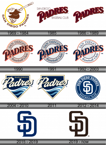
The initial emblem showcased a friar garbed in a rustic brown cloak, wielding a pristine white baseball bat with vigor. This iconic figure was nestled within a golden-hued ring. Beneath this central imagery, the team’s complete moniker was inscribed, rendered in a deep brown shade. This design not only represented the team’s name but also gave a nod to the rich historical and cultural ties of the region, blending sports with tradition. The choice of colors, especially the brown, was symbolic of the earthy tones associated with monks, while the yellow circle provided a vibrant contrast, encapsulating the energy of the game.
1985
The subsequent emblem had a brief lifespan of just a year, marking a shift to the team’s full designation. The term “Padres” was prominently positioned at an angle, occupying the central space in a rich, deep brown shade, complemented by a fiery red border. Surrounding this dominant word, in a more subtle black typeface, were the words “San Diego. Baseball Club.” This new design emphasized the team’s identity and location, connecting them closely to their home city. The contrasting color palette was chosen to highlight the name while providing a sense of depth and dimension, encapsulating the spirit and legacy of the team.
1986 – 1989
The words “San Diego Baseball Club” were omitted from the emblem, streamlining its appearance. Now, the focal point became the deep chocolate-toned “Padres” lettering, prominently featured at the design’s center. This revision emphasized simplicity and a direct connection to the team’s name. By eliminating the additional text, the logo became more straightforward and impactful, ensuring that the “Padres” branding was unmistakable and instantly recognizable, underscoring the team’s identity and heritage in the world of baseball. This transformation marked an evolution in the team’s visual representation, signaling a renewed sense of purpose and direction.
1990
The subsequent emblem showcased a muted grey circle highlighted by a vibrant orange border. Emblazoned upon this backdrop were the words “San Diego Baseball club.” Dominating the front and center was the term “Padres,” rendered in a typeface and hue reminiscent of the earlier design. This artistic combination harmonized the team’s rich legacy with a modern touch. The juxtaposition of the gray circle and the vibrant border illustrated the blend of tradition and freshness that the Padres aimed to represent. Through this evolution, the logo continued to uphold the spirit and dynamism of the baseball club, bridging past sentiments with contemporary flair.
1991
In 1991, the logo underwent a noticeable transformation in its color scheme. The previously gray ring transitioned to a shimmering silver, complemented by a striking blue border. The text embellished on this ring shifted to a deep navy hue. Moreover, the main title, once rendered in a rich dark brown, was reimagined in the same intense blue shade. This modification not only added a refreshing contemporary touch but also symbolized a new chapter for the team. The blue hues perhaps represented the vastness of the sky or ocean, resonating with the limitless possibilities and the depths of dedication that the team embodied in their journey ahead.
1992 – 2003
For over a decade following, the San Diego Padres sported a memorable emblem that underwent some vibrant color modifications. The previously silver ring adopted a pristine white hue, which was echoed in its central core. This core was punctuated by slender stripes of a deep navy shade. The complete moniker of the team, accompanied by the term “Padres,” was consistently showcased in this same navy blue. This design refresh infused a sense of rejuvenation into the team’s identity, symbolizing both continuity and evolution, a reflection of the team’s enduring spirit and its adaptive nature to the changing dynamics of the game.
2004 – 2010
In 2004, coinciding with their move to a new stadium, the club underwent a significant logo transformation. The design featured a pentagonal shape bordered with a golden-yellow trim. Inside this pentagon, there was a depiction of a deep navy sky transitioning into varying shades of blue waves, capturing the essence of San Diego’s coastal beauty. Tucked in the top right corner, the city’s name was subtly inscribed in a hue reminiscent of sun-kissed sand. Dominating the central portion, the word “Padres” was boldly presented in pristine white letters, accentuated with a delicate sandy perimeter, creating a striking contrast against the backdrop. This design not only marked a new chapter for the team but also celebrated the city’s unique maritime charm.
2011
In 2011, the primary shift in the emblem’s design was the omission of the term “San-Diego.” This decision emphasized the brand’s recognition, assuming that fans and the public were already well-acquainted with the team’s association with the city. By simplifying the logo, it offered a cleaner, more streamlined look, placing the focus squarely on the team’s name, “Padres.” It’s possible that this minimalistic approach was taken to resonate more with a contemporary audience who appreciates concise branding. Removing the city’s name could also be a strategic move to make the emblem more versatile across various mediums, whether it’s merchandise, digital platforms, or stadium banners.
2012 – 2014
In a fresh twist for the 2012 season, the Padres revamped their emblem. This time, the design featured a deep blue disc framed by dual white rings. Encircling the outermost boundary, “San Diego Padres Baseball Club” is inscribed prominently in crisp white capital letters. Dominating the heart of this emblematic circle, the intertwined initials “S” and “D” stand tall, symbolizing the iconic city of San Diego. This elegant intertwining serves as a tribute to the city’s deep-rooted connection with the team, bridging past traditions with contemporary design. The fusion of the initials accentuates the synergy between the team and its hometown, amplifying the sense of unity and pride.
2015 – 2019
As the 2015 season unfolded, the franchise unveiled a revamped emblem, embracing minimalism in both design elements and color palette. Eschewing the intricate rondelle, inscriptions, and ancillary details of previous designs, the refreshed logo zeroes in on the intertwined initials “S” and “D.” These characters, which serve as the abbreviation for the team’s name, stand vertically against a pristine white canvas. Rendered in a deep navy hue, the letters seamlessly mesh, embodying unity and elegance. The emblem is devoid of additional color variations or intricate borders. A subtle touch is added with slight, outward-pointing serifs at the tail of the “S” and the flank of the “D,” introducing a hint of dynamism and flair to an otherwise straightforward design, symbolizing the team’s rich legacy streamlined into modern simplicity.
2019 – Today
The refreshed emblem underwent only subtle modifications. The hue of the characters transitioned to a bold black, while the detailing at the extremities was marginally toned down. This contemporary tweak reflects the brand’s aim to embrace a more sleek and modern aesthetic while retaining its core identity. By opting for black, a universal and timeless color, it underscores a sense of sophistication and gravity. The minimalist adjustments to the serifs demonstrate the brand’s attention to detail, ensuring that even the minutest elements align with the overall vision and direction. The outcome? A logo that elegantly marries tradition with the present, making a statement without being overly ostentatious.
