Santander Logo
Santander is a global banking group headquartered in Spain, offering retail and commercial banking services, asset management, and insurance. It operates primarily in Europe, Latin America, North America, and Asia. Key markets include Spain, UK, Brazil, and the US. Santander is controlled by Banco Santander, S.A., with Ana Patricia Botín serving as Executive Chairman. The company is listed on major stock exchanges including the Madrid, New York, and London exchanges. It is committed to supporting communities through various social programs.
Meaning and history
Santander, originating in the city of Santander in Spain, has evolved from its inception in 1857 as a regional bank to a global banking powerhouse with a significant international presence. In its early years, Santander focused on trade between the port of Santander and Latin America, eventually expanding its operations throughout Spain.
The late 20th century marked a significant shift as Santander began its international expansion. A pivotal moment was the acquisition of Banco Español-Chile in 1978, marking its first foray into international banking. In the 1980s, Santander continued its expansion in Latin America, establishing a strong foothold in the region.
The 1990s and early 2000s were characterized by significant acquisitions, including the purchase of Banco Santander-Portugal in 1999 and Abbey National in the UK in 2004, solidifying its presence in Europe. Santander’s acquisition of Sovereign Bancorp in the US in 2008 was another major milestone, marking its entry into the North American market.
In the past decade, Santander has focused on consolidating its operations, divesting non-core assets, and strengthening its core business areas. This has included the sale of its real estate assets and the acquisition of smaller banks to strengthen its market position in key regions.
Today, Santander is one of the world’s largest banks, with a strong presence in Europe, Latin America, North America, and Asia. The Botín family has played a crucial role in its development, with Ana Patricia Botín serving as the Executive Chairman. The bank has remained committed to its roots, supporting communities and promoting social initiatives globally.
1857 – 1949
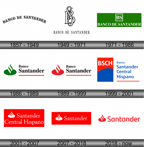
The historical journey of this financial institution’s symbols has predominantly been a textual metamorphosis, given the scant presence of graphic imagery. Its inaugural emblem featured the words “Banco de Santander” inscribed in an antique Old English font. Each character is a testament to the artistry of calligraphy, adorned with intricate swirls, bifurcated stems, and ornate twists, all punctuated by an assortment of both grand and petite dots. This verbiage elegantly arcs, creating a visual symphony that seamlessly melds tradition with aesthetic elegance, thereby encapsulating the rich heritage and esteemed values that the institution has upheld since its inception.
1949 – 1971
Numerous years passed since the inauguration of its initial emblem when the bank underwent a transformation, adopting a new brand identity. A notable feature of this revamped logo is a monogram comprising the intertwined initials “BS.” The characters, presented in a pristine white hue, are subtly outlined with a fine black border. Although these letters retain the classic Old English style, the same cannot be said for the full inscription beneath. In this rendition, the phrase “Banco de Santander” is rendered in elongated, slender typeface adorned with graceful serifs. This evolution in its brand image signifies the bank’s commitment to preserving its rich history while embracing a more contemporary aesthetic.
1971 – 1986
Visual enhancements, including graphics and color, have been meticulously incorporated into the logo to elevate its aesthetic appeal. The intertwined initials “BS” now find themselves encased within a geometric square border, adding a modern touch to the design. Below this, the full name of the bank is prominently displayed in uppercase letters, employing a print typeface that gracefully melds thick and thin strokes. The characteristic serifs remain a steadfast element in this version as well. All these components are set against the backdrop of a vivid green rectangle, a color that not only stands in stark contrast to the white lettering but also serves as a symbolic representation of prosperity and wealth. This infusion of color adds a fresh vibrancy to the logo, perfectly encapsulating the bank’s progressive ethos while maintaining a link to its traditional roots.
1986 – 1989
In 1986, a significant rearrangement of the logo’s elements was undertaken by the creative developers. They opted to eliminate the “de” from the bank’s name, organizing the remaining words into two distinct lines. “Banco” is now positioned at the top in a modestly sized font, while “Santander” claims the bottom portion, presented in a notably larger typeface. The transformation extended to the lettering as well, with a shift from uppercase to lowercase, albeit retaining capitalization for the initial letters. A bold red line serves as a defining underscore for the bank’s name, adding a vibrant splash of color. Accompanying these changes, a new graphical figure was introduced to the left of the text. This illustration consists of a green oval, embellished with gracefully curved stripes that ascend upwards, culminating in a shape reminiscent of a pointed droplet.
1989 – 1999
During those particular years, the transformation was solely confined to a chromatic shift. The emerald green elements that once graced the design were meticulously replaced by a resplendent shade of red. This switch not only infused the logo with a new vibrancy but also encapsulated the bank’s dynamism and progressive ethos. Red, often associated with energy, strength, and power, perfectly mirrored the bank’s burgeoning global presence and robust financial standing. This seemingly simple yet profound change in color palette marked a significant milestone in the bank’s visual identity, symbolizing a departure from the traditional and a bold stride towards a future filled with possibilities and growth. The reimagined logo, now adorned in this rich hue of red, stood as a testament to the bank’s unwavering commitment to innovation and excellence.
1999 – 2001
During those particular years, the transformation was solely confined to a chromatic shift. The emerald green elements that once graced the design were meticulously replaced by a resplendent shade of red. This switch not only infused the logo with a new vibrancy but also encapsulated the bank’s dynamism and progressive ethos. Red, often associated with energy, strength, and power, perfectly mirrored the bank’s burgeoning global presence and robust financial standing. This seemingly simple yet profound change in color palette marked a significant milestone in the bank’s visual identity, symbolizing a departure from the traditional and a bold stride towards a future filled with possibilities and growth. The reimagined logo, now adorned in this rich hue of red, stood as a testament to the bank’s unwavering commitment to innovation and excellence.
2001 – 2007
The executive decision was made by the financial institution’s leadership to revert to its heritage, re-adopting the iconic drop-shaped emblem within an oval frame. Adjacent to this, the word “Santander” is meticulously scribed, situated beneath the brand identifier “Central Hispano.” In this iteration, all components are elegantly rendered in a pristine white hue, harmoniously enclosed within the confines of a horizontally-oriented red rectangle. The choice of a slender font, gracefully embellished with serifs, adds a touch of sophistication and finesse, encapsulating the bank’s commitment to preserving its rich legacy while seamlessly blending it with a modern and progressive aesthetic. This thoughtful amalgamation of elements serves as a visual representation of the bank’s steadfast dedication to excellence and its unwavering resolve to forge a future that is firmly rooted in its esteemed values and heritage.
2007 – 2018
The executive decision was made by the financial institution’s leadership to revert to its heritage, re-adopting the iconic drop-shaped emblem within an oval frame. Adjacent to this, the word “Santander” is meticulously scribed, situated beneath the brand identifier “Central Hispano.” In this iteration, all components are elegantly rendered in a pristine white hue, harmoniously enclosed within the confines of a horizontally-oriented red rectangle. The choice of a slender font, gracefully embellished with serifs, adds a touch of sophistication and finesse, encapsulating the bank’s commitment to preserving its rich legacy while seamlessly blending it with a modern and progressive aesthetic. This thoughtful amalgamation of elements serves as a visual representation of the bank’s steadfast dedication to excellence and its unwavering resolve to forge a future that is firmly rooted in its esteemed values and heritage.
2018 – Today
The executive decision was made by the financial institution’s leadership to revert to its heritage, re-adopting the iconic drop-shaped emblem within an oval frame. Adjacent to this, the word “Santander” is meticulously scribed, situated beneath the brand identifier “Central Hispano.” In this iteration, all components are elegantly rendered in a pristine white hue, harmoniously enclosed within the confines of a horizontally-oriented red rectangle. The choice of a slender font, gracefully embellished with serifs, adds a touch of sophistication and finesse, encapsulating the bank’s commitment to preserving its rich legacy while seamlessly blending it with a modern and progressive aesthetic. This thoughtful amalgamation of elements serves as a visual representation of the bank’s steadfast dedication to excellence and its unwavering resolve to forge a future that is firmly rooted in its esteemed values and heritage.


