Seattle Seahawks Logo
Seattle Seahawks are an NFL team from Seattle, Washington State. They are competing in the top leagues, and often reach good places in ranking, at least in the Western leagues. They are prominent for being one of the few professional teams in America who use acidic green colors as part of their branding.
Meaning and History
The team was started in the year 1974, at the time when most American football teams started their careers. The name isn’t particularly complex, they picked it because Seattle is a major port in the Northwestern America. Washington is also home to a large osprey (known also as a sea hawk) population.
1976 – 2002
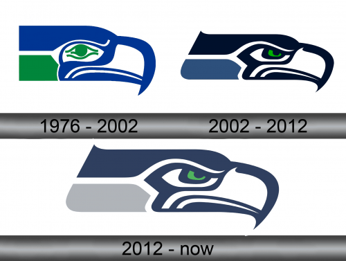
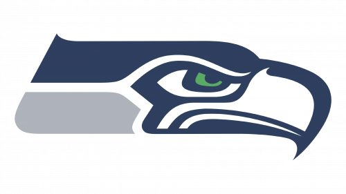
The first logo featured a hawk’s head drawn in simple lines. They gave the bird a mild expression, although it toughened to determination in the coming years. Notably, the designers colored it blue and green – colors of Seattle and Washington, respectively.
2002 – 2012
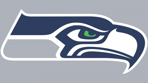
This time, they lengthened the neck a bit and added a frown onto the hawk’s eyes. The colors were shuffled mostly to different shades of blue, although they left some green in the bird’s eyes. After all, it’s both the dominant color of the team’s uniforms and of the State’s flag.
2012 – today
The only change they made for the 2012 emblem is repaint the throat of the bird from pale blue (probably after the flag of Seattle) to grey. It’s not clear why they did this, but it was likely done for more contrast.
Emblem and Symbol
Like many other clubs, Seahawks use the lettering featuring their name as one an alternative logo. It’s not used all the time, but on occasions. It’s also rather unique from many other wordmarks in style – the letters here have more tips and angular shapes about them.
