Seat Logo
Seat is a Spanish automaker that began its existence as a division of the Italian brand Fiat in Spain. It is famous for the Seat 600, which was produced for 16 years since 1957. It was well-recognized in Spain due to its practicality and attractive design. Today, it is the only major manufacturer of its kind with the infrastructure to develop its own automobiles in Spain. The design and assembly divisions of the company are the most modern and efficient. They allow Seat to produce modern cars without being limited to their brand.
Meaning and History
In 1950, the Spanish state, bankers, and the Fiat concern founded a company for the mass production of cars. The brand’s products for many years were licensed copies of Fiat cars. In 1980, the Italians left the game. Two years later, a partnership with the Germans began, and in 1985, VW AG concern took complete control of the Spanish brand. At first, Seat replicated clones of German models, but in the 1990s it began to design and mass-produce original cars, albeit on VW technical platforms. The name is short for Sociedad Espanola de Automoviles de Turismo.
What is Seat?
Seat is a Spanish automotive brand. It is one of the divisions of the Volkswagen Group, the world’s leading automotive group. The brand was founded in 1950.
1953 – 1960
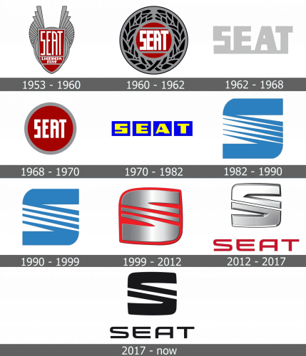
A red crest with a gray outline had “Seat” written in large letters and “Lincencia Fiat” underneath in two lines using a slightly smaller font. The name is done using a geometric typeface. Behind the crest, there is an oval shape that has wing-like elements going up on both sides of it. It looked bold and very powerful.
1960 – 1962
The color scheme was kept the same with just white added to it. The new version was a red round emblem with a thick gray border featuring a floral pattern. The name was done using the same font, but it looked a bit more angular. It was also done in white and had thicker lines. The emblem had some highlights and shadows that created a 3D appearance. The overall look was sophisticated and luxurious.
1962 – 1968
This is an extremely minimalistic yet impressive logo. It says “Seat” in bold, all uppercase letters. They are interconnected using a line at the bottom and feature a light gray color. The bold lines of the logo make it look strong and confident. There are no other elements or embellishments.
1968 – 1970
This logo brought back the bright red, which was used for the inner circle. The frame was a plain gray border. In the center, it stated “Seat” in all uppercase letters using the same font the brand used originally, only bolder. The white color of the letters looked daring and captivating against the red.
1970 – 1982
Bold, geometric lines are the only thing that draws an association with the previous versions. The name features a striking yellow, while the small rectangles they are set on are an azure shade of blue.
1982 – 1990
A stylized “S” is the only element of the logo. It is bold and very symmetrical. The diagonal line of the letter is done as several spikes, which gives it some dynamics and interest and stood for the growth and development of the brand.
1990 – 1999
It might seem that there are no changes to the logo, but an attentive person can see that the spikes have been extended and cut. They are no longer sharp and pointy. In addition, there is one less line. The modifications made it look bolder and even more symmetrical.
1999 – 2012
This emblem is powerful and bright. It features red and silver, the colors the brand already used in several of its logos. The metallic silver letter, which has some volume, is placed on a red background. It also has fewer diagonal lines. “Seat” is printed under the emblem using bold red and a font that was inspired by the original, but has smoother curves.
2012 – 2017
The “S” no longer has a background, but it is still strong and eye-catching thanks to a 3D appearance. The diagonal lines were joined, so there are no two thick lines. The font for the name below has undergone minimal adjustments.
2017 – Today
The logo got a cohesive, timeless look after the company made it all black and without any 3D effects. Otherwise, the emblem stayed unchanged.
Font and Color
The brand used variations of the same font in all of its logos. It is geometric and bold, which gives the emblems a confident appearance. The colors were also powerful and luxurious. Until 1970, these were red, gray, and black. Then, the company introduced blue, which served as a symbol of the quality and reliability of its products. In 1999, the brand brought back red and silver and later black.


