Seattle Mariners Logo
The Seattle Mariners are one of the franchises in the Baseball League. Formed when the American League was creating additional team, it has changed owners several times. Danny Kaye was the first owner. As sad as it might sound, this team is one of six clubs in the league that do not have World Series championship on their list. Moreover, it did not even have a chance to participate in a World Series.
Meaning and History
This baseball team was founded and has been part of the Major League Baseball since 1977. Later, it started to play games as a member of an American League Western Conference. As it might be clear, their home is considered to be Washington state. The main achievements of the team are three wins in the Western Division. In the early 2000s, these baseball players won 116 regular season games, setting a record for the American League for most wins. Their name undoubtedly comes from the prominent local maritime culture.
What is Seattle Mariners?
This is a club from Seattle that plays baseball professionally. Nelson Cruz and Robinson Cano are considered to be its best players. It cannot show off many trophies but is still loved by its fans.
1977 – 1980
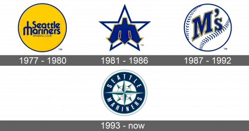
A bright energetic yellow color was the main color of the emblem for the new team. It was designed as a circle and had a relatively thin deep blue border. The same color was used to write “Seattle Mariners” in two lines. The typeface was thick and only the first letters were capitalized. An interesting element of this logo was the design of the letter “M” which was drawn to resemble a marine trident, which extended to the top of the first line. Right under, it said “Baseball Club” in thin upper case letters of the same color.
1981 – 1986
It was not long before the logo acquired a completely new look. Although the color scheme was maintained, the blue became the dominant color. It was used to draw an outline of a five-pointed star using a relatively thick line. The inside of the star was done in white. A marine trident, which once again stood for the letter “M”, was placed in front of the star. It was done using a different shade of blue and had a thin yellow and blue outline. The team surely hoped to be stars in this game.
1987 – 1992
In 1987, the fans saw a new logo, which used a white baseball with blue outlines and stitches. Instead of the trident, it simply had an abbreviation of the name. “M’s” was done in deep blue color with a yellow followed by a thin blue outline. The letters were written in the center and followed the arch of the ball, which gave it a three-dimensional feel. This logo is a very logical representation of the baseball team.
1993 – Today
The team brought back a marine element, but this time it was a pointy nautical compass. This element was drawn in the center of the emblem and was done in new colors. The baseball, which was intertwined with the compass also acquired the typical red stitches. Around the perimeter, the name of the team was written in white large capital letters on deep blue background. The emblem had several different outlines. It was much more complicated than any of the previous versions, but it brought together the ocean and the baseball in a very interesting way. The new logo looked very professionally done.
