Sierra Mist Logo
Along with Mountain Dew, Pepsi Cola and many other sodas, Sierra Mist is one of the many drinks handed by the PepsiCo. This lemon-flavored soda was introduced in 1999, and was specifically designed to compete with Sprite, that was making a lot of money for Coca Cola at the time.
Meaning and History
The company has been careful about the name choice. To choose the name, Pepsi made a polling which involved over 2000 people. The people who took part in the polling suggested over a thousand names, and finally ‘Sierra Mist’ won through selection. The name basically means ‘mountains of mist’ or something along those lines.
1999 – 2001
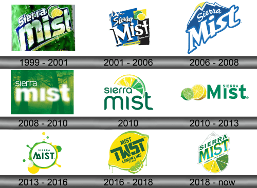
The initial logotype depicted the soda’s name on the green background. The word ‘Mist’ with a bold sans-serif font had the largest part in the whole logo. There was a small part ‘Sierra’ above, written in the white sans-serif font.
As for the other elements of the logo, so, there were two slices of lime and lemon, placed one behind another.
The entire logotype was pushed closer to the realistic style. This was depicted also by the lime-green background with the falling drops.
2001 – 2006
The following logotype had quite a different style.
On the one hand, the inscription was rewritten to the fully white color. The ‘Mist’ word gained the custom font, while the small word ‘Sierra’ had the handwriting typeface. There was also an explanation below – ‘Lemon-flavored soda’.
On the other hand, the background had been executed in three geometric figures of yellow, black and blue colors. Also, the familiar pieces of lime and lemon remained, but they were redrawn as well.
2006 – 2008
Another logotype depicted the familiar inscription, written in the same white color, but with the addition of blue contour. As for the changes: the font of the lower word ‘Mist’ was changed again. This time, it closed to the more simple styles, but still had some eye-catching features. Also, the image of a mountain with a sunrise was put above the lettering.
The background referenced us to the original 1999 version, but it didn’t have the drops, changed its shades to the brighter green and there were put the blue lines above and below.
2008 – 2010
The next logotype depicted the name of the brand in two fonts: a simple sans-serif one for the word ‘Sierra’, and a bold and shining type for the ‘Mist’. All this had the background of a green forest
2010 – 2010
One more experimental logotype was introduced in 2010. It also had a different style than the others. This time, there was a single green typeface for the words. Above them, there was an image of a slice, which had a half of lime and a half of lemon.
2010 – 2013
Another logotype also had a green inscription with an image of lime and lemon of the left side.
2013 – 2016
Again, Pepsi changed the style of their brand’s logo. This time, the inscription with a renovated typeface was put in the green and yellow circle.
2016 – 2018
With a changing of the brand’s name to Mist Twist in 2016, the logo was changed as well. On the background, which featured the citrus theme as well, there was put an inscription with a rectangular type and gaps in the letters.
2018 – Today
When the brand returned to the original name, its designers decided to change the logo one more time. The current logotype depicts the motives from previous logotypes such as mountains or citrus theme, but there are also the new elements such as new font of inscription.
Emblem and Symbol
Different bottles of the soda use different versions of the logo. It depends on the length of the bottle and the space for the logo. For example, the image of mountains can be off-centered to the left. Also, a bit of blue shade can be added to the inscription, if the background’s color is white.
