Slayer Logo
Slayer is a celebrated thrash metal band. Basically, what most people imagine when they hear the words ‘metal music’, also characterizes Slayer. They are a stereotypical metal band, with a big emphasis on the Satanic aesthetic, make-ups and aggressive style of music that involves yelling, fast guitar sequences and so forth.
Meaning and History
Slayer started in 1981 in California, America. This alone makes them amongst the oldest metal bands in this country. Coupled with their success, it ensured they had a very notable influence on much of the metal music played afterwards, at least in America. The name is just a very aggressive and passionate word, which is why they took it.
1983 – 1986
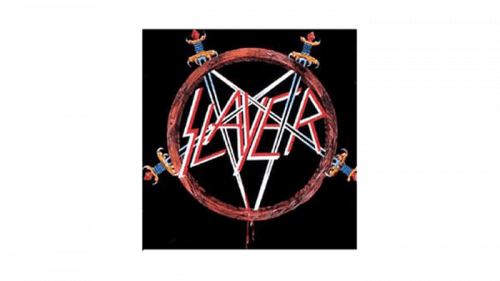
Two years after inception, they revealed their first official logo. In the center was the band’s name, written in an iconic style used by them even into the 21st century. The inscription was styled as runes – the straight strokes formed the letters, and their texture resembled metal. Their colored it white and bloody red.
This was then surrounded by a sort of bronze or rusting ring – the basis of the pentagram. The lines were provided by the four swords driven into this rings from different sides – some of the blades trickling blood. The hilts were aggressively decorated – with a lot of horn-like extensions and blood-red inlays.
But it meant that it wasn’t really a pentagram – there were only four lines, while the true star needs five. They simply couldn’t fit another sword anywhere for it to look alright, hence the lack.
1986 – 1995
The 1986 logo saw a lot of simplification.
Firstly, the name part became a brighter red color, as well as grew in size and thickness a bit. The ring around was repainted yellow. However, the rest remained pretty much the same, except for some minor details that added unnecessary effort.
1995 – 1998
The 1995 logo was a simple band’s name written in almost completely the same way. Moreover, the coloring resembled the 1983 style, with white cores and some red glittering on the sides.
1998 – 2001
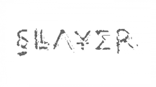
This design went the other direction for a few years. It was a grey depiction of the name styled to look like powder residue or something along these lines. The letters lost their rune-like style and instead turned into more-or-less normal letters, all of them placed on the same level, contrary to the previous attempts.
Notably though, some of these letters are styled to resemble Ancient Greek symbols and letters. ‘S’ resembles the section sign (§), ‘A’ is just an upside-down ‘V’, ‘Y’ has an unnecessary dash in its middle, and the ‘E’ is just sigma (Σ).
2001 – 2009
In 2001, they once more reverted to the previous name designs. This one was almost completely the same as the old rune writings, but with several distinctions. This one is very thin and as if hand-written (or rather, hand-carved) in black.
2009 – 2015
It’s the same 2001 design, but colored white and outlined by a slight layer of black. So, it seems like an imprint of the previous logo design.
2015 – today
The 2015 emblem is almost completely like the 1985 logo, which can be treated like the homage to the past.
Emblem and Symbol
Frequently, Slayer puts their 2015 pentagram logo onto an eagle with folded wings. Eagle, being an old symbol of might and strength, was also used by Nazi Germany – in many cases in precisely the same form. Whether the band really harbors Nazi sentimentalism or not isn’t clear.
