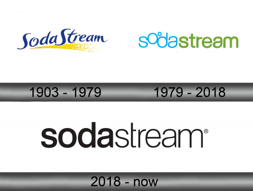
SodaStream Logo
Sodastream is an old British brand that sells water carbonation machines – not the big industrial types, but small and portable mechanisms. These were immensely popular throughout the UK in the 70-80s, and even now they aren’t unsuccessful. Although, the charm faded when they moved to Israel and went international.
Meaning and History
The brand was formed in 1903 when one of the British entrepreneurs created the first real water carbonation device. It meant that you could turn the usual water into a soda – hence the name. They are still making these machines, and are rather popular in the UK. In 1998, they moved to Israel after a local company bought their enterprise.
1903 – 1979
This was the main logo throughout the years. It was basically just the brand’s name, written in spindly font that really looked handwritten. There were many loops, twists and other old-fashioned design choices. They kept it for nostalgia purposes, it seems.
Sometimes they also would repaint the words white and outline them in red, all the while making the letters much thicker and bolder – but that was a secondary esign.
1979 – 2018
The one logo most people are familiar with arrived in 1979. It was the same concept, although written in a different style now. The letters were now plain and much softer. They were all lowercase, but that’s where similarities ended. The first part, ‘soda’, was blue and thin, while the rest of the letters were turned green and bolder.
In addition, they elevated the letters ‘o’ slightly, so it now resembled a bubble (they float up in sodas, as you know). Furthermore, they added a smaller circle next to the letter, and just like it in shape.
2018 – today
In 2018, the design was rearranged slightly. First off, the logo was now exclusively blue. Secondly, it was not the first part that was bolder than the other. In all other aspects, the emblem was rather plain – the ‘bubbles’ were dispensed with, and it was just a regular blue brand name.
Emblem and Symbol
Sodastream didn’t really have a functioning emblem, except for one instance with the second logo iteration. They would often put variously colors splatter drops either above the logo, behind it or somewhere else. Some were circular, others pear-shaped, and the coloring also varied a lot.


