Spiderman Logo
Spiderman is one of the most iconic superheroes of our time. The adventures of this web-slinging sentinel have sprouted many series of comic books, as well as a lot of animated shows and several movie franchises. It’s more than virtually all other comic book heroes in existence, barring maybe Batman.
Meaning and History
Spiderman was created in 1962 by Marvel. They’ve had a lot of successful characters by then, but there were very few of them who could directly appeal to the younger audiences. In essence, Spiderman’s key characteristic is not his spider-like abilities, but also his buoyant and charismatic demeanor.
1962 – 1966
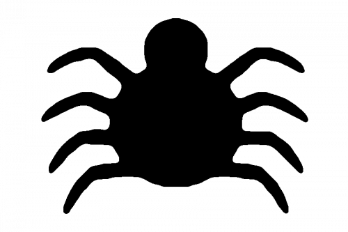
This was the first emblem they did. It featured a very simplistic shape with just two circles for the body and the head with 8 legs. It was completely black, and with all the other elements it looked like a child’s drawing – which was probably the look they went after anyway.
1966 – 1967
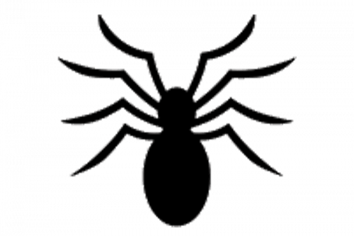
For their second attempt, they basically elongated the body downwards and made the legs more angular and aggressive.
1967 – 1973
This time, the head became distinctly separate from the body, and, for some reason, that’s where the legs grow out of now, instead of the body. And the extremities themselves aren’t as aggressive now, although there are only 6 of them now. So, this variation was more of a strange bug of sorts.
1973 – 1978
In this version, the legs moved to their proper position in the center again, and, what’s more, they became more realistic this time, in addition to being directed into various directions. And lastly, there are 8 of them once more.
1978 – 1984
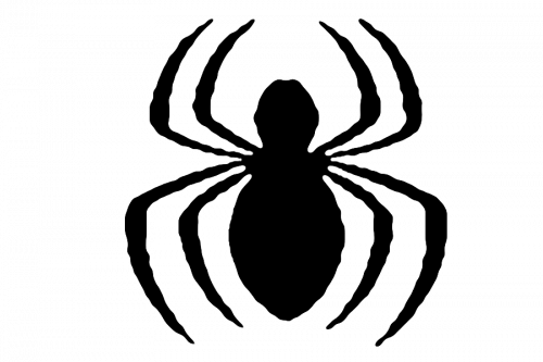
In 1978, they turned the shape of the spider into an oval with a small head on top. The 8 attached legs looked into two different directions – the top half looked up, while the bottom half looked down. This design became pretty common later on.
1984 – 1988
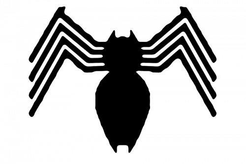
The head and the body in this variation were separated once more, with small jaws sprouting from both the bottom and the top of the overall shape. In addition, the legs were now more tightly grouped together, which made them look wing-like. And, again, they grew out of the head for some reason.
1988 – 1990
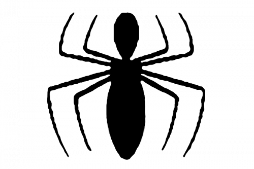
They basically took the 1978 style this time, made it thinner and redesigned the legs a bit. Each pair now went parallel to one another and ended in the same place, which created a disproportioned look.
1990 – 1992
In comparison to the previous style, they took everything almost unchanged, save for legs. The legs were more fluid and looked almost like the radio-waves, which made them look friendlier.
1992 – 1994
In 1992, they started to experiment with the design beyond just changing the legs and the body. This time, they made the body into a blot without any distinct head, and they gave it a few white spots so it would look more aggressive. The legs saw the most change.
They were rather more detailed, which made them look positively jagged. Four of them dangled downside, while two smaller ones sprouted upwards. Between these two and the head, they also added some web. Basically, it didn’t look much like a spider, but more like a mean octopus – which is likely why they changed it.
1994 – 1994
This one is basically a 1990 design, but much thinner and longer. That’s about it, more or less.
1994 – 1996
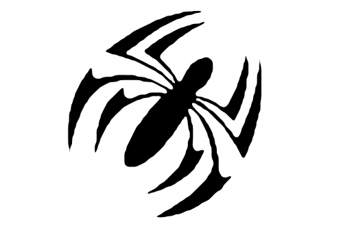
For this design, they added the claws on the ends of the spider’s legs and turned it 45° clockwise. Nothing else was added.
1996 – 1999
This time, the designers made both the body and the head much smaller. The legs, for their part also changed a bit. The bottom four were long and straight, and the upper two pairs were shorter, fluid and they also faced outwards, in contrast to the previous designs that faced inward.
1999 – 2000
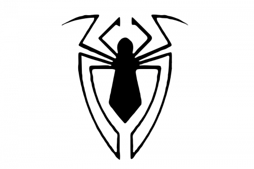
The body grew again and became more angular this time. The legs changed the most, once again – some of them conjunct around the spider body to form something of a shield, but there are also several that just hang around above the body.
2000 – 2002
It’s a standard 1994 design that will also be used later. This time, they made the body a bit more bulky. The legs, by contrast, are shorter and sharper.
2002 – 2004
This is the first in the series of the new logo designs. This one sports a small triangular body in the center (without the head at all), as well as 8 long sharp legs – four downward and four shorter upward extremities in total. This new approach will be used for a lot of iterations past this point.
2004 – 2006
They took the previous design and changed a few nuances. The legs were noticeably rearranged, but the general idea remained. At the same time, the body was elongated a bit.
2006 – 2007
The 2006 design was a one-off for the ‘Iron Spider’ series of comics. And it was more bulky as a result. The logo was divided into two parts – the lower body and the upper head with fat legs attached to each segment.
The bottom part was a rhombus with two pairs of short legs one on top of the other sprouting from the sides. The upper part, however, as a small head with two mandibles, a pair of shorter legs and another couple of sprawling extremities.
2007 – 2008
In 2007, we returned to the ordinary emblems. For this one, they took a 2004 design, elongated the upper legs and made them turn inward near the end. The bottom legs also were narrowed to the center, but that’s about it.
2008 – 2010
A standard design again – there are two rhombuses that act as a body and a head, and there are two pairs of basic linear legs arranged in the usual way. They are thicker than usual and end in square angles.
2010 – 2011
This time around, they took virtually the same body type as in 2008 but with some space between the head and the body, as well as generally shortened the shape. The legs, including the bottom ones, faced upwards. The very top pair, for its part, was completely straight.
2011 – 2011
This design was used for a ‘Miles Morales’ issue in 2011. The legs for this one were just all over the place. The two central pairs for top and bottom were just thing arches, and there two more pairs. The second upper pair were just two square short stubs, and there were two longer lower legs that sprawled a bit wider.
2011 – 2012
At this point, the emblems started going futuristic and out-of-ordinary.
This one looked like a man with a very small torso and long legs standing upright. Granted, there are three other extremities completely separate from the body, in addition to the head that kind of floated above the main blot.
2012 – 2012
As a sort of intermission, they took a 2004 emblem, made it slimmer and paler. The legs, for their part, were elongated and rearranged just a bit.
2012 – 2013
This is a ‘Scarlet Spider’ logo. In comparison to the previous attempts, it’s completely symmetric vertically and horizontally. So, there are two pairs of miniscule legs just alongside the body, and then there are four much bigger claw-like shapes sprouting from the top and bottom.
2013 – 2014
Again, they tried to go for a man/spider mix where the spider seems to stand upright. However, this time, it’s more detailed. Even though the two bottom legs are almost completely straight, there are two upper pairs that resemble wings. The central pair of legs looks like arms, for their part.
2014 – 2015
The 2014 is noticeably more realistic and scary. The legs wave, twirl and change width constantly. The top pair itself looks like a couple of mandibles, which just adds to aggressiveness.
In essence, however, it’s just like the 2004 design, but more nuanced and spooky.
2015 – 2015
It’s a strange design. They made the body into a tie shape and attached 4 lightning-like leg pairs into different sections of it, which gave it an electric feel. Not like with the following style, though.
2015 – 2016
This one only looks like a spider if you have enough imagination. There are two thin bottom legs that go all the way to the middle, which is signified by a little dot. There are two thick zigzags on the sides that are supposed to be another two pairs of legs.
Lastly, there are two more, even thicker legs on the very bottom, and, sandwiched between them, is a head. It’s very futuristic to be sure, but then, it was meant for Spiderman from 2099.
2016 – 2018
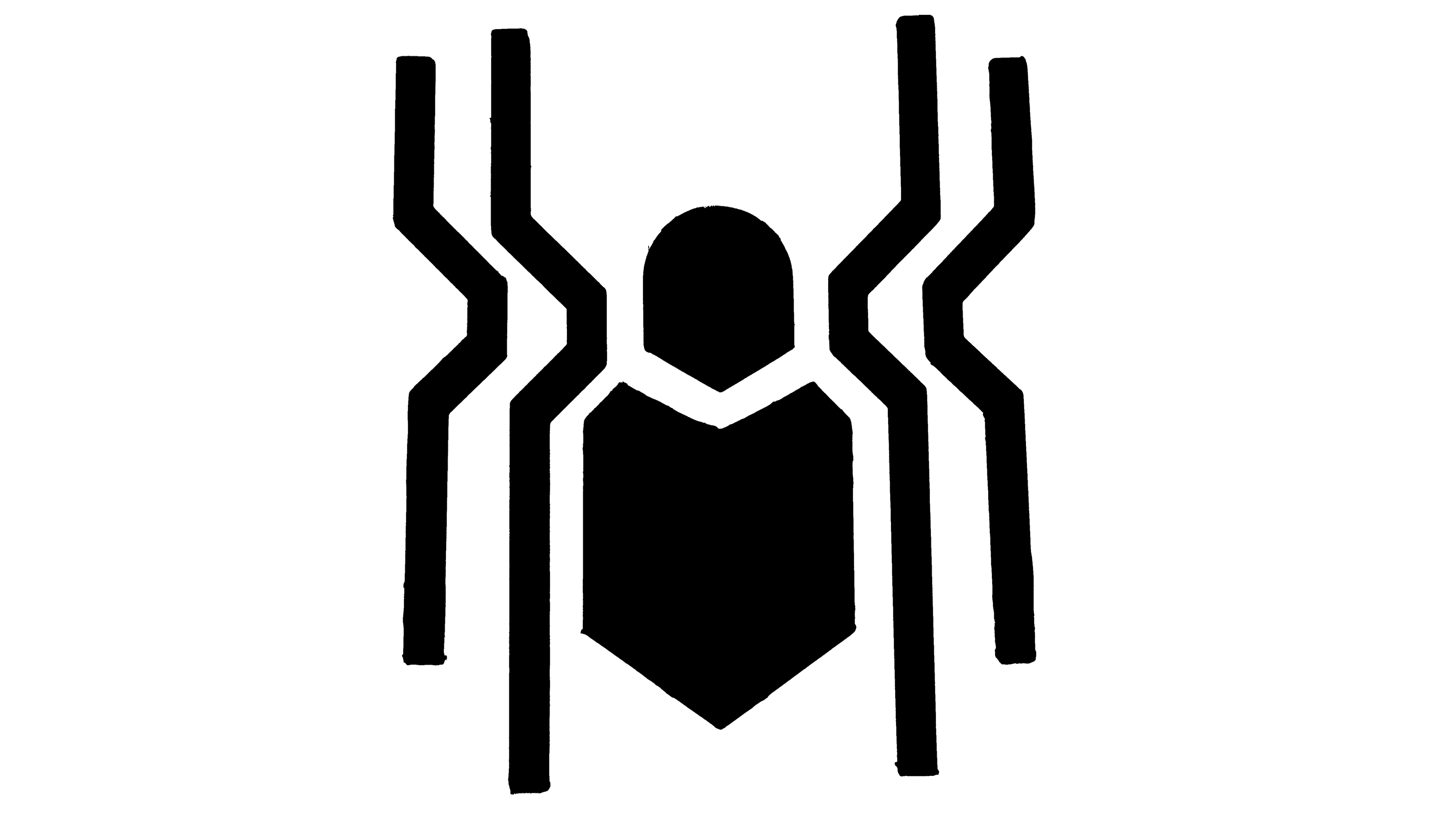
For 2016, they scaled down the insanity level a bit. This emblem was a simple fat body with near-straight lines (there are four of them and they warp slightly near the center) attached to the sides of it. It is still rather futuristic, but not on the same level as the 2099 version.
2018 – 2018
Interestingly, they took the same emblem for this one, but made the body smaller without changing much of the shape. The legs, in the same time, changed little, except they became a bit longer, much thicker and shifted to the middle on the bottom half.
2018 – 2018
This one is, again, not too different from the 2004/2012 design, although the legs are much more prominent and more tightly grouped together in this instance.
2018 – 2019
This variation looks painted on (there are paint leaks), but it isn’t essentially different from the standard variations. The body is small, and the legs are thin and long. Noticeably, there is a circle around almost the entire symbol.
The reason for this aesthetic is simple – it was meant for the movie ‘Spiderman: Into the Spider-verse’, and the main character there is Miles Morales, a kid who graffitied this symbol onto his own suit.
2019 – today
This is basically the 2016 emblem again, but with some changes. The head is a separate circle, and the legs are bigger in all aspects. But the general idea and the shape are the same.
Emblem and Symbol
There are many other Spiderman-related symbols. The recurring emblem is the superhero’s own mask confined into a circle. It usually has some mimic to it – it can wink, wince, and so forth. But it’s generally the same shape, the same color scheme and the same idea.
