Walt Disney Pictures Logo
Disney has been the biggest producer of animated films and shows since time immemorial. Over time, they also bought countless other studios, so that they now own a good chunk of Hollywood. Many things that you’ve watched in a previous year have at least a slightly influenced from this company.
Meaning and History
The company has been active since 1923, when it was founded by the aspiring (and one of the first ever) animator Walt Disney. The studio bore his name ever since – nowadays, it’s known as ‘The Walt Disney Company’. Although the company is mostly known for their animations, they’ve also purchased giant film studios such as Lucasfilm and Marvel.
1929 – 1937
Walt Disney played a pivotal role in devising the initial brand emblems. One such rendition included the depiction of Mickey Mouse, a character already synonymous with the animation house, in a walking pose. The inscription “WALT DISNEY PRODUCTIONS Ltd.” was prominently positioned above the animated icon. The word “MICKEY” was aligned to the left, and to the right resided the word “MOUSE.” Beneath the former, the term “TRADE MARK” was inscribed, and below the latter, one could find the word “REGISTERED.” Subsequently, the statement “SOUND CARTOONS,” adorned in light-hued letters outlined in a darker shade, was crafted. Anchoring the emblem was the address “2719 HYPERION HOLLYWOOD.”
Every word in the emblem was rendered in a distinct typeface, employing a unique assortment of glyphs in most instances. The intentional use of varied typography aimed to imbue the logo with a singular aesthetic, reflecting the diverse and multifaceted nature of the brand. The intricacies within each textual component serve as a testament to the meticulous attention to detail and the quest for uniqueness that have become synonymous with the Disney brand. This emblem, blending iconic imagery with detailed typography, manifested as a comprehensive reflection of the studio’s identity, intertwining the essence of its pioneering animation with its foundational roots in Hollywood, the world’s filmic epicenter. The amalgamation of symbolic elements, coupled with unique font configurations, conveys the brand’s multifarious essence and its enduring commitment to innovative animation production.
1937 – 1948
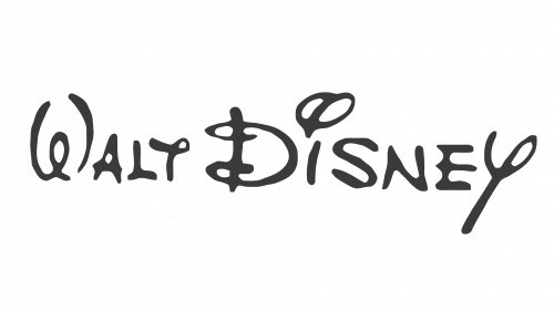
The first logo was likely drafted by Disney himself in 1937. The later versions brought some changes, but the overall style stayed the same throughout the years.
It’s a text that says ‘Walt Disney’ that was drawn as if by hand – which hints at the usual method of creating animations back in the day. The letters are just artistic, fluid and childish as today. Even though later most of the letters were reimagined, some elements stayed. For instance, the dot over ‘I’ looks now just as it was back then.
1948 – 1979
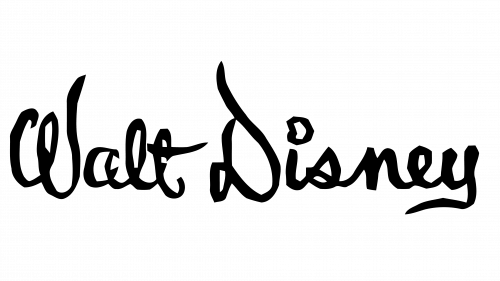
In 1948, Disney redrew his initial draft. The first thing you notice is that it became massively darker. Sure, the previous version was often pitch-black, if they decided to add more ink, but the usual composition was soft grey.
Design-wise, the letters became wavier. There were now almost no straight lines, and the general layout came much closer to the contemporary design that was introduced in the 70s.
1972 – 1983
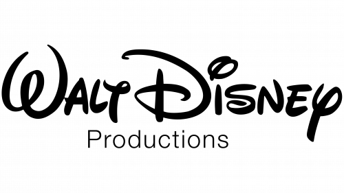
In 1972, this one became the main logo, although the 1948 variant was still in use. The text design that was introduced with this version has pretty much stayed with the brand ever since – the surrounding details changed, and sometimes the color.
But the 1972 version saw this new text design accompanied by a simple plain word ‘Productions’ below in a thin typographic font.
1983 – 1985
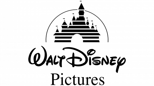
In 1983, they replaced the word below with a notched design that resembles Times New Roman heavily, except it spelled ‘Pictures’ now. This layout basically accompanied the company logo until 2011, with the only exception in the form of an added castle.
1985 – 2006
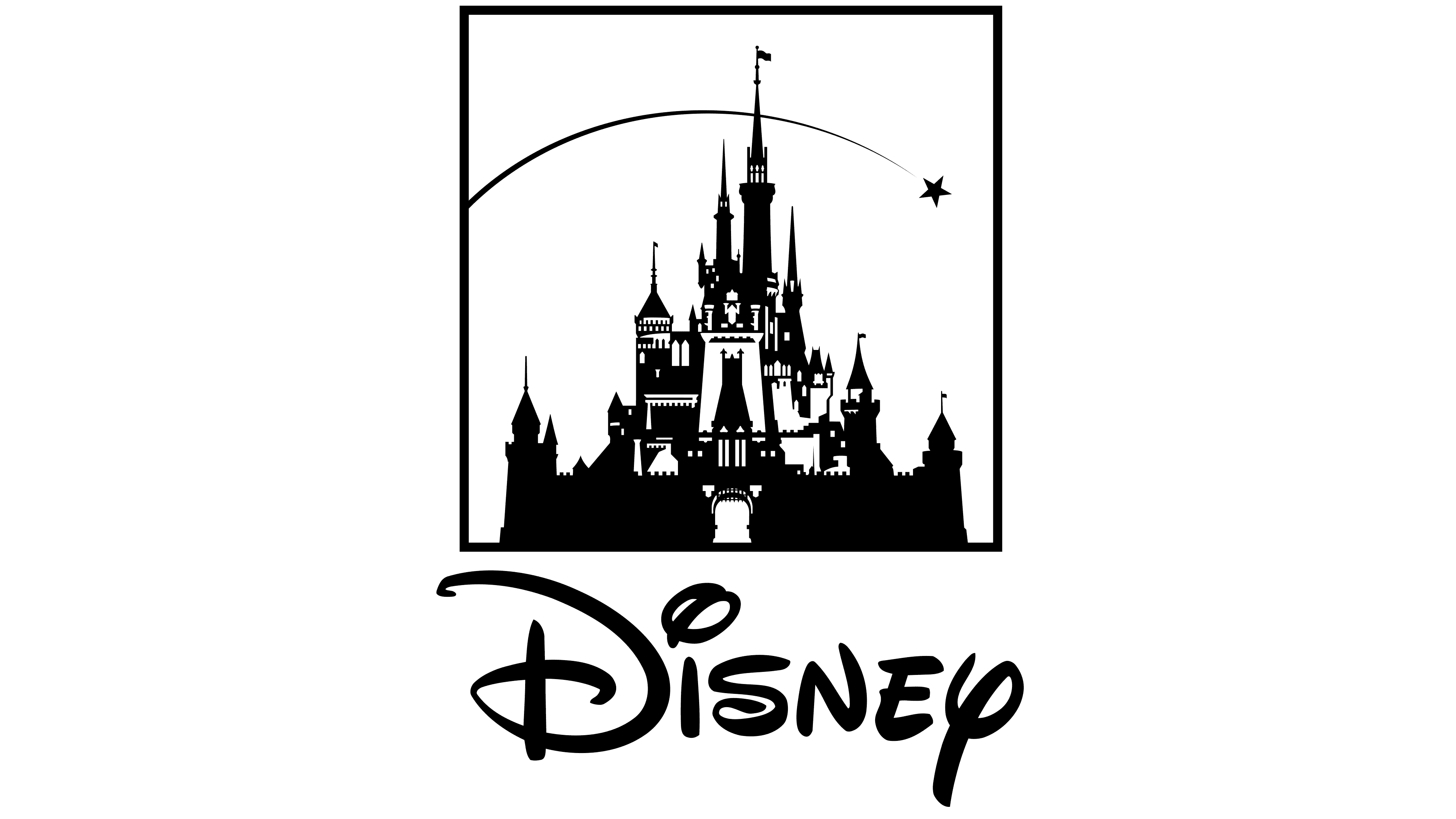
In 1985, the iconic Disney castle was added on top of the previous structure. It was a basic cartoonish castle with tons of towers and a gateway. Several horizontal lines pierced it in some places for some reason.
The last touch is a thing arch that circumvents the building – a trail of the star that went across the screen, if you remember the older Disney intro.
Lastly, the text proportions were slightly changed, with the main text lessened a bit, and the ‘Pictures’ part increasing in size.
2006 – 2011
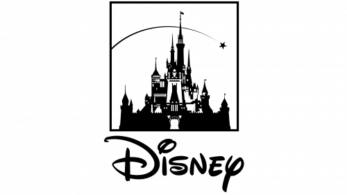
For 2006, the castle (as well as a comet) became more realistic and, in addition, confined in a vertical rectangle. Aside from the ‘Pictures’ element that was now made fully uppercase, nothing else changed.
2011 – today
In 2011, even fewer changes were made. The words ‘Walt’ and ‘Pictures’ were removed from the logo, with the ‘Disney’ part occupying most of the vacant space.
Emblem and Symbol
Disney’s ‘Mickey Mouse logo’ is known since at least the 80s, when the silhouette of his head and ears (basically just three circles) as first used to identify the corporation. Since then, the positioning and focus shifted numerous times. Since 2002, it was lightly cropped and tilted to the side, with some new details in every minor update.
It was mostly used to identify Disney Channel, although it’s not uncommon for it to be featured elsewhere as an icon for the brand as a whole.
