Disney Junior Logo
Disney Junior is a subscription TV network belonging to Disney. Its main office is located in Burbank, California. The broadcast program of the network consists of original TV shows, movies, and some additional series. They are oriented mainly toward kids from 2 to 7 years old. The telecasting occurs in Spanish and English across the United States and some parts of Europe.
Meaning and history
![]()
The Disney Junior network creation started in May 2010. It was supposed to take the post of Disney’s TV network for preschoolers – Playhouse. Junior was formed in February 2011 as just a broadcasting part on Disney Channel, airing in the early hours, seven days a week. In March 2012, the block was transformed into a full-scale TV channel. Now it casts popular Disney franchises such as Mickey Mouse, Jake and the Never Land Pirates, and various cartoonish shows for children. It also shows original TV series and movies, including Lucky Duck, released in 2014.
What is Disney Junior?
Disney Junior is a California-based broadcast network headquartered in. This is a large network, casting TV shows, series, and films, promoted across children from 2 to 7 years old. They also make original movies and series. The channel works on the subscription model, where people pay a monthly fee to watch the shows on it. Junior operates in English and Spanish internationally.
1999 – 2001
![]()
With the transition from the Disney Channel Preschool Block to Playhouse Disney, a new logo was introduced that featured key visual elements of the brand: Winnie-the-Pooh and Mickey Mouse ears. Within a stylized television, Winnie-the-Pooh was depicted waving, holding a honey pot, with his head extending beyond the TV screen. A bright yellow, using the iconic Disney font, spelled out “Disney” across the image. The TV’s unique design included a top adorned with two circular “ears,” reminiscent of Mickey Mouse. The word “playhouse” was set above the TV in a long, yellow cloud, with each letter uniquely colored in vibrant hues, and the typeface used was Jacoby Black, a sans-serif. The design, crafted by Beehive with animated graphics, effectively conveyed the playful and colorful essence of the brand.
2000 – 2011
![]()
In the early 2000s, Beehive refreshed the Playhouse Disney logo by simplifying the original design. The updated logo retained the words “playhouse” and “Disney” within an amorphous yellow cloud with a green outline. Although the typefaces remained unchanged, using the bold Jacoby Black for “playhouse” and unique glyphs for “Disney,” the color palette was modified. The designers introduced a vibrant red for the second line and enhanced the saturation of other colors, removing the shadows for a cleaner appearance.
2001 – 2003
![]()
In 2001, as the channel was rebranded to Playhouse Disney Channel, a logo redesign reintroduced the classic TV icon from 1999, but with modifications. The Winnie-the-Pooh image was replaced with a blue screen featuring concentric circles, over which the familiar yellow “Disney” was superimposed. This design added a gradient to create depth. The TV’s design, complete with Mickey Mouse ears, appeared three-dimensional due to strategic white highlights. The unstructured yellow cloud with “playhouse” remained, slightly lightened.
2002 – 2011
![]()
A collaborative effort among three design firms—Primal Screen, CASquare, and Beehive—led to a groundbreaking redesign of the Playhouse Disney logo. This new logo eliminated the TV and abstract cloud, opting instead for a playful depiction of a yellow Mickey Mouse head emerging from the bottom left. The head was framed by orange semi-arches at the tips of the ears and enclosed in a purple border. Inside the head, “playhouse” and “Disney” were inscribed, with the former retaining its multicolor scheme and receiving subtle light highlights and gradient shadows, lending a three-dimensional effect to the Jacoby Black font.
2010 – 2011
![]()
The logo’s iteration before another redesign included Mickey Mouse’s left ear in its entirety, previously cut off by the frame. This was accomplished by extending the logo into a yellow rectangular base with rounded corners, which balanced the design and echoed the original large TV screen motif from earlier logos. This adjustment provided a nod to the classic Playhouse Disney aesthetic while maintaining modern design elements.
2011 – 2020
![]()
The initial logotype for Disney Junior barely differed from the variant of 2020. It depicted Disney’s nameplate in its iconic handwritten style. This inscription was placed above the word ‘junior’, written in all 3D capitals. The top of the letter ‘i’ was black and had a Mickey Mouse’s head above it. Also, there were two yellow dots on the character. Some other features of the logotype contained the initial letter of the ‘Disney’ word standing to abut the top of the lower ‘j’. The letter ‘y’ also went over the letter ‘n’.
2020 – 2024
![]()
To renovate the logotype in 2020, the brand designers have made several minor changes in its design without changing the main concept. For example, Mickey Mouse’s head now has a highlighted spot, so the whole head looks more volumetric. Moreover, the word ‘Disney’ became a little smaller. Finally, a large dot above the ‘Disney’ word’s letter ‘i’ has received a small empty spot in its left part (previously, it was just black and white).
2024 – Today
![]()
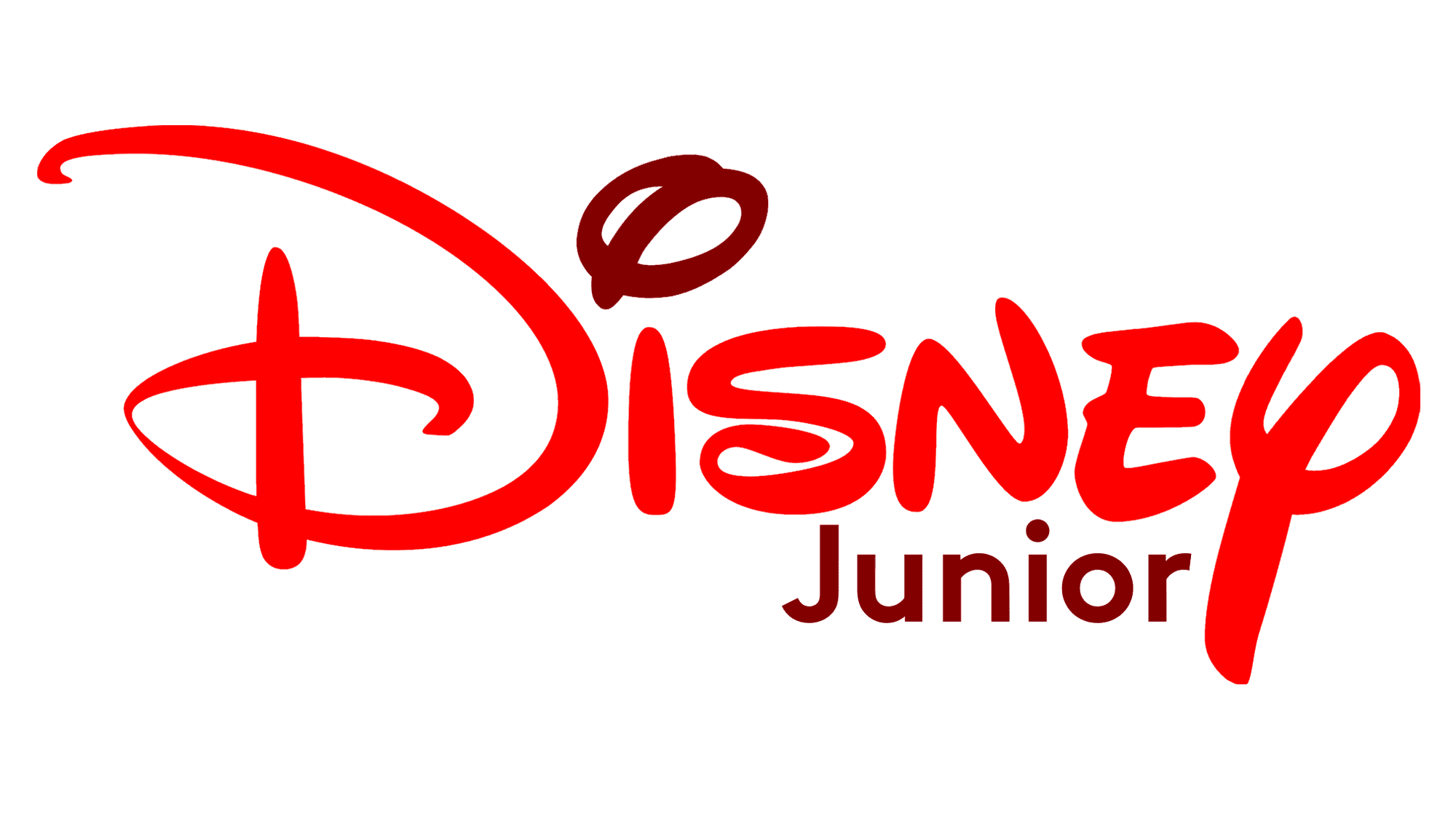
The Disney Junior logo is a vibrant and eye-catching representation of the children’s television network. The design features the classic Disney script in a bright blue color, instantly recognizable and associated with the enchanting and magical world of Disney. The word “Disney” is written in a playful, cursive font that evokes a sense of fun and imagination, capturing the whimsical spirit that is central to the Disney brand. This blue script is designed to be appealing to young audiences, providing a sense of familiarity and warmth.
Next to the Disney script is “Jr.” in bold red letters. This red color creates a striking contrast with the blue Disney script, making the logo stand out. The use of red adds a touch of energy and excitement, while the simplicity of the font ensures clarity and readability. The “Jr.” signifies the channel’s target audience—young children—and the combination of blue and red creates a dynamic and engaging visual appeal.
Overall, the Disney Junior logo effectively communicates the channel’s mission to provide entertaining and educational content for young children. The use of playful fonts and bright colors aligns perfectly with the joy and wonder associated with Disney. This logo is not just a brand identifier but also a promise of quality programming that fosters creativity, learning, and fun for its young viewers.
Font
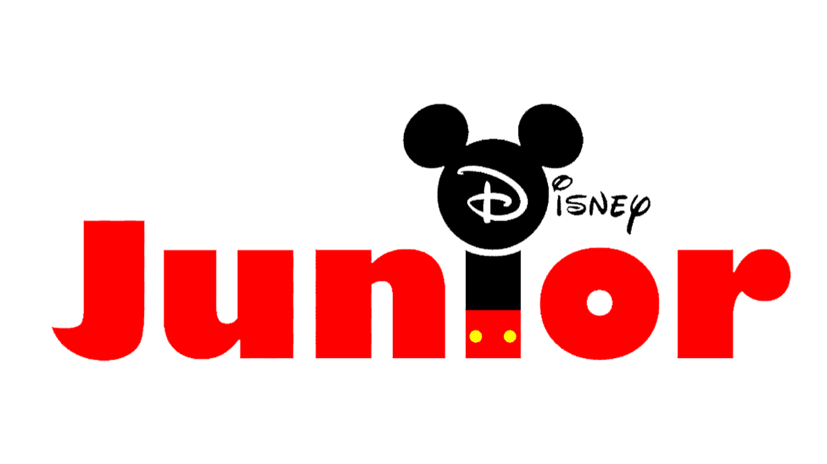
The two words in the channel’s logotype have two completely different scripts. A custom handwritten style with bold lines was used to write the word ‘Disney’. The letters ‘g’ and ‘y’, drawn in somewhat sloppy lines, have the most distinctive appearance here. In its turn, the ‘Junior’ caption uses a heavy sans-serif typeface with no gaps between prominent characters. In both words, the first letters are capitals, while the following ones are lowercase.
Color
The channel design team has used a black, red & yellow color palette to depict the logotype. Here’s how the colors are set: the lower ‘Junior’ word is red, and the letter ‘i’ has two yellow dots on it, while its top is black; the upper ‘Disney’ part and the Mickey Mouse’s head are black. The whole logotype is placed on a white background if there is any.


